Research
/Security News
Bitwarden CLI Compromised in Ongoing Checkmarx Supply Chain Campaign
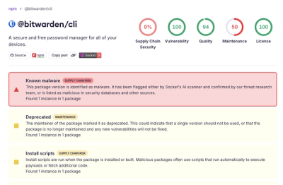
Bitwarden CLI 2026.4.0 was compromised in the Checkmarx supply chain campaign after attackers abused a GitHub Action in Bitwarden’s CI/CD pipeline.
reactjs-intro
Advanced tools
React Intro is a library for creating step-by-step and powerful customer onboarding tours
React Intro is a library for creating step-by-step and powerful customer onboarding tours DEMO
npm install --save reactjs-intro
const steps = [
  {
    selector: "#intro-1",
    position: "right-center",
    children: (
      <div>
        <p>
          Lorem Ipsum is simply dummy text of the printing and typesetting
          industry.
        </p>
      </div>
    ),
  },
  {
    selector: "#intro-2",
    position: "left-start"
    children: (
      <div>
        <p>
          Lorem Ipsum is simply dummy text of the printing and typesetting
          industry.
        </p>
      </div>
    ),
  },
  {
    selector: "#intro-3",
    position: "top-end"
    children: (
      <div>
        <p>
          Lorem Ipsum is simply dummy text of the printing and typesetting
          industry.
        </p>
      </div>
    ),
  },
];
| Name | Description | Type |
|---|---|---|
selector | CSS selector | String |
position | Position of the tooltip | String |
children | The tooltip content | String or JSX |
import Intro from "react-intro";
import "react-intro/dist/index.css";

const Example = () => {
  const [enabled, setEnabled] = useState(false);

  const toggle = () => {
    setEnabled(!enabled);
  };

  return <Intro steps={steps} enabled={enabled} onComplete={toggle} />;
};
Intro.propTypes = {
  steps: PropTypes.arrayOf(
    PropTypes.shape({
      selector: PropTypes.string.isRequired,
      position: PropTypes.oneOf([
        "left-center",
        "left-start",
        "left-end",
        "right-center",
        "right-start",
        "right-end",
        "top-center",
        "top-start",
        "top-end",
        "bottom-center",
        "bottom-start",
        "bottom-end",
      ]).isRequired,
      children: PropTypes.node.isRequired,
    })
  ),
  enabled: PropTypes.bool,
  initialStep: PropTypes.number,
  onComplete: PropTypes.func,
  onChange: PropTypes.func,
  nextLabel: PropTypes.string,
  backLabel: PropTypes.string,
  doneLabel: PropTypes.string,
};

Intro.defaultProps = {
  steps: [],
  initialStep: 0,
  enabled: false,
  onChange: () => {},
  onComplete: () => {},
  nextLabel: "Next",
  backLabel: "Back",
  doneLabel: "Done",
};
| Name | Type | Description |
|---|---|---|
enabled | Boolean | Defines if the steps are visible or not. |
initialStep | Number | Step to show at the beginning |
steps | Array | All the steps. |
onChange | Function | Callback called when the steps are changed and the callback function will receive the current step as parameter |
onComplete | Function | Callback called when all the steps are completed |
nextLabel | String | Label for next button |
doneLabel | String | Label for done button |
backLabel | String | Label for back button |
FAQs
React Intro is a library for creating step-by-step and powerful customer onboarding tours
The npm package reactjs-intro receives a total of 0 weekly downloads. As such, reactjs-intro popularity was classified as not popular.
We found that reactjs-intro demonstrated a not healthy version release cadence and project activity because the last version was released a year ago. It has 1 open source maintainer collaborating on the project.
Did you know?

Socket for GitHub automatically highlights issues in each pull request and monitors the health of all your open source dependencies. Discover the contents of your packages and block harmful activity before you install or update your dependencies.

Research
/Security News
Bitwarden CLI 2026.4.0 was compromised in the Checkmarx supply chain campaign after attackers abused a GitHub Action in Bitwarden’s CI/CD pipeline.

Research
/Security News
Docker and Socket have uncovered malicious Checkmarx KICS images and suspicious code extension releases in a broader supply chain compromise.

Product
Stay on top of alert changes with filtered subscriptions, batched summaries, and notification routing built for triage.