
Research
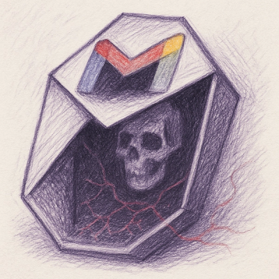
wget to Wipeout: Malicious Go Modules Fetch Destructive Payload
Socket's research uncovers three dangerous Go modules that contain obfuscated disk-wiping malware, threatening complete data loss.
By Kush Pandya - May 01, 2025
rn-segmented-tab-controls
Advanced tools
A lightweight React Native library for segmented control and tab navigation with no dependencies
npm install rn-segmented-tab-controls
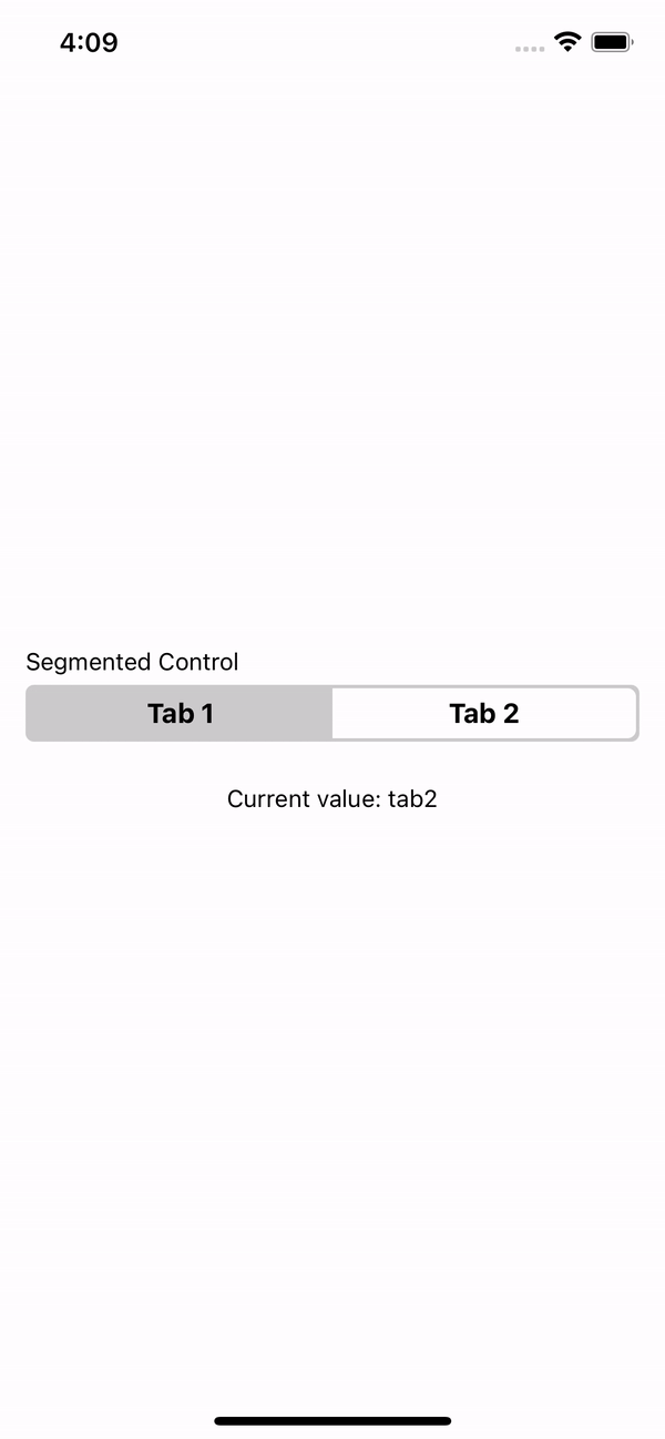
SegmentedControl Component
import {SegmentedControl} from 'rn-segmented-tab-controls';

const App = () => {
  const [value, setValue] = useState('tab1');

  const values = [
    {key: 'Tab 1', value: 'tab1'},
    {key: 'Tab 2', value: 'tab2'},
  ];

  return (
    <SegmentedControl
      label="Segmented Control"
      values={values}
      onChange={value => setValue(value)}
    />
  );
};
| Prop | Description | Type | Required | Default |
|---|---|---|---|---|
values | Key and value array to generate each tab. | {key: string; value: string}[] | Yes | None |
onChange | Function that returns the selected value. | (value: string) => void | Yes | None_ |
label | The label with which you want to identify the segmentedControl. | string | No | None |
labelStyle | Styles for label. | StyleProp<TextStyle> | No | None |
selectedIndex | Selected initial value. | number | No | 0 |
backgroundColor | SegmentedControl background color. | string | No | '#CCCCCC' |
tintColor | Tint color for the selected tab. | string | No | '#FFFFFF' |
textColor | Text color in the segmentedControl. | string | No | '#000000' |
selectedTextColor | Text color en the selected tab. | string | No | '#000000' |
style | Styles for the component container. | StyleProp<ViewStyle> | No | None |
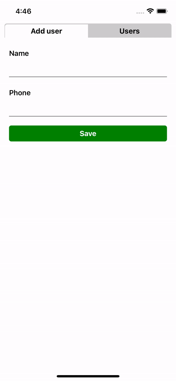
TabControl Component
import {TabControl} from 'rn-segmented-tab-controls';
import {FormUser, Users} from './components';

const App = () => {
  const values = [
    {key: 'Add user', renderItem: FormUser},
    {key: 'Users', renderItem: Users},
  ];

  return <TabControl values={values} />;
};
| Prop | Description | Type | Required | Default |
|---|---|---|---|---|
values | Key and renderItem array to generate each tab. | {key: string; renderItem: JSX.Element}[] | Yes | None |
label | The label with which you want to identify the tabControl. | string | No | None |
labelStyle | Styles for label. | StyleProp<TextStyle> | No | None |
selectedIndex | Selected initial value. | number | No | 0 |
backgroundTabColor | TabControl background color. | string | No | '#CCCCCC' |
tabTintColor | Tint color for the selected tab. | string | No | '#FFFFFF' |
textColor | Text color in the TabControl. | string | No | '#000000' |
selectedTextColor | Text color en the selected tab. | string | No | '#000000' |
containerStyle | Styles for the rendered component. | StyleProp<ViewStyle> | No | None |
style | Styles for the component container. | StyleProp<ViewStyle> | No | None |
This project is licenced under the MIT License.
FAQs
A lightweight React Native library for segmented control and tab navigation with no dependencies
The npm package rn-segmented-tab-controls receives a total of 4 weekly downloads. As such, rn-segmented-tab-controls popularity was classified as not popular.
We found that rn-segmented-tab-controls demonstrated a healthy version release cadence and project activity because the last version was released less than a year ago. It has 1 open source maintainer collaborating on the project.
Did you know?

Socket for GitHub automatically highlights issues in each pull request and monitors the health of all your open source dependencies. Discover the contents of your packages and block harmful activity before you install or update your dependencies.
Research
Socket's research uncovers three dangerous Go modules that contain obfuscated disk-wiping malware, threatening complete data loss.
Research
Socket uncovers malicious packages on PyPI using Gmail's SMTP protocol for command and control (C2) to exfiltrate data and execute commands.
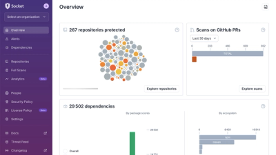
Product
We redesigned Socket's first logged-in page to display rich and insightful visualizations about your repositories protected against supply chain threats.