Research
/Security News
DuckDB npm Account Compromised in Continuing Supply Chain Attack
Ongoing npm supply chain attack spreads to DuckDB: multiple packages compromised with the same wallet-drainer malware.

The sdk-tabs component is an easy way to organize and display infomation in your application which minimizes cognitive overload on the user.
| Version | Compatibility |
|---|---|
| 16 | EOL 2025 |
| 17 | EOL 2025 |
| 18 | ✔ |
| 19 | ✔ |
| 20 | Q3 2025 |
NOTE: This package leverages the sdk-core-library for core configurations (i.e., colors, icons, etc.).
Using NPM:
npm install --save sdk-tabs
To configure the sdk-tabs for your application, add the following lines to your app.module.ts file:
import { SDKTabsModule } from 'sdk-tabs';

@NgModule({
    imports: [
        SDKTabsModule
    ]
})
export class AppModule { }
// Required properties.
tabs: SDKTab[] = []; // List of tabs. See properties list below.

// Optional properties.
activeTab: SDKTab | undefined; // Set the current active tab. This is used to load a tab from a share.
fontFamily: string = ""; // Font to use for the tab titles.
fontColor: string = ""; // Color to use for the tab titles.
tabColor: string = ""; // Color of the tabs.
tabBorderColor: string = ""; // Border color of the tabs.
activeTabColor: string = ""; // Active tab color.
activeFontColor: string = ""; // Active tab font color.
height: string = ""; // Height of tabs. Default is auto.
share: boolean = false; // Enable share icon.
tabChangedEvent: EventEmitter<{ from: any, to: any }> = new EventEmitter(); // Callback when active tab changes.

SDKTab {
    title: string; // Name on the tab.
    type?: Type<any>; // The component to display when the tab is selected.
    inputs?: any; // Input properties for the component displayed.
    outputs?: any // Output properties for the component displayed.
    urlParams?: string // Parameters to be used when sharing the tab.
}
<!-- Simple (out-of-the-box) -->
<sdk-tabs [tabs]="tabs"></sdk-tabs>

<!-- Advanced -->
<sdk-tabs
    [share]=true
    fontFamily="Courier New"
    fontColor="white"
    tabColor="green"
    tabBorderColor="black"
    activeFontColor="green"
    activeTabColor="white"
    height="100px"
    [tabs]="tabs">
</sdk-tabs>
import { SDKTab } from 'sdk-tabs';

public tabs: SDKTab[] = [
    {
        title: "Introduction",
        type: <any>IntrodutionTabComponent,
        inputs: {
            "title": "Introducing TABS! The easiest way to organize your layout."
        },
        outputs: {}
    },
    {
        title: "The Basics",
        type: <any>TheBasicsTabComponent,
        inputs: {
            "title": "The Basics - A simple out-of-the-box design."
        },
        outputs: {},
        urlParams: "abc=123" // Set tab's url parameters explicitly
    },
    (() => {
        let tab: SDKTab = {
            title: "Advanced",
            type: <any>AdvancedTabComponent,
            inputs: {
                "title": "Advanced Options and Setup."
            },
            outputs: {},
            urlParams: ""
        };

        // Create a callback method to handle dynamic params.
        tab.outputs = {
            setUrlParamsEvent: (params: any) => {
                this.setUrlParams(tab, params);
            }
        };

        return tab;
    })()
];

public setUrlParams(tab: SDKTab, params: string) {
    let tmp: SDKTab[] = [...this.tabs];
    let ndx = tmp.findIndex((t: SDKTab)=> t.title === tab.title);

    if (ndx > -1) {
        tmp[ndx].urlParams = params;
    }

    this.tabs = [...tmp];
}
NOTE: setUrlParamsEvent is called from inside your AdvancedTabComponent passing back the parameters to be used when sharing the tab's url.
Example:
import { Component, EventEmitter, Output } from '@angular/core';

@Component({
    selector: 'advanced-tab',
    templateUrl: './advanced-tab.component.html',
    styleUrls: ['./advanced-tab.component.scss']
})

export class AdvancedTabComponent {
    @Output() setUrlParamsEvent: EventEmitter<string> = new EventEmitter();

    protected ngAfterViewInit() {
        this.setUrlParamsEvent.emit("abc=123&xyz=789");
    }
}
FAQs
Simple to use (Angular) component for organizing your content and UI layout.
We found that sdk-tabs demonstrated a healthy version release cadence and project activity because the last version was released less than a year ago. It has 1 open source maintainer collaborating on the project.
Did you know?

Socket for GitHub automatically highlights issues in each pull request and monitors the health of all your open source dependencies. Discover the contents of your packages and block harmful activity before you install or update your dependencies.

Research
/Security News
Ongoing npm supply chain attack spreads to DuckDB: multiple packages compromised with the same wallet-drainer malware.

Security News
The MCP Steering Committee has launched the official MCP Registry in preview, a central hub for discovering and publishing MCP servers.

Product
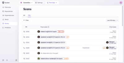
Socket’s new Pull Request Stories give security teams clear visibility into dependency risks and outcomes across scanned pull requests.