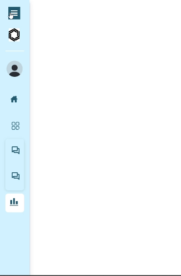
React Sidebar
Table of contents
Installation
Checkout the below video for refrence.
https://github.com/Roxiler/sidebar-ui-react/assets/97351159/2fffcbc8-0e09-40fb-ac8c-ffdf76c89acb


  import {Sidebar} from "react-sidebar"

  const menus = [
  {
    title: 'Home',
    icon: <Home/>,
    path: '/home',
  },
  {
    title: 'Chats',
    icon: <Chats/>,
    path: '/chats',
    subMenu: [
      {
        value: 'Chat 1',
        subPath: '/chats/chat1',
      },
      {
        value: 'Chat 2',
        subPath: '/chats/chat2',
      },
    ],
  },
  {
    title: 'Analytics',
    icon: <Analytics/>,
    path: '/analytics',
  },
];


 export default function App() {
    return (
      <div>
        <Sidebar menus={menus}/>
      </div>
    );
  }
For theme, dark and light ,profile data with header image :
<Sidebar
menus={menus}
avatar={profilelogo}
headerImage='https://encrypted-tbn0.gstatic.com/images?q=tbn:ANd9GcRmg6VbQr7k4bE8m1sGjODK19nEZn-UKVChBg&usqp=CA'
heading='Sidebar'
theme='light'
email='jhondoe@gmail.com' name='Jhon Doe'collapse={toggle} dividerColor='white'
/>
Usage of burger Icon and Close Icon :
<div className="sidebarContainer">

      <div className={toggle === true ? 'hideToggleicon' : 'showToggleicon'}><div onClick={() => setToggle(!toggle)}><Hamburger /></div></div>

      <Sidebar
      menus={menus}
      avatar={profilelogo}
      headerImage='https://encrypted-tbn0.gstatic.com/images?q=tbn:ANd9GcRmg6VbQr7k4bE8m1sGjODK19nEZn-UKVChBg&usqp=CA'
      heading='Sidebar'
      theme='light' email='jhondoe@gmail.com' name='Jhon Doe'collapse={toggle} dividerColor='white'
       />

      <div className={toggle === true ? 'righthamburger' : 'lefthamburger'}>
        <div className={toggle === true ? 'burgerContainer' : 'burgerContainer active'} onClick={handleToggle}>
          <BurgerIcon hideToggleIcon={false} />
        </div>
      </div>


</div>
props
| headerImage | string | header image url on the top |
| heading | string | heading of the app or website on top |
| avatar | string | user avatar/image |
| name | string | name/username of user |
| email | string | email of user |
| menus | [object] | pass the pops and menus for adding the menus and submenus respectively |
| collapse | boolean | sets if you want to collapse the sidebar or not |
| fontColor | string | to change the whole font color as per the user's choice |
| backgroundColor | string | to change the background color of sidebar |
| hoverContainerBackground | string | choose the hover container of sidebar |
| theme | string | choose from dark or light theme |
| hideToggleIcon | boolean | to hide and unhide the toggle icon |
| dividerColor | string | color of the divider between header and profile contents |