Product
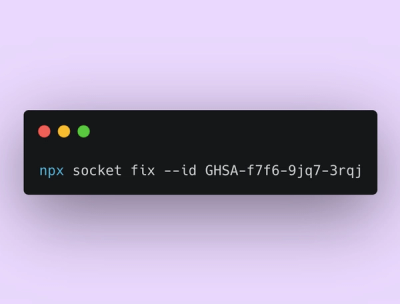
Announcing Socket Fix 2.0
Socket Fix 2.0 brings targeted CVE remediation, smarter upgrade planning, and broader ecosystem support to help developers get to zero alerts.
storybook-addon-grid
Advanced tools
npm install storybook-addon-grid keeps your stories in rhythm
This is free to use software, but if you do like it, consider supporting me ❤️

npm install storybook-addon-grid
// .storybook/main.js
const config = {
  addons: ['storybook-addon-grid'],
};
Chromatic users
Include this additional preset to configure the column guides for your Chromatic screenshots.
// .storybook/main.js
const config = {
  addons: ['storybook-addon-grid', 'storybook-addon-grid/chromatic'],
};
The column guides are controlled with parameters and as such you can define this globally or per story.
The column guides can be turned on either via clicking the toolbar button, or via a keyboard shortcut Ctrl + G.
Note: Due to the nature of
z-index, the rootdivof the stories will have aposition: relativeandz-index: 0applied to it, allowing the column guides to sit over the top.
Column design system is defined by 3 values:
columnsgap between themgutter — minimal margin between the system and the screenmaximal-width for the system to limit maximum width of all columns as well.columns?: number = 12The number of columns guides.
gap?: string = '20px'The gap between columns.
gutter?: string = '50px'System's gutter (margin) for both left and right.
Define to override the gutter defined on the right-hand-side.
maxWidth?: string = '1024px'The maximum width our columns should grow.
color?: string = 'rgba(255, 0, 0, 0.1)'Sets the color used for the column guides.
// .storybook/preview.js
export const parameters = {
  grid: {
    gridOn: true,
    columns: 12,
    gap: '20px',
    gutter: '50px',
    maxWidth: '1024px',
  },
};
// MyComponent.stories.js
export const Example = () => {...};
Example.parameters = {
	grid: {
		columns: 6,
	},
};
The way storybook-addon-grid solves responsive properties is leaving this up to you. We don't you to build
abstractions and implementations for this addon, we want to reuse existing patterns you may already be using.
In fact all properties map through to css, so any css variable you expose is consumable.
eg:
// file: my-styles.css
@media (min-width: 768px) {
  :root {
    --columns: 8;
    --gap: 12px;
    --gutter: 24px;
  }
}
Story.parameters = {
  grid: {
    // a custom variable names for the number of columns
    columns: 'var(--columns)',
    // or the gutter
    gutter: 'var(--gutter)',
    // or the gap
    gap: 'var(--gap)',
  },
};
You can see this in action over at our example story ResponsiveGrid.
Special thanks to Marina for the initial implementation and design.
MIT © Marais Rossouw
FAQs
Column guides for your stories
We found that storybook-addon-grid demonstrated a healthy version release cadence and project activity because the last version was released less than a year ago. It has 1 open source maintainer collaborating on the project.
Did you know?

Socket for GitHub automatically highlights issues in each pull request and monitors the health of all your open source dependencies. Discover the contents of your packages and block harmful activity before you install or update your dependencies.

Product
Socket Fix 2.0 brings targeted CVE remediation, smarter upgrade planning, and broader ecosystem support to help developers get to zero alerts.

Security News
Socket CEO Feross Aboukhadijeh joins Risky Business Weekly to unpack recent npm phishing attacks, their limited impact, and the risks if attackers get smarter.

Product
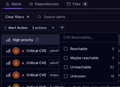
Socket’s new Tier 1 Reachability filters out up to 80% of irrelevant CVEs, so security teams can focus on the vulnerabilities that matter.