Strapi Plugin - Rich Text (Blocks - Extended)
An extended version of the JSON based native Strapi field "Rich Text (Blocks)" that provides enhanced customization options and features.
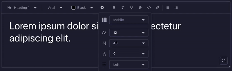
Preview
🚀 Features
- 📝 All native Rich Text Blocks features
- 🎨 Customizable font families with presets
- 🌈 Custom color palettes
- 📱 Configurable viewport options
- 📏 Custom font sizes
- ↕️ Adjustable line heights
- ↔️ Letter spacing control
- ⬅️ Text alignment options
- 🔠 Text formatting options including uppercase transform
- ✨ On-the-fly custom values for font size, line height, and letter spacing
- 🔄 Expandable editor interface
- ➖ Separator blocks with customizable styling
- 📐 Viewport-specific image dimensions with aspect ratio locking
🖼️ Image Block Support
The image block is now fully functional! Thanks to the integration with strapi-plugin-media-extended, you can:
- Select single or multiple images from the media library
- Upload new images directly from the editor
- Organize images in folders
- Full media library functionality within the rich text editor
- Viewport-specific image dimensions: Set custom width and height for each breakpoint
- Aspect ratio locking: Maintain proportional dimensions when resizing images
Image Settings
The image block includes advanced viewport-specific settings:
Viewport-specific settings (configurable per device breakpoint):
- Image Width: Set custom width for images at different viewports
- Image Height: Set custom height for images at different viewports
- Aspect Ratio Lock: Toggle to maintain proportional dimensions when adjusting width or height
- When locked, changing width automatically adjusts height proportionally (and vice versa)
- Uses the image's intrinsic dimensions to calculate the aspect ratio
- Default state is locked to preserve image proportions
Default behavior:
- Mobile viewport automatically uses the image's intrinsic dimensions as defaults
- Other viewports start with no explicit dimensions (allowing responsive behavior)
- Aspect ratio is locked by default to prevent image distortion
Note: The strapi-plugin-media-extended plugin is required for image block functionality.
⚙️ Installation
npm install strapi-plugin-rich-text-blocks-extended strapi-plugin-media-extended
yarn add strapi-plugin-rich-text-blocks-extended strapi-plugin-media-extended
Note: The strapi-plugin-media-extended package is required for image block functionality.
🔧 Configuration
Basic Settings
disableDefaultFonts | boolean | false | Enable to use custom font presets |
customFontsPresets | string | - | Custom font families (format: "Label:value") |
disableDefaultColors | boolean | false | Enable to use custom color presets |
customColorsPresets | string | - | Custom colors (format: "Label:#HEX") |
Example font presets:
Arial:arial
Open Sans:open-sans
Times New Roman:times-new-roman
Georgia:georgia
Example color presets:
Black:#000000
White:#FFFFFF
Gray:#808080
Light Gray:#D3D3D3
Dark Gray:#A9A9A9
Advanced Settings
disableDefaultViewports | boolean | false | Enable to use custom viewport presets |
customViewportsPresets | string | - | Custom viewports (format: "Label:value") |
disableDefaultSizes | boolean | false | Enable to use custom font sizes |
customSizesPresets | string | - | Custom font sizes (one per line) |
disableDefaultLineHeights | boolean | false | Enable to use custom line heights |
customLineHeightsPresets | string | - | Custom line heights (one per line) |
disableDefaultTracking | boolean | false | Enable to use custom letter spacing |
customTrackingPresets | string | - | Custom letter spacing values (one per line) |
disableDefaultAlignments | boolean | false | Enable to use custom alignments |
customAlignmentsPresets | string | - | Custom alignments (format: "Label:value") |
Example viewport presets:
Mobile:mobile
Tablet:tablet
Desktop:desktop
Example size presets:
6
8
9
10
11
12
14
16
18
24
30
48
Example alignment presets:
Left:left
Center:center
Right:right
Justify:justify
🎯 Usage
- After installation, the plugin will be available as a custom field type in your Content-Types Builder.
- Add a new field and select "Rich Text Blocks (Extended)" as the field type.
- Configure the field options according to your needs using the settings above.
🔡 Text Formatting
The editor supports various text formatting options:
- Uppercase: Transform selected text to uppercase using the AA button in the toolbar
- Superscript: Apply using the sup button in the toolbar
- Subscript: Apply using the sub button in the toolbar
- Bold: Apply using the B button in the toolbar or Ctrl/Cmd+B
- Italic: Apply using the I button in the toolbar or Ctrl/Cmd+I
- Underline: Apply using the U button in the toolbar or Ctrl/Cmd+U
- Strikethrough: Apply using the S button in the toolbar or Ctrl/Cmd+Shift+S
- Inline code: Apply using the Code button in the toolbar or Ctrl/Cmd+E
These formatting options can be applied to any text within paragraphs, headings, lists, and quotes.
📝 Block Types
The plugin supports various block types including:
- Paragraphs
- Headings (H1-H6)
- Lists
- Links
- Images (with full media library support)
- Quotes
- Code blocks
- Separators
🎯 Separator Block
The separator block allows you to add visual dividers between content sections with the following customizable options:
Non-viewport specific settings:
- Style: Choose from solid, dashed, dotted, or double line styles
- Color: Select from the available color palette
Viewport-specific settings (configurable per device breakpoint):
- Size: Control the thickness of the separator (0-100)
- Length: Set the width percentage of the separator (0-100%)
- Orientation: Choose between horizontal or vertical orientation
These viewport-specific settings allow you to create responsive separators that adapt to different screen sizes.
🤝 Contributing
Feel free to contribute to this plugin by:
- Creating issues for bugs or feature requests
- Submitting pull requests for improvements
- Providing feedback and suggestions
📄 License
MIT License - Copyright (c) Jorge Pizzati


