Product
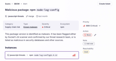
Introducing the Alert Details Page: A Better Way to Explore Alerts
Socket's new Alert Details page is designed to surface more context, with a clearer layout, reachability dependency chains, and structured review.
Style tools for component-based UI development.
SUIT CSS provides a reliable and testable styling solution for component-based web application development. The project includes:
Each of these modules are made up of smaller modules, making it easy to customize your setup and build pipeline.
Install the SUIT package and preprocessor with npm:
npm install suitcss --save
npm install suitcss-preprocessor --save-dev
Create an index.css that will import the SUIT packages. Add values for the
custom media queries and any custom properties that you wish to override:
@import "suitcss";

@custom-media --sm-viewport (min-width: 320px) and (max-width: 640px);
@custom-media --md-viewport (min-width: 640px) and (max-width: 960px);
@custom-media --lg-viewport (min-width: 960px);

:root {
  --Grid-gutter-size: 25px;
}
Packages can also be installed independently for a more modular build:
npm install suitcss-utils-size suitcss-components-grid --save
@import "suitcss-components-grid";
@import "suitcss-utils-size";
Add an entry to the scripts object in package.json that will run the
preprocessor:
"scripts": {
  "build": "suitcss index.css build/build.css"
}
Now run npm run build on the command line to output the built packages to
build/build.css. The preprocessor can also watch for file changes by passing
the -w flag e.g. npm run build -- -w.
Refer to the SUIT theme for a more thorough example.
SUIT CSS makes use of variables, custom media queries, and dependency resolution for CSS.
HTML:
<article class="Excerpt u-cf">
  <img class="Excerpt-thumbnail u-sizeFit" src="{{src}}" alt="">
  <div class="u-sizeFill">
    <h1 class="Excerpt-title"><a href="{{url}}">{{title}}</a></h1>
    <p class="Excerpt-text u-textBreak">{{description}}</p>
    <span class="Excerpt-readMore">
      <!-- BUTTON COMPONENT -->
    </span>
  </div>
</article>
CSS:
/** @define Excerpt */

@import "suitcss-utils-layout";
@import "suitcss-utils-size";
@import "suitcss-utils-text";
@import "./Button";

/**
 * Content excerpts. Agnostic of image size, and with a clear call to action.
 */

:root {
  --Excerpt-padding: 20px;
  --Excerpt-highlight-color: orange;
}

.Excerpt {
  padding: var(--Excerpt-padding);
}

.Excerpt-thumbnail {
  border: 2px solid var(--Excerpt-highlight-color);
  border-radius: 3px;
  margin-right: 10px;
}

.Excerpt-title {
  border-bottom: 1px solid #ccc;
  margin: 0 0 15px;
  padding-bottom: 5px;
}

.Excerpt-readMore {
  display: inline-block;
  margin-top: 10px;
}
Each CSS package can be installed with npm. It's suggested that you depend on individual packages as and when you need them, however, you can install all the CSS packages at once if you prefer:
npm install suitcssEach package is stand-alone, contains its own documentation and tests, and is written to follow a common set of naming conventions.
You can also download pre-built bundles to try things out without setting up a build process:
The suitcss-preprocessor runs CSS through a build pipeline. It performs per-file tests for conformance to the SUIT CSS naming conventions, offers minification and allows additional PostCSS plugins to be added. A CLI and Node API are available
The preprocessor makes use of:
Packages are linted with postcss-bem-linter and minification is provided by cssnano.
Libraries / frameworks for component-based development:
Tools and dependency managers:
Install Node (comes with npm).
To generate a build:
npm run build
flex)flex)flex)FAQs
CSS base styles, utilities, and structural components for web apps
We found that suitcss demonstrated a not healthy version release cadence and project activity because the last version was released a year ago. It has 4 open source maintainers collaborating on the project.
Did you know?

Socket for GitHub automatically highlights issues in each pull request and monitors the health of all your open source dependencies. Discover the contents of your packages and block harmful activity before you install or update your dependencies.

Product
Socket's new Alert Details page is designed to surface more context, with a clearer layout, reachability dependency chains, and structured review.

Product
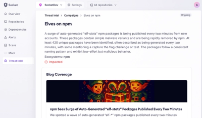
Campaign-level threat intelligence in Socket now shows when active supply chain attacks affect your repositories and packages.

Research
Malicious PyPI package sympy-dev targets SymPy users, a Python symbolic math library with 85 million monthly downloads.