Svelte Cartesian
A single component that helps render prop combinations (the "Cartesian
Product") for visual regression testing.
Why
When building reusable components, testing them helps build confidence that
they'll work as expected in one or many consuming applications, and helps ensure
they remain stable as features are added. This includes, but is not limited to:
- Type checking
- Unit tests
- Integration tests
- Visual regression tests
- End to end tests
At various stages of a UI library's maturity, different levels of test coverage
become more necessary as the library matures.
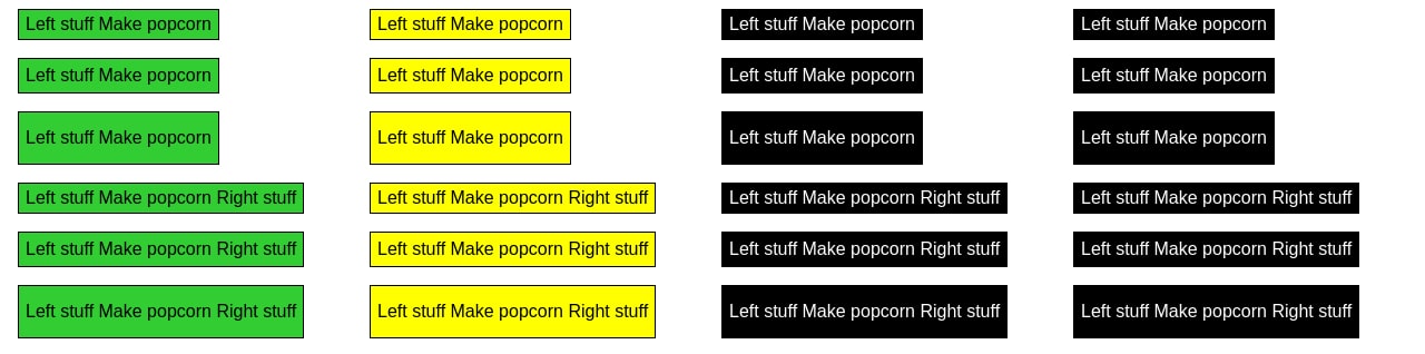
svelte-cartesian helps with point 4: Visual regression tests. Today, rendering
many combinations of a component requires nested {#each} loops and some style
boilerplate. svelte-cartesian solves this in one component that accepts prop
values you wish to test, and then renders prop combinations.
Before and after using svelte-cartesian
Before using svelte-cartesian
<script>
import { Button } from './Button.svelte'
</script>
{#each ['primary', 'secondary'] as variant}
{#each ['small', 'medium', 'large'] as size}
{#each ['main', 'common', 'ghost'] as prominence}
<Button {size} {variant} {prominence}>
Dispense popcorn
</Button>
{/each}
{/each}
{/each}
After using svelte-cartesian
<script>
  import { Cartesian } from 'svelte-cartesian'
  import { Button } from './Button.svelte'
</script>

<Cartesian
  Component={Button}
  props={{
    variant: ['primary', 'secondary'],
    size: ['small', 'medium', 'large'],
    prominence: ['main', 'common', 'ghost']
  }}
>
  Dispense popcorn
</Cartesian>
Svelte 4 usage
-
Install package
npm install -D svelte-cartesian
-
Add component to your page.
<script>
  import { Cartesian } from 'svelte-cartesian'
</script>
-
Pass props with array of potential values, including an explicit undefined
where applicable.
Basic usage (Svelte 4)
- Pass a component to the
Component prop.
- Pass an object to
props containing possible prop keys for your passed-in
component, with each prop key containing an array of potential values.
<script>
  import Button from './Button.svelte'
  import { Cartesian } from 'svelte-cartesian'
</script>

<Cartesian
  Component={Button}
  props={{
    variant: ['primary', 'secondary'],
    size: ['medium', 'large']
  }}
>
  Click me
</Cartesian>
Usage with slots (Svelte 4)
- Pass your component into the default slot.
- Spread the
innerProps slot prop to your component, which will render a
single prop combination at every iteration.
- This is used to manually define named slot combinations for your provided
component.
<script>
import Button from './Button.svelte'
import { Cartesian } from 'svelte-cartesian'
const props = {
Component: Button,
props: {
variant: ['primary', 'secondary'],
size: ['medium', 'large']
}
}
</script>
<Cartesian {...props} let:innerProps>
<Button {...innerProps}>
<svelte:fragment slot="left">
Left contents
</svelte:fragment>
Click me
</Button>
</Cartesian>
<Cartesian {...props} let:innerProps>
<Button {...innerProps}>
Click me
</Button>
</Cartesian>
Adding labels (Svelte 4)
Use the labels prop to generate labels next to every component instance.
<Cartesian
props={props}
Component={Component}
labels />
Allowed values for the labels prop:
true: same as 'short'.'short': display comma-separated values, skip objects.'long': display line-separated key-value pairs, represent object values as their type name.'long-with-objects': same as 'long', but with full object definitions.
Default labelling behaviour can be overridden with the label slot.
<Cartesian
props={props}
Component={Component}
labels
>
<div class="label-container" slot="label" let:label>
<span class="label">Props</span>
<pre class="props">{label}</pre>
</div>
</Cartesian>
<Cartesian
props={props}
Component={Component}
>
<div class="label-container" slot="label" let:innerProps>
<span class="label">Props</span>
<pre class="props">{customLabel(innerProps)}</pre>
</div>
</Cartesian>
Styling <Cartesian> (Svelte 4)
<Cartesian> has these default CSS behaviours:
- Use CSS Grid with a
gap of 1rem.
padding is set to 0.5rem 1rem to allow consistent space when multiple
<Cartesian> components are rendered one after the other.grid-template-columns is set to var(--columns, repeat(2, 1fr)) for a
default 2-column grid overridable with the --columns CSS variable.
There are a few ways to override its styles:
- Via the
--columns CSS variable; you may use Svelte --style-props or
style="--columns: repeat(3, 1fr)" to set a new value.
- Use the
style attribute that overrides the default style via
divAttributes. The same technique can be applied to your own passed-in
components so long as it accepts style via $$restProps or pass-through props.
- Pass in global class names to the
class attribute that gets passed in via divAttributes.
- Wrap
<Cartesian> with your own element and styles, and set the unstyled
prop to true.
<script>
import { Cartesian } from 'svelte-cartesian'
import Button from './Button.svelte'
</script>
<Cartesian
Component={Button}
props={{
size: ['small', 'medium'],
variant: ['primary', 'secondary']
}}
--columns="repeat(4, 1fr)"
style="background-color: green"
>
</Cartesian>
<Cartesian> props (Svelte 4)
Component | ComponentType | Required: A Svelte component. |
props | Record<string, any[]> | Required: An object containing prop names and an array of potential values. |
asChild | ?boolean=false | Renders the default slot's contents. Each Cartesian's iteration will pass innerProps as slot props. Default value false. See usage with slots for more details. |
labels | ?(undefined | boolean | 'short' | 'long' | 'long-with-objects')=undefined | Generate labels under every iteration. See adding labels for detailed usage. |
unstyled | ?boolean=false | Disable built-in CSS. |
divAttributes | ?SvelteHTMLElements["div"]={} | Attributes to be spread onto the wrapping <div> element. |
let:innerProps | Record<string, any> | Provides a single combination of props at every iteration to the default slot. Use this alongside asChild to spread innerProps to your nested component. |
let:label | string | Generated label for a given instance. This is provided to the label slot. See adding labels for more details. |
<Cartesian> slots (Svelte 4)
| default | let:innerProps | Default slot. Contents get passed to provided Component. When asChild is set to true, contents MAY contain provided Component and its respective slots; see usage with slots for more details. |
label | let:label, let:innerProps | Provide your own label, styles, and logic instead of the default provided label. |
Examples (Svelte 4)
See more examples in end to end tests.
Svelte 5 usage (experimental)
[!WARNING]
This component is based on the release candidate of Svelte 5 and is considered
unstable. Any breaking changes will not be properly indicated in
svelte-cartesian releases at this time, but there are no planned changes.
-
Install package
npm install -D svelte-cartesian
-
Add component to your page.
<script>
  import Button from './Button.svelte'
  import { CartesianWithRunes as Cartesian } from 'svelte-cartesian'
</script>

{#snippet children()}
  Click me
{/snippet}

<Cartesian
  Component={Button}
  props={{
    variant: ['primary', 'secondary'],
    size: ['medium', 'large'],
    children: [children]
  }}
/>
-
Pass props with array of potential values, including an explicit undefined
where applicable. Ensure snippets are passed in as props and defined within
the markup of the page using <CartesianWithRunes>.
Styling <CartesianWithRunes> (Svelte 5)
Styling <CartesianWithRunes> is done in the exact same way as with <Cartesian>.
<CartesianWithRunes> props (Svelte 5)
Component | ComponentType | Required: A Svelte component. |
props | Record<string, any[]> | Required: An object containing prop names and an array of potential values. |
unstyled | ?boolean=false | Disable built-in CSS. |
divAttributes | ?SvelteHTMLElements["div"]={} | Attributes to be spread onto the wrapping <div> element. |
Project roadmap
Goals
- Add deeper styling flexibility.
- Improve types.
Non-goals
Credits


