Svelte Heros v2
If you are looking for the version 1, go to Svelte-Heros
Hero Icons v2 uses Heroicon v2 to create Svelte SVG icons. You can select outline and solid icons using the variation props. Svlete-Heros support major CSS framework. You can add additional CSS using the class props.
Thank you for considering my open-source package. If you use it in a commercial project, please support me by sponsoring me on GitHub: https://github.com/sponsors/shinokada. Your support helps me maintain and improve this package for the benefit of the community.
Repo
GitHub Repo
Original source
tailwindlabs/heroicons
License
Svelte-Heros-V2 License
tailwindlabs/heroicons LICENSE
Installation
pnpm i -D svelte-heros-v2
Usage
<script>
  import { AcademicCap } from 'svelte-heros-v2';
</script>

<AcademicCap />
Faster compiling
If you need only a few icons from this library in your Svelte app, import them directly. This can optimize compilation speed and improve performance by reducing the amount of code processed during compilation.
<script>
  import AcademicCap from 'svelte-heros-v2/AcademicCap.svelte';
</script>

<AcademicCap />
If you are a TypeScript user, install typescript version 5.0.0 or above.
pnpm i -D typescript@latest
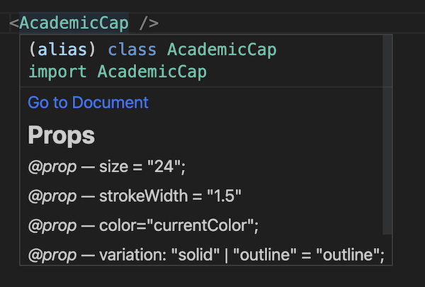
Props
- size: string = ctx.size || '24';
- role: string = ctx.role || 'img';
- color: string = ctx.color || 'currentColor';
- variation: 'solid' | 'outline' | 'mini' = ctx.variation || 'outline';
- viewBox: string = ctx.viewBox || '0 0 24 24';
- strokeWidth: string = ctx.strokeWidth || '1.5';
- ariaLabel = 'file name';
IDE support
If you are using an LSP-compatible editor, such as VSCode, Atom, Sublime Text, or Neovim, hovering over a component name will display a documentation link, features, props, events, and an example.
Variation
The default variation value is outline. Use the variation prop to change it to solid or mini.
<AcademicCap variation="solid" /> <AcademicCap variation="mini" />
Size
Use the size prop to change the size of icons.
<AcademicCap size="30" />
<AcademicCap size="40" />
<AcademicCap size="50" />
If you are using Tailwind CSS, you can add a custom size using Tailwind CSS by including the desired classes in the class prop. For example:
<AcademicCap class="shrink-0 h-20 w-20" />
Setting Global Icon using setContext
You can establish global icon preferences in your Svelte application using setContext. This allows you to configure icon-related properties once and share them across multiple components. Here's how you can do it:
<script>
import { setContext } from 'svelte';
const iconCtx = {
strokeWidth: '2',
size: '100',
color: '#ff4488',
role: 'svg icon image'
};
setContext('iconCtx', iconCtx);
</script>
The size, color, role, and other properties are optional, allowing you to fine-tune the appearance and accessibility of your icons as needed.
If you set size, icons can be customized with different colors. For example:
<script>
  import { setContext } from 'svelte';
  import { AcademicCap } from 'svelte-heros-v2';
  const iconCtx = {
    size: '50'
  };
  setContext('iconCtx', iconCtx);
</script>

<AcademicCap color="#ff4488" />
Remember that you can set only one or two of these properties, allowing you to tailor icon settings to your specific design and accessibility requirements.
Feel free to mix and match these properties as needed to create visually appealing and accessible icons in your Svelte application.
Creating a Default Icon Setting
You can create a config file, /src/lib/icon.config.json.
The Icon component serves as a wrapper for svelte:component, allowing you to establish a global default setting or expand the capabilities of a component.
To create a default global icon setting, follow these steps:
Configuration File
Start by creating a configuration file named /src/lib/icon.config.json with the following structure:
{
  "config1": {
    "size": 40,
    "color": "#FF5733"
  },
  "config2": {
    "size": 50,
    "color": "#445533"
  }
}
In this JSON file, you can define different configurations (config1 and config2 in this case) for your icons, specifying attributes like size, variation, and color.
Implementation
In your Svelte page file, make use of the configurations from the JSON file:
<script lang="ts">
  type IconConfig = {
    config1: {
      size: number;
      color: string;
    };
    config2: {
      size: number;
      color: string;
    };
  };
  import config from '$lib/icon.config.json';
  import { Icon, AcademicCap, ShoppingBag } from 'svelte-heros-v2';

  const iconConfig: IconConfig = config;
  const config1 = iconConfig.config1;
  const config2 = iconConfig.config2;
</script>

<Icon {...config1} icon="{AcademicCap}" />
<Icon {...config2} icon="{ShoppingBag}" />
We import the configurations from the JSON file and assign them to config1 and config2. We then utilize the Icon component with the spread attributes to apply the respective configurations to each icon.
Custom Default Icon
If you wish to create a custom default icon, you can follow these steps:
Create a Svelte component named src/lib/MyIcon.svelte:
<script lang="ts">
  import type { ComponentType } from 'svelte';
  const config = {
    size: 30,
    color: '#FF5733'
  };
  import { Icon } from 'svelte-heros-v2';
  export let icon: ComponentType;
</script>

<Icon {...config} {icon} />
This component, MyIcon.svelte, accepts an icon prop which you can use to pass in the specific icon component you want to display. The default configuration is also applied to the icon.
Implementation in a Page
To use your custom default icon in a Svelte page, do the following:
<script>
  import MyIcon from '$lib/MyIcon.svelte';
  import { AcademicCap } from 'svelte-heros-v2';
</script>

<MyIcon icon="{AcademicCap}" />
Here, we import the MyIcon component and the AcademicCap icon. By passing the AcademicCap icon to the icon prop of MyIcon, you apply the default configuration to the icon.
CSS HEX Colors
Use the color prop to change colors with HEX color code.
<AcademicCap color="#ff0000" /> <AcademicCap color="#00ffd8" />
Stroke width
Use the strokeWidth prop to change the SVG stroke-width.
<AcademicCap strokeWidth="4" size="100" />
CSS framework support
Use the class prop to change colors and additional CSS.
For example, Tailwind CSS:
<AcademicCap class="text-pink-700 mr-4" />
If you use the dark mode on your website with Tailwind CSS, add your dark mode class to the class prop.
Let's use dark for the dark mode class as an example.
<AcademicCap class="text-pink-700 dark:text-blue-300" />
Bootstrap example:
<AcademicCap class="position-absolute top-0 px-1" />
aria-label
All icons have aria-label. For example AcademicCap has aria-label="academic cap".
Use ariaLabel prop to modify the aria-label value.
<AcademicCap ariaLabel="red academic cap" class="text-red-500" />
Unfocusable icon
If you want to make an icon unfocusable, add tabindex="-1".
<AcademicCap tabindex="-1" />
Events
All icons have the following events:
- on:click
- on:keydown
- on:keyup
- on:focus
- on:blur
- on:mouseenter
- on:mouseleave
- on:mouseover
- on:mouseout
Passing down other attributes
You can pass other attibutes as well.
<AcademicCap tabindex="0" />
Using svelte:component
<script>
  import { AcademicCap } from 'svelte-heros-v2';
</script>

<svelte:component this="{AcademicCap}" size="40" />
Using onMount
<script>
  import { Cib500px } from 'svelte-coreui-icons';
  import { onMount } from 'svelte';
  const props = {
    size: '50',
    color: '#ff0000'
  };
  onMount(() => {
    const icon = new Cib500px({ target: document.body, props });
  });
</script>
Import all
Use import * as Icon from 'svelte-heros-v2'.
<script>
  import * as Icon from 'svelte-heros-v2';
</script>

<Icon.ShoppingBag size="30" class="text-red-500" />
<Icon.Sparkles size="40" class="text-blue-700" />
<Icon.Star size="50" class="text-green-700" />
<Icon.User size="60" class="text-purple-500" />
<Icon.Wifi size="100" class="text-purple-500" tabindex="0" />
Dynamically change the variation
<script>
  import { Map } from 'svelte-heros-v2';
  let isSolid = false;
</script>

<map size="50" on:click="{()" ="">
  (isSolid = !isSolid)} variation={isSolid ? 'solid' : 'outline'} /></map
>
Other icons
Svelte-Icon-Sets


