

Security News
The Hidden Blast Radius of the Axios Compromise
The Axios compromise shows how time-dependent dependency resolution makes exposure harder to detect and contain.
By Ahmad Nassri - Apr 01, 2026
tb-grid is a super simple and lightweight 12 column responsive grid system utilizing css grid.
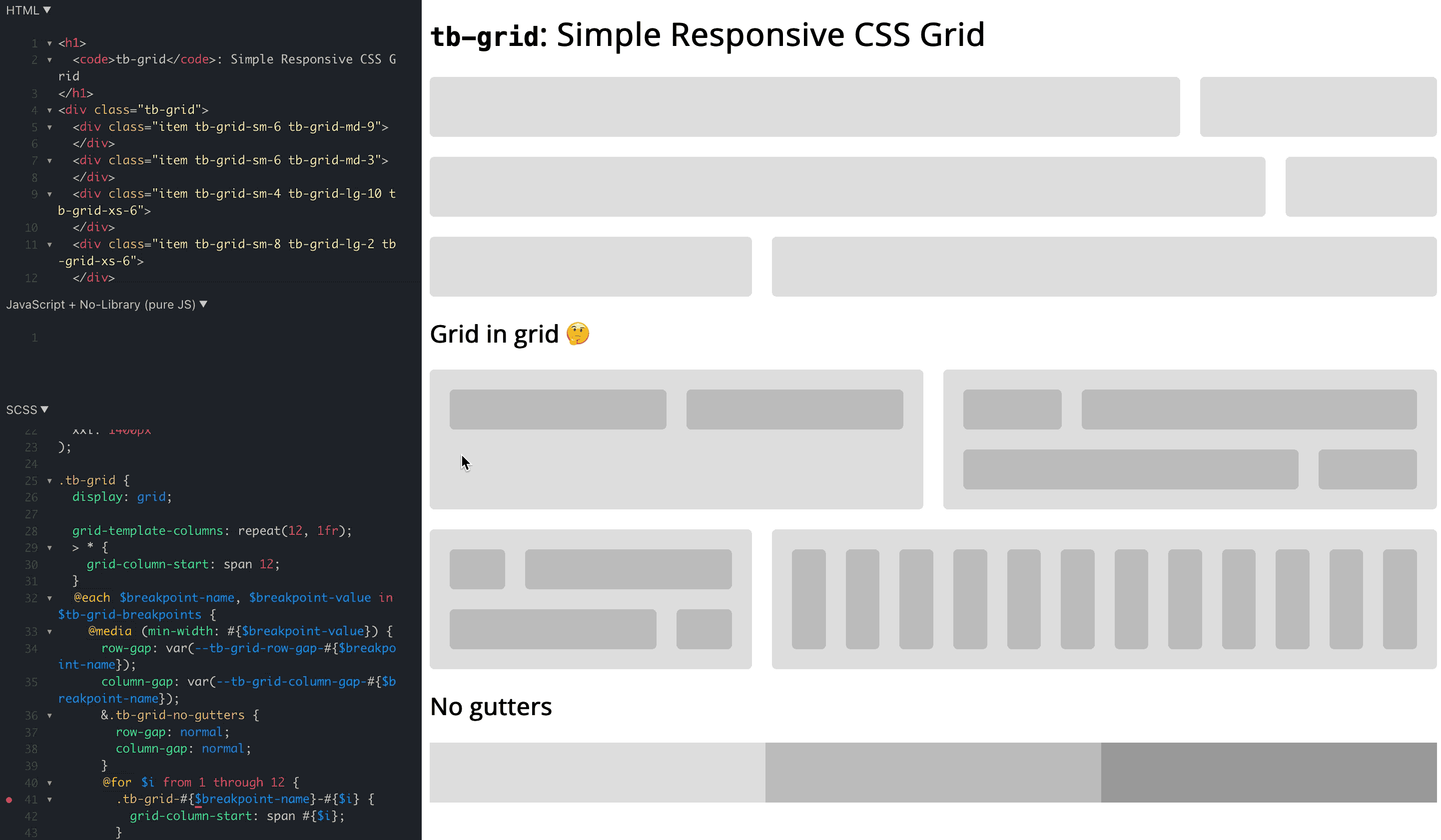
tb-grid: https://codepen.io/bersling/pen/RwKzdgV (Original: https://codepen.io/WeeHorse/pen/PQydzW)tb-grid?Bootstrap's grid system is awesome. With very little code you can add responsiveness to your html in a declarative manner. The use of 12 columns make the grid system extremely versatile since you can divide it into nice fractions (12/2, 12/3, 12/4, 12/6 - they all produce integers!).
However, there are also some thing bootstrap didn't get right.
.container and .row aren't that exotic that there would be no accidental collisions..container > .row > .col. It would be great if we could drop the .container.overflow: hidden.tb-grid addresses all those gripes with bootstrap and frankly with all other grid systems we know (foundation, skeleton, ...).
tb-grid?tb-grid is a reverse engineered bootstrap 12 column grid built with modern css. This means it's utilizing features such as css grid. Like that we can reverse enginineer bootstrap's column system in less than 100 lines of scss, which translates into roughly 300 lines of css - around 7kb!
tb-grid?There are a couple of ways how you can get tb-grid, choose what suits you best.
Copy the code from tb-grid.scss to your project.
Copy the code from tb-grid.css to your project.
npm install tb-grid and include the scss or css file from there. (node_modules/tb-grid/tb-grid.scss or node_modules/tb-grid/tb-grid.css)
You could use unkpg to get the file: <link rel="stylesheet" href="https://unpkg.com/tb-grid@0.0.1/tb-grid.css">
tb-grid?It is pretty similar to bootstrap, with the exception that it's simpler yet with better scoping and making gap control a first class citizen:
<div class="tb-grid tb-grid-gap-10">
  <div class="tb-grid-sm-6">
    Item 1
  </div>
  <div class="tb-grid-sm-6">
    Item 2
  </div>
  <div class="tb-grid-sm-4 tb-grid-lg-6">
    Item 3
  </div>
  <div class="tb-grid-sm-8 tb-grid-lg-6">
    Item 4
  </div>
</div>
No tb-grid-gap-<px> value means no gaps / gutters, since that's the only default that is not arbitrary and it's really easy to add a gap. Supported up to 50px.
tb-grid have?column-gap is a fixed value it starts to overflow when the tb-grid parent reaches the size of column_gap * 12. For example, a column_gap of 30px becomes problematic when the tb-grid parent is 360px. That's why the defaults use min(..., 8%), to squish the gutters when it gets too tight.1.0.0.tb-grid in our own codebasetb-grid! Why don't you just give it a spin and let us know what you think?FAQs
tb-grid is a super simple and lightweight 12 column responsive grid system utilizing css grid.
The npm package tb-grid receives a total of 615 weekly downloads. As such, tb-grid popularity was classified as not popular.
We found that tb-grid demonstrated a not healthy version release cadence and project activity because the last version was released a year ago. It has 1 open source maintainer collaborating on the project.
Did you know?

Socket for GitHub automatically highlights issues in each pull request and monitors the health of all your open source dependencies. Discover the contents of your packages and block harmful activity before you install or update your dependencies.
Security News
The Axios compromise shows how time-dependent dependency resolution makes exposure harder to detect and contain.

Research
A supply chain attack on Axios introduced a malicious dependency, plain-crypto-js@4.2.1, published minutes earlier and absent from the project’s GitHub releases.

Research
Malicious versions of the Telnyx Python SDK on PyPI delivered credential-stealing malware via a multi-stage supply chain attack.