tb-grid


👉 Demos
🤔 Why tb-grid?
Bootstrap's grid system is awesome. With very little code you can add responsiveness to your html in a declarative manner. The use of 12 columns make the grid system extremely versatile since you can divide it into nice fractions (12/2, 12/3, 12/4, 12/6 - they all produce integers!).
However, there are also some thing bootstrap didn't get right.
- The classes aren't scoped or namespaced. And
.container and .row aren't that exotic that there would be no accidental collisions.
- It requires too much nesting:
.container > .row > .col. It would be great if we could drop the .container.
- At 50kb minified (only the gridsystem!), it's not exactly small
- The gutters / gaps need hacking with additional padding or
overflow: hidden.
tb-grid addresses all those gripes with bootstrap and frankly with all other grid systems we know (foundation, skeleton, ...).
🤯 What is tb-grid?
tb-grid is a reverse engineered bootstrap 12 column grid built with modern css. This means it's utilizing features such as css grid. Like that we can reverse enginineer bootstrap's column system in less than 100 lines of scss, which translates into roughly 300 lines of css - around 7kb!
🚀 How can I install tb-grid?
There are a couple of ways how you can get tb-grid, choose what suits you best.
Option 1: SCSS
Copy the code from tb-grid.scss to your project.
Option 2: CSS
Copy the code from tb-grid.css to your project.
Option 3: npm
npm install tb-grid and include the scss or css file from there. (node_modules/tb-grid/tb-grid.scss or node_modules/tb-grid/tb-grid.css)
Option 4: npm CDN (unpkg)
You could use unkpg to get the file: <link rel="stylesheet" href="https://unpkg.com/tb-grid@0.0.1/tb-grid.css">
🎨 How can I use tb-grid?
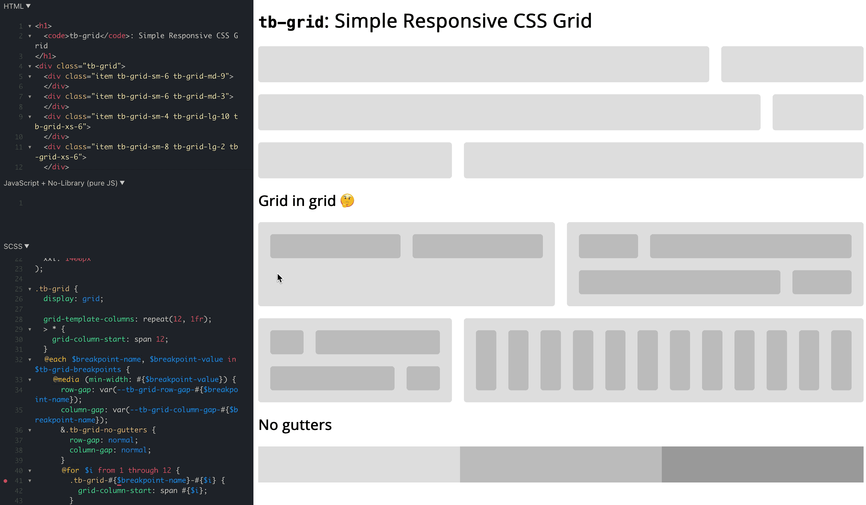
It is pretty similar to bootstrap, with the exception that it's simpler yet with better scoping and making gap control a first class citizen:
<div class="tb-grid tb-grid-gap-10">
  <div class="tb-grid-sm-6">
    Item 1
  </div>
  <div class="tb-grid-sm-6">
    Item 2
  </div>
  <div class="tb-grid-sm-4 tb-grid-lg-6">
    Item 3
  </div>
  <div class="tb-grid-sm-8 tb-grid-lg-6">
    Item 4
  </div>
</div>
No tb-grid-gap-<px> value means no gaps / gutters, since that's the only default that is not arbitrary and it's really easy to add a gap. Supported up to 50px.
✋ What limitations does tb-grid have?
- It doesn't support old browsers (IE): https://caniuse.com/?search=grid . 95% of people are using browsers that support CSS grid as of April 2021. It's up to you to decide whether this is sufficient for your project.
- If the
column-gap is a fixed value it starts to overflow when the tb-grid parent reaches the size of column_gap * 12. For example, a column_gap of 30px becomes problematic when the tb-grid parent is 360px. That's why the defaults use min(..., 8%), to squish the gutters when it gets too tight.
💯 What's the status of the project?
- The project is to be considered experimental and non-battle tested at this point
- The "API" (class names, css property names) are not to be considered stabled. Rather it is a working draft and we'd love to receive feedback on it. This is also reflected in the npm version below
1.0.0.
- Initial prototype is working well, see demo
- We are planning to replace Bootstrap with
tb-grid in our own codebase
- We would be thrilled to hear your opinions & suggestions on
tb-grid! Why don't you just give it a spin and let us know what you think?


