Product
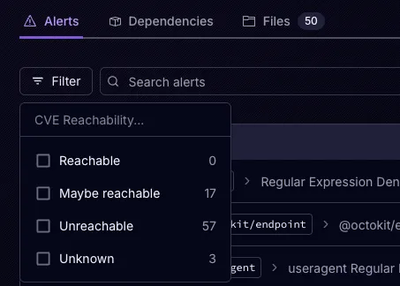
Announcing Precomputed Reachability Analysis in Socket
Socket’s precomputed reachability slashes false positives by flagging up to 80% of vulnerabilities as irrelevant, with no setup and instant results.
tbc-common-confirmation-modal
Advanced tools
Common Modal for all Trinidad Benham React apps
npm install --save tbc-common-confirmation-modal
In component where you wish modal to be activated:
import ConfirmationModalContainer from "tbc-common-confirmation-modal/dist/ConfirmationModalContainer";
<ConfirmationModalContainer {...props} />
| Prop | Type | Required | Default | Description |
|---|---|---|---|---|
| isOpen | Boolean | Required | false | flag used to determine if modal is open or not |
| title | String | Recommended | "" | modal's title |
| body | String | Optional | "" | modal's body text |
| large | Boolean | Optional | false | flag used if a large confirmation modal is desired |
| buttons | Object | Required | see below | see below |
The buttons object prop is made of three optional sub-objects: left, center, and right, each representing an available button in the modal's footer (see below).
Each buttons sub-object has the following keys:
| Key | Type | Default: left | Default: center | Default: right | Description |
|---|---|---|---|---|---|
| show | Boolean | false | false | false | flag determining if button is displayed |
| style | String | "btn-info" | "btn-warning" | "btn-primary" | CSS style applied to button |
| text | String | "Cancel" | "Delete" | "Save" | Text of button |
| icon | String | "far fa-times-circle" | "far fa-trash-alt" | "fas fa-upload" | Icon (by CSS class) within button |
| disabled | Boolean | false | false | false | flag determining if button is disabled |
| type | String | "" | "" | "" | Type of button (used in forms): "", "submit", or "reset" |
| function | Function | none | none | none | function fired when button is clicked |
  <ConfirmationModal
    isOpen={toggleState.open.includes("this-modal")}
    title="Confirmation Modal"
    body="Do you confirm?"
    large
    buttons={{
      left: {
        show: true,
        function: () => {
          toggleToggle("this-modal");
        }
      },
      center: {
        show: false // unnecessary, as this is default value
      }
      right: {
        show: true,
        style: "btn-secondary",
        text: "Do Something Blue",
        icon: "fas fa-question-circle",
        disabled: {disabledFlag},
        function: () => {
          doSomethingBlue();
        }
      }
    }}
  />
Along with the Confirmation Modal itself, this module also has access to a separate ModalFooter that can be used in any other modal. It uses the same buttons prop as above.
import ModalFooterContainer from "tbc-common-confirmation-modal/dist/ModalFooterContainer";
<ModalFooterContainer buttons={buttons} />
npm install --save bootstrap reactstrap @material-ui/core lodash
For any unit test file that deep renders ("mounts") this imported component, add the following:
jest.mock("tbc-common-confirmation-modal/dist/ConfirmationModalContainer", () => "div");
jest.mock("tbc-common-confirmation-modal/dist/ModalFooterContainer", () => "div");
FAQs
Common Modal for all Trinidad Benham React apps
The npm package tbc-common-confirmation-modal receives a total of 0 weekly downloads. As such, tbc-common-confirmation-modal popularity was classified as not popular.
We found that tbc-common-confirmation-modal demonstrated a not healthy version release cadence and project activity because the last version was released a year ago. It has 1 open source maintainer collaborating on the project.
Did you know?

Socket for GitHub automatically highlights issues in each pull request and monitors the health of all your open source dependencies. Discover the contents of your packages and block harmful activity before you install or update your dependencies.

Product
Socket’s precomputed reachability slashes false positives by flagging up to 80% of vulnerabilities as irrelevant, with no setup and instant results.

Product
Socket is launching experimental protection for Chrome extensions, scanning for malware and risky permissions to prevent silent supply chain attacks.

Product
Add secure dependency scanning to Claude Desktop with Socket MCP, a one-click extension that keeps your coding conversations safe from malicious packages.