Research
/Security News
DuckDB npm Account Compromised in Continuing Supply Chain Attack
Ongoing npm supply chain attack spreads to DuckDB: multiple packages compromised with the same wallet-drainer malware.
tbc-panda-confirmation-modal
Advanced tools
Common Modal for all Trinidad Benham Panda React apps
npm install --save tbc-panda-confirmation-modal
As of version 0.2.0, to use the component included in this module, the following style file will need to be imported/included into the main App.scss:
@import "tbc-panda-confirmation-modal/dist/styles/modals.scss";
In component where you wish modal to be activated:
import ConfirmationModal from "tbc-panda-confirmation-modal/dist/ConfirmationModal";
<ConfirmationModal {...props} />
| Prop | Type | Required | Default | Description |
|---|---|---|---|---|
| isOpen | Boolean | Required | false | flag used to determine if modal is open or not |
| title | String | Recommended | "" | modal's title |
| body | String | Optional | "" | modal's body text |
| large | Boolean | Optional | false | flag used if a large confirmation modal is desired |
| buttons | Object | Required | see below | see below |
The buttons object prop is made of three optional sub-objects: left, center, and right, each representing an available button in the modal's footer (see below).
Each buttons sub-object has the following keys:
| Key | Type | Default: left | Default: center | Default: right | Description |
|---|---|---|---|---|---|
| show | Boolean | false | false | false | flag determining if button is displayed |
| style | String | "btn-info" | "btn-warning" | "btn-prime" | CSS style applied to button |
| text | String | "Cancel" | "Delete" | "Save" | Text of button |
| icon | String | "far fa-times-circle" | "far fa-trash-alt" | "fas fa-upload" | Icon (by CSS class) within button |
| disabled | Boolean | false | false | false | flag determining if button is disabled |
| type | String | "" | "" | "" | Type of button (used in forms): "", "submit", or "reset" |
| function | Function | none | none | none | function fired when button is clicked |
  <ConfirmationModal
    isOpen={toggleState.open.includes("this-modal")}
    title="Confirmation Modal"
    body="Do you confirm?"
    large
    buttons={{
      left: {
        show: true,
        function: () => {
          toggleToggle("this-modal");
        }
      },
      center: {
        show: false // unnecessary, as this is default value
      }
      right: {
        show: true,
        style: "btn-main",
        text: "Do Something Blue",
        icon: "fas fa-question-circle",
        disabled: {disabledFlag},
        function: () => {
          doSomethingBlue();
        }
      }
    }}
  />
Along with the Confirmation Modal itself, this module also has access to a separate ModalFoot that can be used in any other modal. It uses the same buttons prop as above.
import ModalFoot from "tbc-panda-confirmation-modal/dist/ModalFoot";
<ModalFoot buttons={buttons} />
npm install --save bootstrap reactstrap @material-ui/core lodash
For any unit test file that deep renders ("mounts") this imported component, add the following:
jest.mock("tbc-panda-confirmation-modal/dist/ConfirmationModal", () => "div");
jest.mock("tbc-panda-confirmation-modal/dist/ModalFoot", () => "div");
FAQs
Common Modal for all Trinidad Benham Panda React apps
The npm package tbc-panda-confirmation-modal receives a total of 7 weekly downloads. As such, tbc-panda-confirmation-modal popularity was classified as not popular.
We found that tbc-panda-confirmation-modal demonstrated a not healthy version release cadence and project activity because the last version was released a year ago. It has 1 open source maintainer collaborating on the project.
Did you know?

Socket for GitHub automatically highlights issues in each pull request and monitors the health of all your open source dependencies. Discover the contents of your packages and block harmful activity before you install or update your dependencies.

Research
/Security News
Ongoing npm supply chain attack spreads to DuckDB: multiple packages compromised with the same wallet-drainer malware.

Security News
The MCP Steering Committee has launched the official MCP Registry in preview, a central hub for discovering and publishing MCP servers.

Product
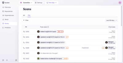
Socket’s new Pull Request Stories give security teams clear visibility into dependency risks and outcomes across scanned pull requests.