Product
Introducing Reports: An Extensible Reporting Framework for Socket Data
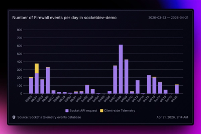
Explore exportable charts for vulnerabilities, dependencies, and usage with Reports, Socket’s new extensible reporting framework.


The Design Graph Framework
Theme UI is a library for creating themeable user interfaces based on constraint-based
design principles. Build custom component libraries, design systems, web applications,
Gatsby themes, and more with a flexible API for best-in-class developer ergonomics.
stable docs: https://theme-ui.com
develop (prerelease) docs: https://dev.theme-ui.com
Built for design systems, white-labels, themes, and other applications where customizing colors, typography, and layout are treated as first-class citizens and based on a standard Theme Specification, Theme UI is intended to work in a variety of applications, libraries, and other UI components. Colors, typography, and layout styles derived from customizable theme-based design scales help you build UI rooted in constraint-based design principles.
sx propnpm install theme-ui @emotion/react
If you don't need color modes or components you can install @theme-ui/core.
Any styles in your app can reference values from the global theme object. To
provide the theme in context, wrap your application with the ThemeUIProvider
component and pass in a custom theme object.
// basic usage
import { ThemeUIProvider } from 'theme-ui'
import theme from './theme'

export default (props) => (
  <ThemeUIProvider theme={theme}>{props.children}</ThemeUIProvider>
)
The theme object follows the System UI
Theme Specification, which lets you define
custom color palettes, typographic scales, fonts, and more. Read more about
theming.
// example theme.js
export default {
  fonts: {
    body: 'system-ui, -apple-system, BlinkMacSystemFont, "Segoe UI", Roboto, "Helvetica Neue", sans-serif',
    heading: '"Avenir Next", sans-serif',
    monospace: 'Menlo, monospace',
  },
  colors: {
    text: '#000',
    background: '#fff',
    primary: '#33e',
  },
}
sx propThe sx prop works similarly to Emotion's css prop, accepting style objects
to add CSS directly to an element in JSX, but includes extra theme-aware
functionality. Using the sx prop for styles means that certain properties can
reference values defined in your theme object. This is intended to make
keeping styles consistent throughout your app the easy thing to do.
The sx prop only works in modules that have defined a custom pragma at the top
of the file, which replaces the default React JSX functions. This means you can
control which modules in your application opt into this feature without the need
for a Babel plugin or additional configuration.
/** @jsxImportSource theme-ui */

export default (props) => (
  <div
    sx={{
      fontWeight: 'bold',
      fontSize: 4, // picks up value from `theme.fontSizes[4]`
      color: 'primary', // picks up value from `theme.colors.primary`
    }}
  >
    Hello
  </div>
)
Read more about how the custom pragma works.
The sx prop also supports using arrays as values to change properties
responsively with a mobile-first approach. This API originated in Styled
System and is intended as
a terser syntax for applying responsive styles
across a singular dimension.
/** @jsxImportSource theme-ui */

export default (props) => (
  <div
    sx={{
      // applies width 100% to all viewport widths,
      // width 50% above the first breakpoint,
      // and 25% above the next breakpoint
      width: ['100%', '50%', '25%'],
    }}
  />
)
MIT License
Thanks goes to these wonderful people (emoji key):
This project follows the all-contributors specification. Contributions of any kind welcome!
FAQs
The Design Graph Framework
The npm package theme-ui receives a total of 42,226 weekly downloads. As such, theme-ui popularity was classified as popular.
We found that theme-ui demonstrated a healthy version release cadence and project activity because the last version was released less than a year ago. It has 4 open source maintainers collaborating on the project.
Did you know?

Socket for GitHub automatically highlights issues in each pull request and monitors the health of all your open source dependencies. Discover the contents of your packages and block harmful activity before you install or update your dependencies.

Product
Explore exportable charts for vulnerabilities, dependencies, and usage with Reports, Socket’s new extensible reporting framework.

Product
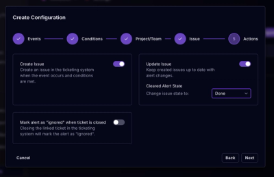
Socket for Jira lets teams turn alerts into Jira tickets with manual creation, automated ticketing rules, and two-way sync.

Company News
Socket won two 2026 Reppy Awards from RepVue, ranking in the top 5% of all sales orgs. AE Alexandra Lister shares what it's like to grow a sales career here.