
Product
Announcing Precomputed Reachability Analysis in Socket
Socket’s precomputed reachability slashes false positives by flagging up to 80% of vulnerabilities as irrelevant, with no setup and instant results.
By Martin Torp - Jul 30, 2025
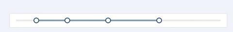
treactr-slider
Advanced tools
Slider UI component for React


npm install --save treactr-slider
import React from 'react';
import ReactDOM from 'react-dom';
import Slider, { Range } from 'treactr-slider';
// We can just import Slider or Range to reduce bundle size
// import Slider from 'treactr-slider/lib/Slider';
// import Range from 'treactr-slider/lib/Range';
import 'treactr-slider/assets/index.css';

ReactDOM.render(
  <div>
    <Slider />
    <Range />
  </div>,
  container
);
An extension to make Slider or Range support Tooltip on handle.
const Slider = require('treactr-slider');
const createSliderWithTooltip = Slider.createSliderWithTooltip;
const Range = createSliderWithTooltip(Slider.Range);
After Range or Slider was wrapped by createSliderWithTooltip, it will have the following props:
| Name | Type | Default | Description |
|---|---|---|---|
| tipFormatter | (value: number): React.ReactNode | value => value | A function to format tooltip's overlay |
The following APIs are shared by Slider and Range.
| Name | Type | Default | Description |
|---|---|---|---|
| className | string | '' | Additional CSS class for the root DOM node |
| min | number | 0 | The minimum value of the slider |
| max | number | 100 | The maximum value of the slider |
| marks | {number: string} or{number: { style, label }} | {} | Marks on the slider. The key determines the position, and the value determines what will show. If you want to set the style of a specific mark point, the value should be an object which contains style and label properties. |
| step | number or null | 1 | Value to be added or subtracted on each step the slider makes. Must be greater than zero, and max - min should be evenly divisible by the step value. When marks is not an empty object, step can be set to null, to make marks as steps. |
| vertical | boolean | false | If vertical is true, the slider will be vertical. |
| handle | (props) => React.ReactNode | A handle generator which could be used to customized handle. | |
| included | boolean | true | If the value is true, it means a continuous value interval, otherwise, it is a independent value. |
| disabled | boolean | false | If true, handles can't be moved. |
| dots | boolean | false | When the step value is greater than 1, you can set the dots to true if you want to render the slider with dots. |
| onBeforeChange | Function | NOOP | onBeforeChange will be triggered when ontouchstart or onmousedown is triggered. |
| onChange | Function | NOOP | onChange will be triggered while the value of Slider changing. |
| onAfterChange | Function | NOOP | onAfterChange will be triggered when ontouchend or onmouseup is triggered. |
| minimumTrackStyle | Object | {} | The style used for the track to the left of the button. |
| maximumTrackStyle | Object | {} | The style used for the track to the right of the button. |
| handleStyle | Object | {} | The style used for handle. |
| Name | Type | Default | Description |
|---|---|---|---|
| defaultValue | number | 0 | Set initial value of slider. |
| value | number | - | Set current value of slider. |
| Name | Type | Default | Description |
|---|---|---|---|
| defaultValue | number[] | [0, 0] | Set initial positions of handles. |
| value | number[] | Set current positions of handles. | |
| count | number | 1 | Determine how many ranges to render, and multiple handles will be rendered (number + 1). |
| allowCross | boolean | true | allowCross could be set as true to allow those handles to cross. |
| pushable | boolean or number | true | pushable could be set as true to allow pushing of surrounding handles when moving an handle. When set to a number, the number will be the minimum ensured distance between handles. Example: |
npm install
npm start
npm start and then go to http://localhost:8005/examples/
Online examples: http://react-component.github.io/slider/
http://localhost:8005/tests/runner.html?coverage
http://localhost:8005/node_modules/rc-server/node_modules/node-jscover/lib/front-end/jscoverage.html?w=http://localhost:8088/tests/runner.html?coverage
treactr-slider is released under the MIT license.
FAQs
Slider UI component for React
The npm package treactr-slider receives a total of 1 weekly downloads. As such, treactr-slider popularity was classified as not popular.
We found that treactr-slider demonstrated a not healthy version release cadence and project activity because the last version was released a year ago. It has 1 open source maintainer collaborating on the project.
Did you know?

Socket for GitHub automatically highlights issues in each pull request and monitors the health of all your open source dependencies. Discover the contents of your packages and block harmful activity before you install or update your dependencies.
Product
Socket’s precomputed reachability slashes false positives by flagging up to 80% of vulnerabilities as irrelevant, with no setup and instant results.

Product
Socket is launching experimental protection for Chrome extensions, scanning for malware and risky permissions to prevent silent supply chain attacks.

Product
Add secure dependency scanning to Claude Desktop with Socket MCP, a one-click extension that keeps your coding conversations safe from malicious packages.