Product
Introducing SSO
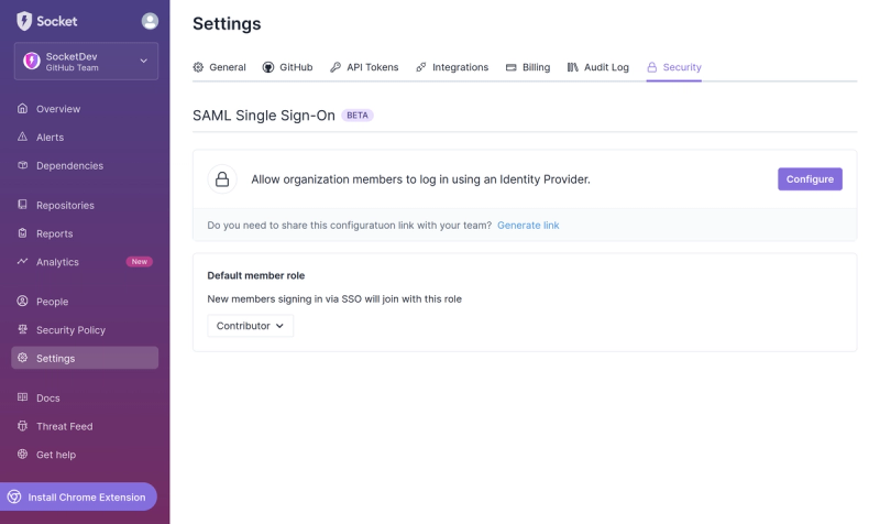
Streamline your login process and enhance security by enabling Single Sign-On (SSO) on the Socket platform, now available for all customers on the Enterprise plan, supporting 20+ identity providers.
tsa-dashboard
Advanced tools
This is a component that you can call with any time series data in the expected format {'data':[<float>...], 'time':[<str>...]} anywhere within your ReactJS project to visualize the data with auto-generated analytics like trend, seasonality, number summar
Readme
This package makes available a React component, <TSADashboard /> that may be instantiated with custom data to produce a generic time series data dashboard as shown below.

Background computations performed by this component requires that the a docker image, smitshah16/timeseries, be pulled and run on your device. Please find this image here: https://hub.docker.com/r/smitshah16/timeseries.
This package may be installed via the command npm i tsa-dashboard and is available at https://www.npmjs.com/package/tsa-dashboard.
Once installed, it may be imported as import { TSADashboard } from "tsa-dashboard".
The component is to be instantiated as follows. Notice expected data format.
data = {'data':[<float>, ...], 'time':["YYYY-MM-DD hh:mm:ss", ...]};
<TSADashboard
    title="a suitable title"
    data={data}
    frequency="10min"
    period="8"
    lags="10"
    backend_url_root="http://127.0.0.1:8001"
/>
Here, property frequency expects the frequency at which given time series values were collected. This must be a valid python pandas library offset aliases (please refer: https://pandas.pydata.org/pandas-docs/version/0.9.1/timeseries.html#offset-aliases). This is because the backend computation leverages the Python 3.0 programming language as well as the Django framework.
The period property refers to the no. of samples in a season. That is, after how many observation would you like to assume that there are repetitions in the given time series? This value must be <= no. of points in the time series/2.
The lags property is the no. of lags in the past that you'd like autocorrelation to be computed for. This value must be <= no. of points in the time series/2.
Finally, the backend_url_root property must contain a string that points to the location where the aforementioned pre-requisite docker image is running.
The following text briefly explains what each plot/section in the dashboard contains.
CONTROLS: This section allows for certain aspects of displayed plots to be altered. Frequency depends on the interval as per which underlying data was collected. Hence, this field cannot be changed. Period refers to a the no. of time steps after which one would like to assume that patterns in the data repeat (this affects th trend, seasonal and residual plots). Lags refers to how many time steps back int ime from any point, would one want to determine autocorrelation for (the ACF and PACF plots are affected by this). The Bins refer to no. of approximate bins that the Histogram shall have. Toggling the Outliers checkbox reveals any outliers on the box plot and includes them in computations. The chosen decomposition type determines how decomposition is performed, + (additive) or x (multiplicative). If the magnitude of peaks and toughs in the base line plot seem to increase over time, then this indicates that multiplicative decomposition many be more suitable.
Line Plot: Time series decomposition involves breaking down a time series into its constituent components, typically trend, seasonal, and residual (noise), allowing for the identification and analysis of underlying patterns and variations within the data. The trend, seasonal and residual line plots can thus be used to better understand long-term trends, seasonal fluctuations, and irregularities in the time series. Differencing each value in the time series from its immediate past value one or more times results in removal of trends and seasonality from a time series so that its statistical properties remain constant over time. Such data is said to be stationary. If in the stationary plot, there appears to be fluctuations that increase or decrease in magnitude over time, this can indicate heteroscedasticity.
Histogram Plot: A histogram is a graphical representation of the distribution of a dataset. It displays the frequency of data points falling within specified intervals, known as bins, along the x-axis, with the count or frequency of observations in each bin represented on the y-axis. The no. of approximate (depends on how data range can be divided) bins may be changed from the "CONTROLS" section.
Number Summary: This table provides a quick overview of some of the actual numbers behind obtained plots. The "Differenced" metric here refers to how many times the data was differenced before it was deemed stationary as per the Augmented Dickey Fuller (ADF) test.
ACF & PACF Plots: The ACF and PACF plots show autocorrelation and partial autocorrelation respectively of the time series with its own lagged values from the past. Here, autocorrelation also considers the indirect relationship between observations at two points in time, partial autocorrelation measures direct relationship only. The x-axis of this plot represents the lag (number of time steps) at which the autocorrelation or partial autocorrelation is calculated and the y-axis represents the correlation coefficient which can range from -1 (inverse relationship) to 1 (positive relationship). The blue lines represent confidence intervals such that correlation may be considered significant in either direction if it (green vertical lines) extend beyond these confidence intervals. The no. of past values (lags) to consider can be set in the CONTROLS section (this may not be a value > half the no. of data points).
Box Plot: A box plot is a graphical representation of the distribution of a dataset based on its five-number summary: minimum, first quartile (Q1), median (Q2), third quartile (Q3), and maximum. It provides a visual clue about central tendency, spread, skewness and prevalence of outliers. The median line indicates the central tendency of the data. If the median line is closer to one end of the box, then this suggests skewness in the distribution. The length of the box (IQR) represents the spread or variability of the data. A longer box indicates greater variability. Any points that fall outside the 1.5 * IQR range in wither direction, are considered to be outliers and can be made visible (red dots) on the plot by checking the "Outliers" box in the "CONTROLS" section (nothing appears if there are no outliers)
FAQs
This is a component that you can call with any time series data in the expected format {'data':[<float>...], 'time':[<str>...]} anywhere within your ReactJS project to visualize the data with auto-generated analytics like trend, seasonality, number summar
The npm package tsa-dashboard receives a total of 6 weekly downloads. As such, tsa-dashboard popularity was classified as not popular.
We found that tsa-dashboard demonstrated a healthy version release cadence and project activity because the last version was released less than a year ago. It has 1 open source maintainer collaborating on the project.
Did you know?

Socket for GitHub automatically highlights issues in each pull request and monitors the health of all your open source dependencies. Discover the contents of your packages and block harmful activity before you install or update your dependencies.

Product
Streamline your login process and enhance security by enabling Single Sign-On (SSO) on the Socket platform, now available for all customers on the Enterprise plan, supporting 20+ identity providers.

Security News
Tea.xyz, a crypto project aimed at rewarding open source contributions, is once again facing backlash due to an influx of spam packages flooding public package registries.

Security News
As cyber threats become more autonomous, AI-powered defenses are crucial for businesses to stay ahead of attackers who can exploit software vulnerabilities at scale.