Research
Security News
Lazarus Strikes npm Again with New Wave of Malicious Packages
The Socket Research Team has discovered six new malicious npm packages linked to North Korea’s Lazarus Group, designed to steal credentials and deploy backdoors.
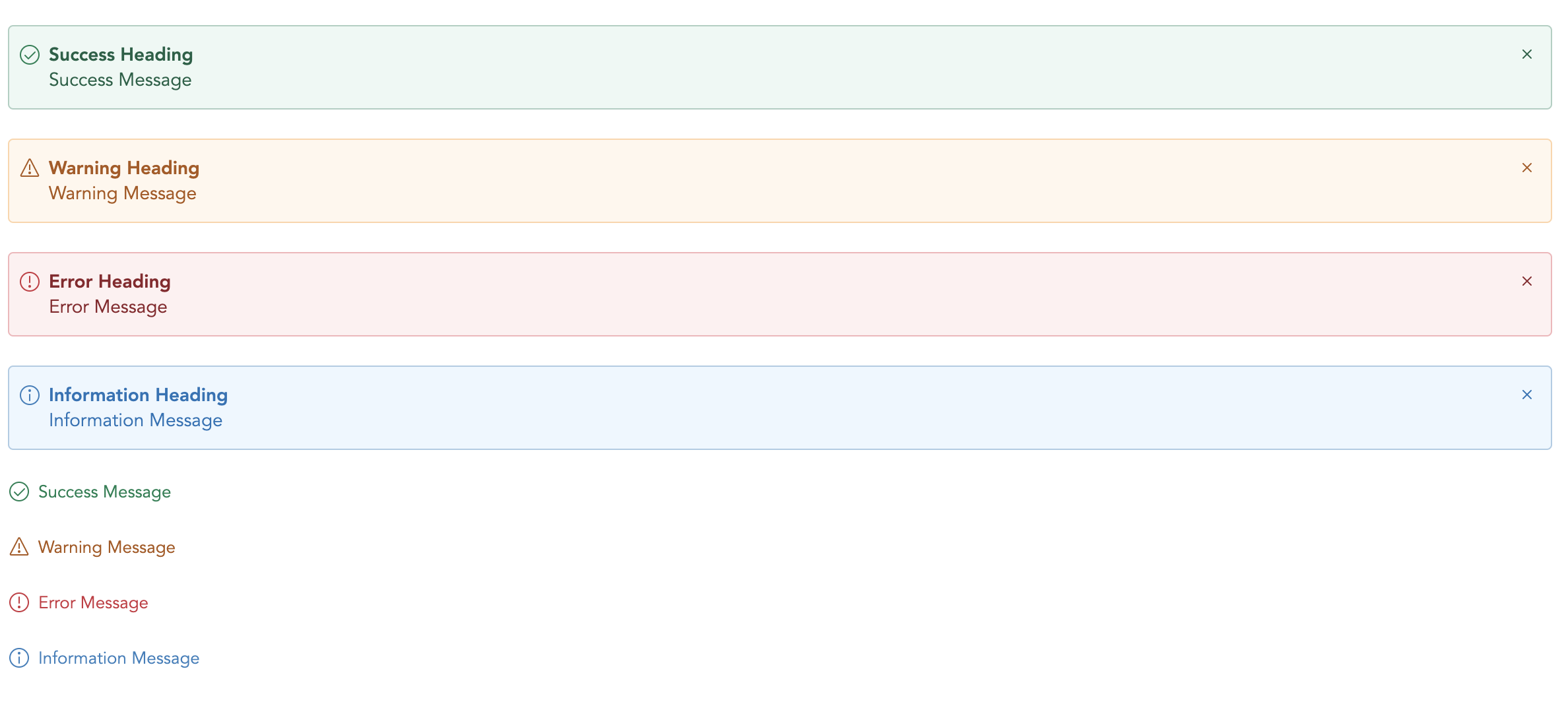
A light weight vue plugin built groundup.


Code Sandbox: Link

npm i vs-alert
yarn add vs-alert
<template>
  <vs-alert type="success">
    Success
  </vs-alert>
</template>

<script>
  import VsAlert from 'vs-alert';

  export default {
    components: {
      VsAlert,
    },
  };
</script>
<script src='https://unpkg.com/vs-alert@<version>/dist/vs-alert.min.js'></script>
<template>
  <vs-alert type="success">
    Success
  </vs-alert>
</template>
Nuxt Code Snippet
After installation,
Create a file /plugins/vs-alert.js
import Vue from 'vue';
import VsAlert from 'vs-alert';

Vue.component('vs-alert', VsAlert);
Update nuxt.config.js
module.exports = {
  ...
  plugins: [
    { src: '~plugins/vs-alert', mode: 'client' }
    ...
  ]
}
In the page/ component
<template>
  <vs-alert type="success">
    Success
  </vs-alert>
</template>
Note
<no-ssr>...</no-ssr> tag.import VsAlert from 'vs-alert'
& add in component:{VsAlert} and use it within component, without globally installing in plugin folder.| Name | Type | Default | Description |
|---|---|---|---|
| type | String | - | Type of alert to be shown. (success, warning, error, info, secondary) |
| title | String | - | The alert title (text only). For HTML, use the header slot. |
| showClose | Boolean | false | Show alert close icon |
| small | Boolean | false | Applies reduced padding |
| noBg | Boolean | false | Remove background color |
| Name | Description |
|---|---|
| close | Emitted when the alert close icons is clicked. Listen for it using @close. |
You can define own item markup via slots:
| Name | Description |
|---|---|
| (default) | Holds the alert content and can contain HTML. |
| icon | Slot to add custom icon for type |
| title | Slot to add custom title |
FAQs
A simple vue alert.
The npm package vs-alert receives a total of 0 weekly downloads. As such, vs-alert popularity was classified as not popular.
We found that vs-alert demonstrated a not healthy version release cadence and project activity because the last version was released a year ago. It has 1 open source maintainer collaborating on the project.
Did you know?

Socket for GitHub automatically highlights issues in each pull request and monitors the health of all your open source dependencies. Discover the contents of your packages and block harmful activity before you install or update your dependencies.

Research
Security News
The Socket Research Team has discovered six new malicious npm packages linked to North Korea’s Lazarus Group, designed to steal credentials and deploy backdoors.

Security News
Socket CEO Feross Aboukhadijeh discusses the open web, open source security, and how Socket tackles software supply chain attacks on The Pair Program podcast.

Security News
Opengrep continues building momentum with the alpha release of its Playground tool, demonstrating the project's rapid evolution just two months after its initial launch.