vue-airbnb-style-datepicker
This is a VueJs version of the popular AirBnb datepicker.
Installation
With NPM:
npm install vue-airbnb-style-datepicker --save
With Yarn:
yarn add vue-airbnb-style-datepicker
NB: This plugin is dependant on VueJS 2.x and date-fns (for date manipulation). Make sure you have these dependencies installed.
Enable plugin in your app
First off, tell Vue to use the plugin in your main.js:
import Vue from 'vue'
import App from './App.vue'
import AirbnbStyleDatepicker from 'vue-airbnb-style-datepicker'
import 'vue-airbnb-style-datepicker/dist/styles.css'
const datepickerOptions = {
sundayFirst: false,
days: [
'Monday',
'Tuesday',
'Wednesday',
'Thursday',
'Friday',
'Saturday',
'Sunday'
],
daysShort: ['Mon', 'Tue', 'Wed', 'Thur', 'Fri', 'Sat', 'Sun'],
colors: {
selected: '#00a699',
inRange: '#66e2da',
selectedText: '#fff',
text: '#565a5c',
inRangeBorder: '#00a699'
},
texts: {
apply: 'Apply',
cancel: 'Cancel'
}
}
Vue.use(AirbnbStyleDatepicker, datepickerOptions)
new Vue({
el: '#app',
render: h => h(App)
})
The options is optional. It is only needed if you want to overwrite default colors, texts etc. For example if your site uses another language than english. Note that days and daysShort always should start with Monday.
Use plugin
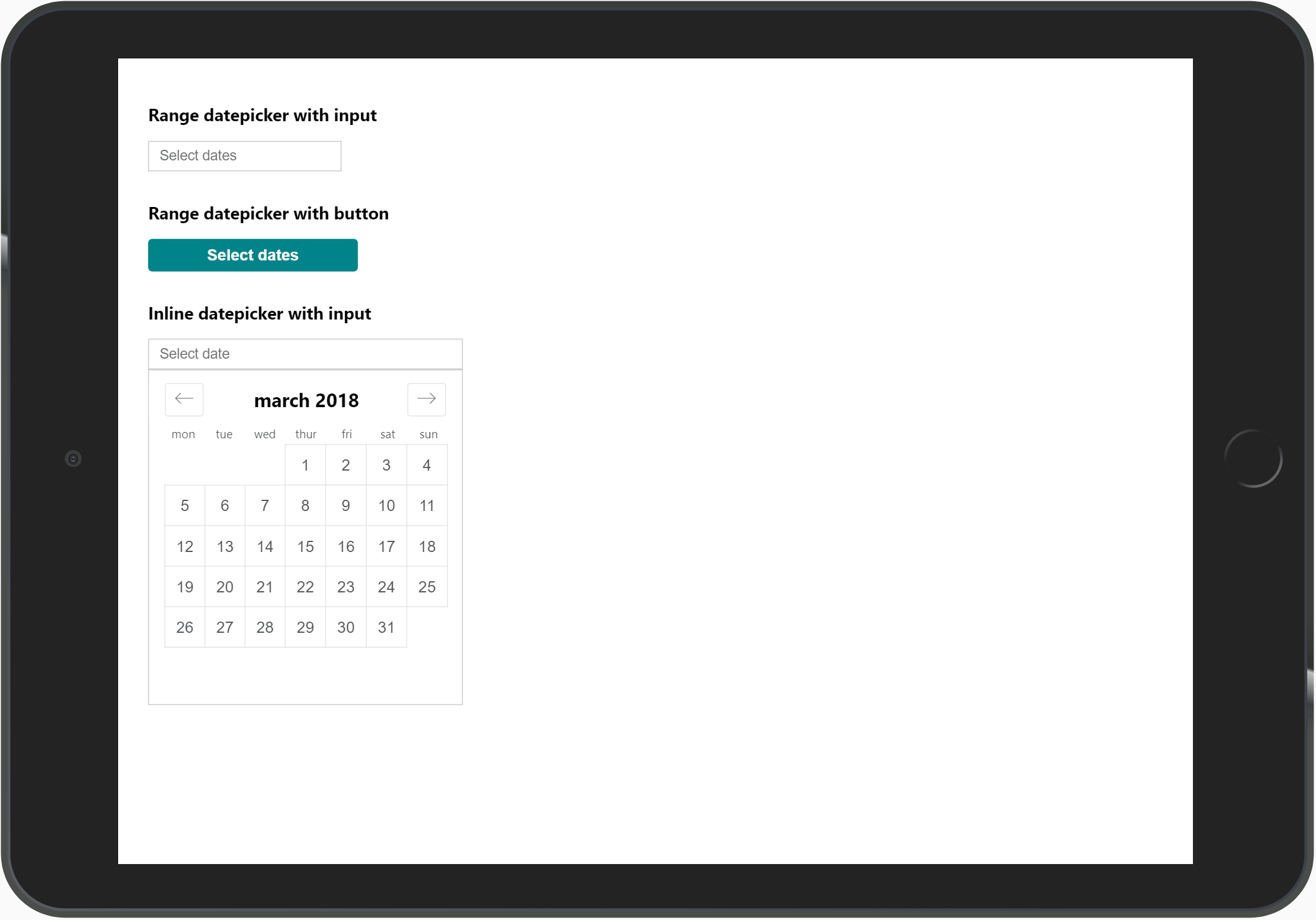
Add datepicker in your component like this:
<template>
  <div>
    <div class="datepicker-trigger">
      <input
        type="text"
        id="datepicker-trigger"
        placeholder="Select dates"
        :value="formatDates(dateOne, dateTwo)"
      >

      <AirbnbStyleDatepicker
        :trigger-element-id="'datepicker-trigger'"
        :mode="'range'"
        :fullscreen-mobile="true"
        :date-one="dateOne"
        :date-two="dateTwo"
        @dateOneSelected="val => { dateOne = val }"
        @dateTwoSelected="val => { dateTwo = val }"
      />
    </div>
  </div>
</template>

<script>
import format from 'date-fns/format'

export default {
  data() {
    return {
      dateFormat: 'D MMM',
      dateOne: '',
      dateTwo: ''
    }
  },
  methods: {
    formatDates(dateOne, dateTwo) {
      let formattedDates = ''
      if (dateOne) {
        formattedDates = format(dateOne, this.dateFormat)
      }
      if (dateTwo) {
        formattedDates += ' - ' + format(dateTwo, this.dateFormat)
      }
      return formattedDates
    }
  }
}
</script>
NB: Note that you need to wrap the datepicker in a <div class="datepicker-trigger">. This is used as the base for the positioning of the datepicker.
Also note that the id of element that triggers the datepicker needs to be the same as prop :trigger-element.
This plugin does not dictate how you show the dates. This allows for more flexibility since you can use whatever trigger element you want. The value is being emitted from the component when a date is selected, and handled in the @dateOneSelected and @dateTwoSelected methods. Then you just assign the value to your data properties. And it is up to you to decide how you want to display the dates.
The formatDates() methods is just an example of how it can be solved.
Properties for <AirbnbStyleDatepicker />
| triggerElementId | The id of the element that user clicks on (without #).
Type: String, Required |
| mode | If datepicker should select a range or just a single date.
Type: String, Required, Values: `'single |
| dateOne | Model for first date.
Type: String, Required |
| dateTwo | Model for second date.
Type: String, Required if using mode="range" |
| minDate | Disable dates before this.
Type: String |
| endDate | Disable dates after this.
Type: String |
| offset | Offset vertical position of datepicker (in pixels from .datepicker-trigger bottom).
Type: Number, Default: 0 |
| monthsToShow | How many months to show. For mobile it's always 1.
Type: Number, Default: 2 |
| startOpen | If you want the datepicker start open
Type: Boolean, Default: false |
| fullscreenMobile | Show fullscreen view on mobile.
Type: Boolean, Default: false |
| mobileHeader | Text to show on mobile header
Type: String, Default: 'Select dates' |
| inline | Use inline mode (datepicker always showing)
Type: Boolean, Default: false |
Example with all properties (not recommended, only to show values):
<AirbnbStyleDatepicker
  :trigger-element-id="'datepicker-trigger'"
  :mode="'range'"
  :date-one="dateOne"
  :date-two="dateTwo"
  :min-date="'2018-10-12'"
  :end-date="'2021-01-01'"
  :offset="30"
  :months-to-show="2"
  :start-open="true"
  :fullscreen-mobile="true"
  :mobile-header="'Mobile header text'"
  :inline="true"
  @dateOneSelected="val => { dateOne = val }"
  @dateTwoSelected="val => { dateTwo = val }"
/>
Development
If you want to fiddle around with the code, there is an example project included in the repo that showcases some different datepicker configurations.
git clone https://github.com/MikaelEdebro/vue-airbnb-style-datepicker.git

npm install

npm run dev
Edit App.vue.