vue-airbnb-style-datepicker
This is a VueJs version of the popular AirBnb datepicker.
Installation
With NPM:
npm install vue-airbnb-style-datepicker --save
With Yarn:
yarn add vue-airbnb-style-datepicker
NB: This plugin is dependant on VueJS 2.x and date-fns (for date manipulation). Make sure you have these dependencies installed.
Enable plugin in your app
First off, tell Vue to use the plugin in your main.js:
import Vue from 'vue'
import App from './App.vue'
import AirbnbStyleDatepicker from 'vue-airbnb-style-datepicker'
import 'vue-airbnb-style-datepicker/dist/styles.css'
const datepickerOptions = {
sundayFirst: false,
days: [
'Monday',
'Tuesday',
'Wednesday',
'Thursday',
'Friday',
'Saturday',
'Sunday'
],
daysShort: ['Mon', 'Tue', 'Wed', 'Thur', 'Fri', 'Sat', 'Sun'],
colors: {
selected: '#00a699',
inRange: '#66e2da',
selectedText: '#fff',
text: '#565a5c',
inRangeBorder: '#00a699'
},
texts: {
apply: 'Apply',
cancel: 'Cancel'
}
}
Vue.use(AirbnbStyleDatepicker, datepickerOptions)
new Vue({
el: '#app',
render: h => h(App)
})
The options is optional. It is only needed if you want to overwrite default colors, texts etc. For example if your site uses another language than english. Note that days and daysShort always should start with Monday.
Use plugin
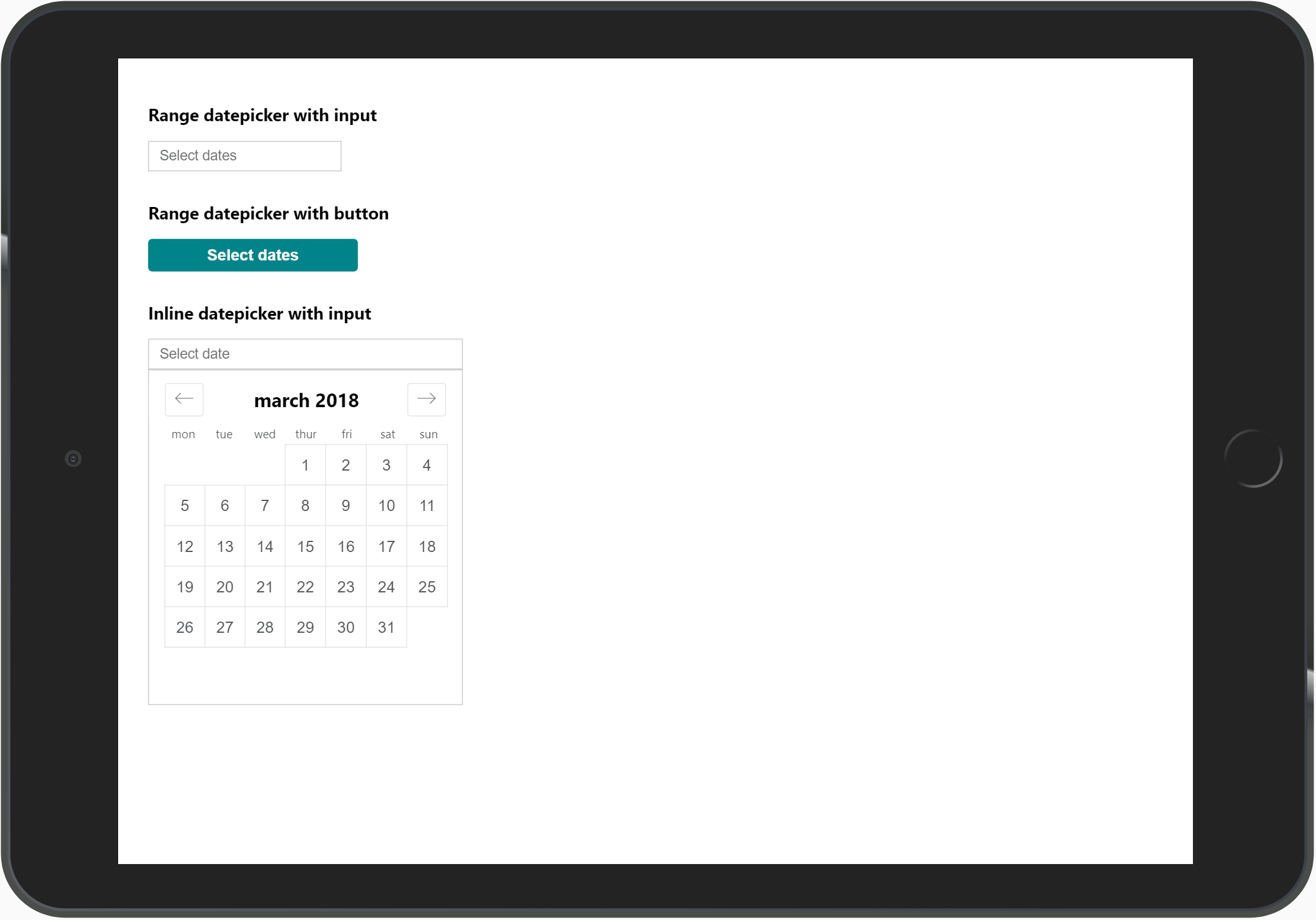
Add datepicker in your component like this:
<template>
  <div>
    <div class="datepicker-trigger">
      <input
        type="text"
        id="datepicker-trigger"
        placeholder="Select dates"
        :value="formatDates(dateOne, dateTwo)"
      >

      <AirbnbStyleDatepicker
        :trigger-element-id="'datepicker-trigger'"
        :mode="'range'"
        :fullscreen-mobile="true"
        :date-one="dateOne"
        :date-two="dateTwo"
        @date-one-selected="val => { dateOne = val }"
        @date-two-selected="val => { dateTwo = val }"
      />
    </div>
  </div>
</template>

<script>
import format from 'date-fns/format'

export default {
  data() {
    return {
      dateFormat: 'D MMM',
      dateOne: '',
      dateTwo: ''
    }
  },
  methods: {
    formatDates(dateOne, dateTwo) {
      let formattedDates = ''
      if (dateOne) {
        formattedDates = format(dateOne, this.dateFormat)
      }
      if (dateTwo) {
        formattedDates += ' - ' + format(dateTwo, this.dateFormat)
      }
      return formattedDates
    }
  }
}
</script>
NB: Note that you need to wrap the datepicker in a <div class="datepicker-trigger">. This is used as the base for the positioning of the datepicker.
Also note that the id of element that triggers the datepicker needs to be the same as prop :trigger-element.
This plugin does not dictate how you show the dates. This allows for more flexibility since you can use whatever trigger element you want. The value is being emitted from the component when a date is selected, and handled in the @date-one-selected and @date-two-selected methods. Then you just assign the value to your data properties. And it is up to you to decide how you want to display the dates.
The formatDates() methods is just an example of how it can be solved.
Properties & events for <AirbnbStyleDatepicker />
| triggerElementId | The id of the element that user clicks on (without #).
Type: String, Required |
| mode | If datepicker should select a range or just a single date.
Type: String, Required, Values: `'single |
| dateOne | Model for first date.
Type: String, Required |
| dateTwo | Model for second date.
Type: String, Required if using mode="range" |
| minDate | Disable dates before this.
Type: String |
| endDate | Disable dates after this.
Type: String |
| offsetY | Offset vertical position of datepicker (in pixels from triggerElementId bottom).
Type: Number, Default: 0 |
| offsetX | Offset horisontal position of datepicker (in pixels from triggerElementId left or right depending on alignment).
Type: Number, Default: 0 |
| monthsToShow | How many months to show. For mobile it's always 1.
Type: Number, Default: 2 |
| startOpen | If you want the datepicker start open
Type: Boolean, Default: false |
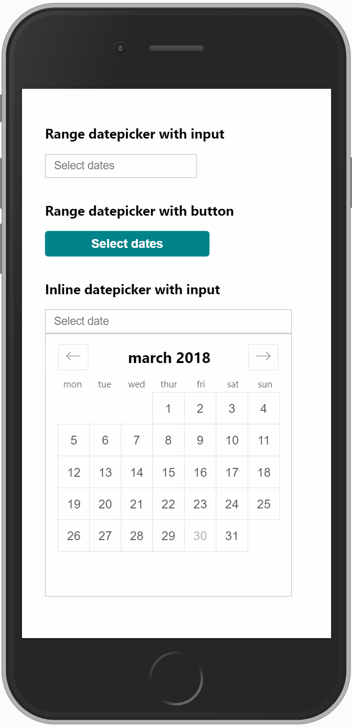
| fullscreenMobile | Show fullscreen view on mobile.
Type: Boolean, Default: false |
| mobileHeader | Text to show on mobile header
Type: String, Default: 'Select dates' |
| inline | Use inline mode (datepicker always showing)
Type: Boolean, Default: false |
| disabledDates | Disable specific dates.
Type: Array |
| @date-one-selected | Event emitted when second date is selected.
Required |
| @date-two-selected | Event emitted when second date is selected.
Required if using mode="range" |
| @closed | Event emitted when datepicker is closed. |
Example with all properties (not recommended, only to show values):
<AirbnbStyleDatepicker
  :trigger-element-id="'datepicker-trigger'"
  :mode="'range'"
  :date-one="dateOne"
  :date-two="dateTwo"
  :min-date="'2018-10-12'"
  :end-date="'2021-01-01'"
  :offset-y="30"
  :months-to-show="2"
  :start-open="true"
  :fullscreen-mobile="true"
  :mobile-header="'Mobile header text'"
  :inline="true"
  :disabled-dates="['2018-10-20', '2018-10-22']"
  @date-one-selected="val => { dateOne = val }"
  @date-two-selected="val => { dateTwo = val }"
/>
Usage in non Single Page App (SPA)
If you're using Vue to enhance your server rendered page, you can use a CDN to load the plugin. This is a simple example:
<!DOCTYPE html>
<html lang="en">
<head>
  <meta charset="UTF-8">
  <meta name="viewport" content="width=device-width, initial-scale=1.0, maximum-scale=1.0, user-scalable=0" />
  <meta http-equiv="X-UA-Compatible" content="ie=edge">
  <title>Test CDN</title>
  <link rel="stylesheet" href="https://unpkg.com/vue-airbnb-style-datepicker@latest/dist/styles.css">
  <style>
  html, body {
    min-height: 100vh;
  }
  </style>
</head>

<body>
  <div id="app">
    <div class="datepicker-trigger">
      <input type="text" id="trigger-range" :value="date1 + ' - ' + date2" readonly>
      <airbnb-style-datepicker
        :trigger-element-id="'trigger-range'"
        :date-one="date1"
        :date-two="date2"
        v-on:date-one-selected="function(val) { date1 = val }"
        v-on:date-two-selected="function(val) { date2 = val }"
      ></airbnb-style-datepicker>
    </div>
  </div>

  <script src="https://cdn.jsdelivr.net/npm/vue/dist/vue.js"></script>
  <script src="https://unpkg.com/vue-airbnb-style-datepicker@latest/dist/vue-airbnb-style-datepicker.min.js"></script>
  <script>
    var app = new Vue({
      el: '#app',
      data: {
        date1: '',
        date2: ''
      }
    })
  </script>
</body>
</html>
This version comes with the the neccesary date-fns methods bundled, so no need to add date-fns as a dependency.
If you however are already using date-fns for your other site logic, I would highly recommend using the version without bundled dependencies. This is much smaller and there's no need to have duplicated code:
<script src="https://unpkg.com/vue-airbnb-style-datepicker@latest/dist/no-dep/vue-airbnb-style-datepicker.min.js"></script>
The methods used (and that you need to include in your app) are the following. Note, this only applies if you're using the no-dep version:
import format from 'date-fns/format'
import subMonths from 'date-fns/sub_months'
import addMonths from 'date-fns/add_months'
import getDaysInMonth from 'date-fns/get_days_in_month'
import isBefore from 'date-fns/is_before'
import isAfter from 'date-fns/is_after'
Browser support
This datepicker have been tested with the following browsers/OS:
Chrome
Firefox
Edge
Android
IE: 9 and higher
Safari: 7.1 and higher
iOS: 6 and higher
However, these tests have not been extensive. More or less just trying the datepicker out, and see that it doesn't throw any console errors etc. If you're planning on using this in production, make sure that it runs smoothly in the browsers that you're planning on supporting.
Contribute
I gladly accept contributions to improve this datepicker. But before you start hacking away, please first create a PR where you explain the actions, so we can agree that the changes makes sense. I wan't to keep this datepicker as close as possible to the original Airbnb datepicker, and not add strange edge cases that complicates the API and makes the size bigger.
Roadmap/todo:s
- Improve logic for positioning of datepicker. Support for showing the datepicker above the input if it doesn't fit below.


