Vue Awesome Paginate


Vue Awesome Paginate is a modern and powerfull vue js pagination library with a large set of various pagination components that are flexible, very lightweight, SEO friendly, customizable with pure CSS and very easy to use.
Key Features
-
All pagination functionalities are built in to the package with 0 dependants.
-
Various different types of pagination components that you can enable or disable according to your needs, and what suits your website best.
-
Complete customization support for every component using pure CSS.
-
Complete RTL support.
-
Search Engine Optimization friendly.
-
Different localizations support.
-
Package is built with typescript and vite with complete support for vue.js (3x) and nuxt.js (3.x)
Table of Contents
Demo
This is a simple Demo environment for the package where you can use and test the package.
Requirements
This package supports both vue.js and nuxt.js, you are required to use one of these versions:
Installation
To use the package you must first add the it to your dependencies in your project.
$ npm i vue-awesome-paginate
Then you have to register the package in your project as well as import a necessary css file that comes with the package.
Vue.js
main.js
import { createApp } from "vue";
import App from "./App.vue";
import VueAwesomePaginate from "vue-awesome-paginate";
import "vue-awesome-paginate/dist/style.css";
createApp(App).use(VueAwesomePaginate).mount("#app");
Nuxt.js
plugins/vue-awesome-paginate.js
import VueAwesomePaginate from "vue-awesome-paginate";
import "vue-awesome-paginate/dist/style.css";
export default defineNuxtPlugin((nuxtApp) => {
nuxtApp.vueApp.use(VueAwesomePaginate);
});
Usage
A complete vue-awesome-paginate component example with some custom CSS customization would be like this:
<script setup lang="ts">
  import { ref } from "vue";

  const onClickHandler = (page: number) => {
    console.log(page);
  };

  const currentPage = ref(1);
</script>

<template>
  <vue-awesome-paginate
    :total-items="50"
    :items-per-page="5"
    :max-pages-shown="5"
    v-model="currentPage"
    @click="onClickHandler"
  />
</template>

<style>
  .pagination-container {
    display: flex;

    column-gap: 10px;
  }

  .paginate-buttons {
    height: 40px;

    width: 40px;

    border-radius: 20px;

    cursor: pointer;

    background-color: rgb(242, 242, 242);

    border: 1px solid rgb(217, 217, 217);

    color: black;
  }

  .paginate-buttons:hover {
    background-color: #d8d8d8;
  }

  .active-page {
    background-color: #3498db;

    border: 1px solid #3498db;

    color: white;
  }

  .active-page:hover {
    background-color: #2988c8;
  }
</style>
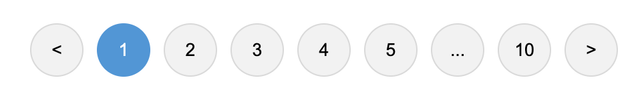
Result of the above code:
Required Attributes
Total required attributes to build a full pagination for your website is only two attributes, the component will handle all the other functionalities and attributes by default
as simple as this example:
<vue-awesome-paginate :total-items="200" v-model="currentPage" />
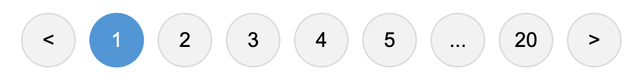
Result of the above code:
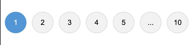
Configurations
You have total control over your pagination component, you can configure every element's appearence, number and behavior.
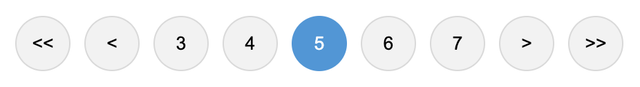
Example: you can set items per single page, maximum pagination buttons to show and a click event handler.
<vue-awesome-paginate
  :total-items="50"
  v-model="currentPage"
  :items-per-page="5"
  :max-pages-shown="5"
  @click="onClickHandler"
/>
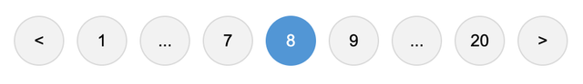
Result of the above code:
(Show/Hide) or (Enable/Disable) breakpoint buttons
Breakpoint buttons are clickable and shown by default, if you click on them you will get a jump of max-pages-shown / 2 in the pagination
You can Disable/Enable or Hide/Show them through attributes
<vue-awesome-paginate
:total-items="50"
v-model="currentPage"
:items-per-page="5"
:max-pages-shown="5"
:show-breakpoint-buttons="false"
@click="onClickHandler"
/>
<vue-awesome-paginate
:total-items="50"
v-model="currentPage"
:items-per-page="5"
:max-pages-shown="5"
@click="onClickHandler"
:disable-breakpoint-buttons="true"
/>
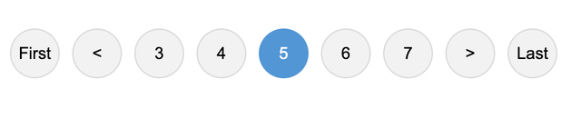
Show Ending Buttons (First and Last Page Buttons)
You can hide/show Ending buttons to be able to navigate to first and last page of the pagination component
<vue-awesome-paginate
:total-items="50"
v-model="currentPage"
:items-per-page="5"
:max-pages-shown="5"
:show-ending-buttons="true"
:show-breakpoint-buttons="false"
/>
Result of the above code:
Hide Prev/Next buttons
You can hide prev/next buttons in two ways
<vue-awesome-paginate
:total-items="50"
v-model="currentPage"
:items-per-page="5"
:max-pages-shown="5"
@click="onClickHandler"
:hide-prev-next="true"
/>
<vue-awesome-paginate
:total-items="50"
v-model="currentPage"
:items-per-page="5"
:max-pages-shown="5"
@click="onClickHandler"
:hide-prev-next-when-ends="true"
/>
Result of the above code:
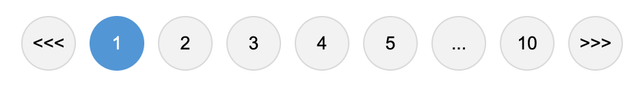
Change buttons content
You can change the content inside the prev/next buttons in two ways:
1- Pass a string to prev-button-content or next-button-content attributes
<vue-awesome-paginate
  :total-items="50"
  v-model="currentPage"
  :items-per-page="5"
  :max-pages-shown="5"
  @click="onClickHandler"
  prev-button-content="<<<"
  next-button-content=">>>"
/>
Result of the above code:
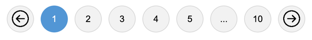
2- Inject your own HTML content into the buttons through custom slots
<vue-awesome-paginate
  :total-items="50"
  v-model="currentPage"
  :items-per-page="5"
  :max-pages-shown="5"
  @click="onClickHandler"
>
  <template #prev-button>
    <span>
      <img src="backward-arrow-icon.png" height="25" />
    </span>
  </template>

  <template #next-button>
    <span>
      <img src="forward-arrow-icon.png" height="25" />
    </span>
  </template>
</vue-awesome-paginate>
Result of the above code:
Custom Slots
This 2nd method of injecting html through custom slots in to elements in the previous example is available for all the other controlling elements like breakpoint buttons and jump buttons etc...
You can see all the slots in the slots table at API section
Show Jump Buttons
Jump Buttons are extra layers on top of Prev/Next buttons, if you enable them they will appear at each ends of the component, you can customize and configure them just like any other elements of the component and if you click on them it will have the same behavior as clicking on breakppoint buttons which is jumping by (max-pages-show/2)
<vue-awesome-paginate
  :total-items="50"
  v-model="currentPage"
  :items-per-page="5"
  :max-pages-shown="5"
  :show-breakpoint-buttons="false"
  :show-jump-buttons="true"
/>
Result of the above code:
Make the component SEO friendly
Pagination components can have a great impact on SEO, it's important to make your pagination elements links, so that when crawlers crawl your page, they will be able to find the pagination elements and extract the links from them.
In order to achive this you can replace the button elements with anchor tag elements by changing type attribute to "link" and specify a linkUrl attribute to tell crawlers and search engines where this pagination element is pointing to.
linkUrl attribute must be a string url to where the pagination element is pointing to, and the string must include [page] placeholder, which will be replaced with the actual page number.
example:
<vue-awesome-paginate
  :total-items="50"
  v-model="currentPage"
  :items-per-page="5"
  :max-pages-shown="5"
  @click="onClickHandler"
  type="link"
  link-url="/blog/posts?page=[page]"
/>
Note: Changing buttons to anchor tags won't affect the functionality or the behavior of the component, it's just a way to make the component SEO friendly. you will still have to handle the navigation logic yourself in on-click event attribute.
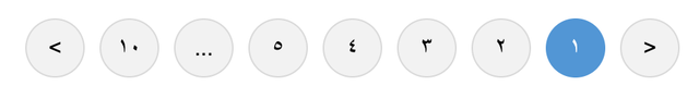
RTL and Locale Support
There are complete supports for RTL and different localizations without using any other 3rd party libraries
<vue-awesome-paginate
  :total-items="50"
  v-model="currentPage"
  :items-per-page="5"
  :max-pages-shown="5"
  dir="rtl"
  locale="ar"
/>
Result of the above code:
Custom Styles
By default pagination buttons have the default html styles, you can customize every element of the component through the default class names that are set for each element, or you can set your own class names for any element you want.
<template>
  <vue-awesome-paginate
    :total-items="50"
    v-model="currentPage"
    :items-per-page="5"
    :max-pages-shown="5"
    paginate-buttons-class="btn"
    active-page-class="btn-active"
    back-button-class="back-btn"
    next-button-class="next-btn"
  />
</template>

<style>
  .btn {
    height: 40px;

    width: 40px;

    border: none;

    margin-inline: 5px;

    cursor: pointer;
  }

  .back-btn {
    background-color: red;
  }

  .next-btn {
    background-color: red;
  }

  .btn-active {
    background-color: blue;

    color: white;
  }
</style>
Result of the above code:

You don't necessarily need to set class names for the elements if you don't want to, you can just use their default class names that are available in the class names table in the API section.
Important Note: If the tag of the parent component is scoped, you have to use the ::deep combinator in order to apply the styles to the elements of the component.
API
Component Attributes
Note that all the attributes in the table below can be written in both camel case and kebab case styles.
| totalItems | Total Number of items that you want to paginate | Number | | Required |
| itemsPerPage | Total Number of items that you explicitly want to show per one page | Number | 10 | Must be greater than 0 |
| v-model | Current active page | Number | | Required and must be greater than 0 |
| showEndingButtons | Show First and Last page buttons on each endings of the pagination component | Boolean | false | |
| maxPagesShown | Maximum pagination buttons (Number Buttons only) to be shown | Number | 5 | Must be greater than 0 |
| dir | Driection of the component (RTL Support) | "ltr" | "rtl" | "ltr" | Must be one of either options |
| onClick (Deprecated, use @click event handler instead) | A function that runs when the user changes a page by clicking any of the elements of the component (Passing the new active page to the function as a parameter) | Function | ()=>{} | |
| type | HTML Element type of the pagination component | "button" | "link" | "button" | must be either a link or button |
| linkUrl | The url string that the anchor tag is pointing to | String | | required when type attribute is set to 'link', and must include "[page]" placeholder in order to be replaced with the actual page number during rendering |
| locale | Localization of the component (currently only Arabic, English and Persian locales are supported, more localization options will be added! | "en" | "ar" | "ir" | "en" | Must be one of the available options) |
| prevButtonContent | Content to be shown in the prev button | String | Slot | "<" | Must be either a string or a custom slot |
| nextButtonContent | Content to be shown in the prev button | String | Slot | ">" | Must be either a string or a custom slot |
| hidePrevNext | Hide the prev and next buttons permanently | Boolean | false | |
| hidePrevNextWhenEnds | Hide the prev button when pagination is at the beginning and next button when the pagination is at the end | Boolean | false | |
| disablePagination | Enable/Disable the whole component buttons | Boolean | false | |
| showBreakpointButtons | Show/Hide the breakpoint buttons | Boolean | true | |
| disableBreakpointButtons | Enable/Disable the breakpoint buttons | Boolean | false | |
| startingBreakpointContent | Content to be shown in the starting breakpoint button | String | Slot | "..." | Must be either a string or a custom slot |
| endingBreakpointButtonContent | Content to be shown in the ending breakpoint button | String | Slot | "..." | Must be either a string or a custom slot |
| showJumpButtons | Show/Hide the jump buttons | Boolean | false | |
| backwardJumpButtonContent | Content to be shown in the backward jump button | String | Slot | "<<" | Must be either a string or a custom slot |
| forwardJumpButtonContent | Content to be shown in the forward jump button | String | Slot | ">>" | Must be either a string or a custom slot |
| firstPageContent | Content to be shown in the first page button | String | Slot | "First" | Must be either a string or a custom slot |
| lastPageContent | Content to be shown in the last page button | String | Slot | "Last" | Must be either a string or a custom slot |
Class Name Attributes
All the class names have a default value.
| paginationContainerClass | Styles for this class will be applied for the container of the whole compoent | pagination-container |
| paginateButtonsClass | A global class name, styles for this class will be applied for all of the buttons inside the component | paginate-buttons |
| disabledPaginateButtonsClass | A global class name, styles for this class will be applied for all of the buttons when disabled inside the component | disabled-paginate-buttons |
| numberButtonsClass | Styles for this class will be applied for all the number buttons | number-buttons |
| activePageClass | Styles for this class will be applied for the current active page button | active-page |
| firstPageButtonClass | Styles for this class will be applied for the first page button | first-page-buton |
| lastPageButtonClass | Styles for this class will be applied for the last page button | last-page-buton |
| backButtonClass | Styles for this class will be applied for the back button | back-button |
| nextButtonClass | Styles for this class will be applied for the next button | next-button |
| startingBreakpointButtonClass | Styles for this class will be applied for the starting breakpoint button | starting-breakpoint-button |
| endingBreakpointButtonClass | Styles for this class will be applied for the ending breakpoint button | ending-breakpoint-button |
| disabledBreakPointButtonClass | Styles for this class will be applied for the breakpoint buttons when the whole pagination component is disbaled or the breakpoints are disabled | disabled-breakpoint-button |
| backwardJumpButtonClass | Styles for this class will be applied for the backward jump button | backward-jump-button |
| forwardJumpButtonClass | Styles for this class will be applied for the forward jump button | forward-jump-button |
| firstButtonClass | Styles for this class will be applied for the the very first button that shows when first break point button appears | first-button |
| lastButtonClass | Styles for this class will be applied for the the very last button that shows when last break point button appears | first-button |
| disabledFirstButtonClass | Styles for this class will be applied for the first button when disabled | disabled-first-button |
| disabledLastButtonClass | Styles for this class will be applied for the last button when disabled | disabled-last-button |
| disabledBackwardJumpButtonClass | Styles for this class will be applied for the backward jump button when pagination is disabled | disabled-backward-jump-button |
| disabledBackButtonClass | Styles for this class will be applied for the back button when pagination is disabled | disabled-back-button |
| disabledNextButtonClass | Styles for this class will be applied for the next button when pagination is disabled | disabled-next-button |
| disabledForwardJumpButtonClass | Styles for this class will be applied for the forward jump button when pagination is disabled | disabled-forward-jump-button |
Slot Names
These slot names can be used for Vue Slots in order to inject custom html in to the target element
| prev-button | Prev Button |
| next-button | Next Button |
| backward-jump-button | Backward Jump Button |
| forward-jump-button | Forward Jump Button |
| starting-breakpoint-button | Starting Breakpoint Button |
| ending-breakpoint-button | Ending Breakpoint Button |
| first-page-button | First Page Button |
| last-page-button | Last Page Button |
Events
| click | A function that runs when the user changes a page by clicking any of the elements of the component | (page: number) |
Author
Peshang Hiwa
License
The MIT License


