


vue-confirm-dialog
Simple Confirm Dialog verification plugin with Vue.js.
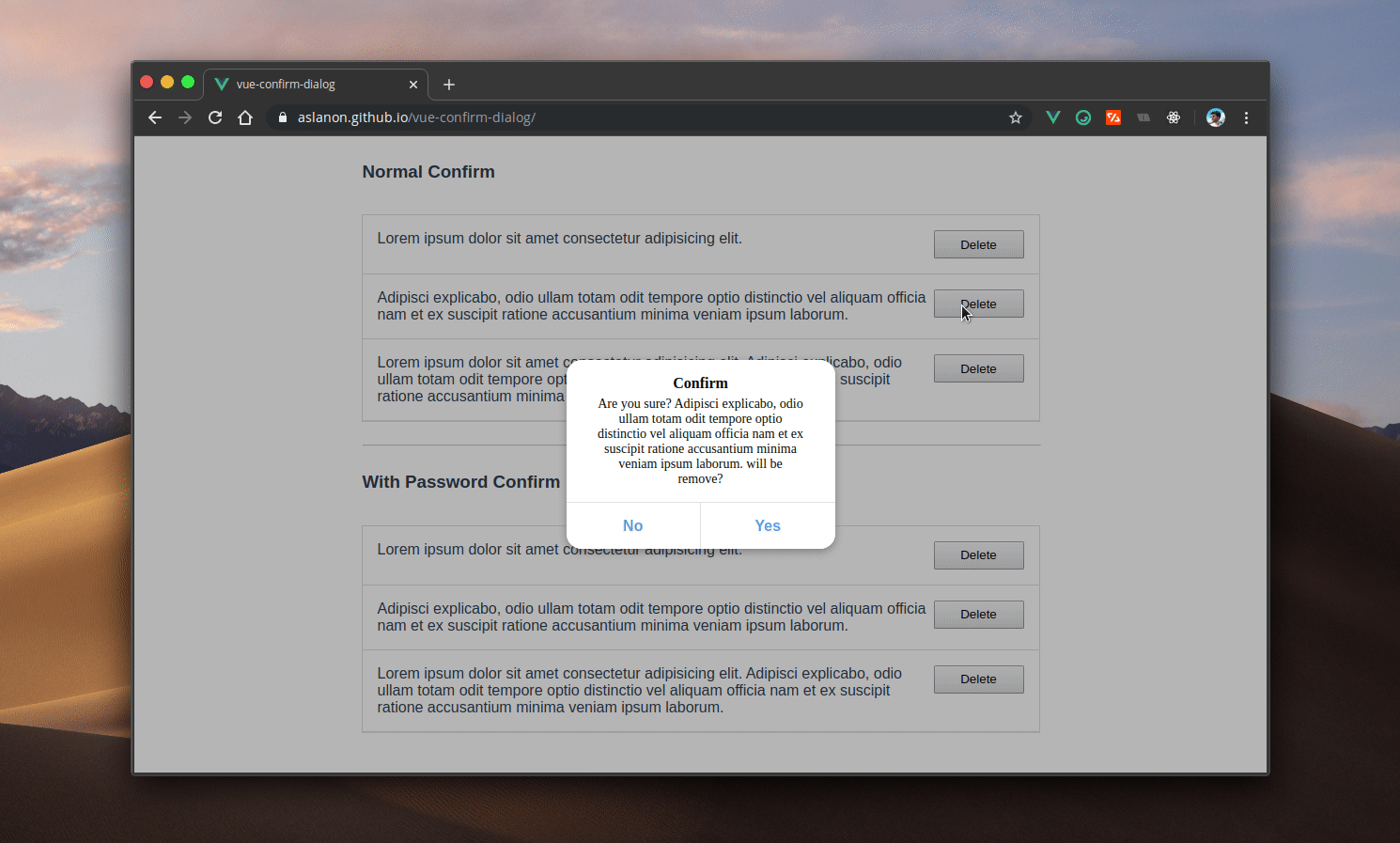
Demo: https://aslanon.github.io/vue-confirm-dialog/
Install
$ npm install --save vue-confirm-dialog
Quick Start Usage
In main.js or plugin (for Nuxt.js):
import Vue from 'vue'
import VueConfirmDialog from 'vue-confirm-dialog'

Vue.use(VueConfirmDialog)
In App.vue (or in the template file for Nuxt.js (layout/default.vue)):
<template>
<div id="app">
<vue-confirm-dialog></vue-confirm-dialog>
</div>
</template>
<script>
import VueConfirmDialog from 'vue-confirm-dialog'
export default {
name: 'app',
components: {
VueConfirmDialog
}
}
</script>
In any of functions :
methods: {
handleClick(){
this.$confirm(
{
message: `Are you sure?`,
button: {
no: 'No',
yes: 'Yes'
},
callback: confirm => {
if (confirm) {
}
}
}
)
}
}
If you want to use in *.js file (e.g Vuex Store) before import Vue and after use Vue.$confirm.
import Vue from 'vue'
export default {
namespaced: true,
state: {},
actions: {
logout({ commit }) {
Vue.$confirm({
title: 'Are you sure?',
message: 'Are you sure you want to logout?',
button: {
yes: 'Yes',
no: 'Cancel'
},
callback: confirm => {
}
})
}
}
}
API
If you want to password confirm, "auth" key is must be true.
this.$confirm({
auth: true,
message: 'foo',
button: {
yes: 'Yes',
no: 'Cancel'
},
callback: (confirm, password) => {
if (confirm && password == YOUR_PASSWORD) {
}
}
})
Use only for information
If you want to use only for information and you want of see one button in dialog, you can use only one of 'no' or 'yes' button object.
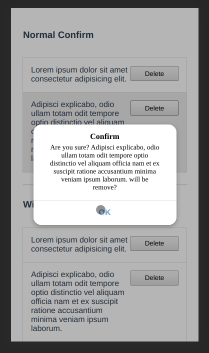
methods: {
handleClick(){
this.$confirm(
{
title: 'Information',
message: 'This content has been removed',
button: {
yes: 'OK',
}
},
callback: confirm => {
if (confirm) {
}
}
)
}
}
Style
:root {
  --title-color: black;
  --message-color: black;
  --overlay-background-color: #0000004a;
  --container-box-shadow: #0000004a 0px 3px 8px 0px;
  --base-background-color: #ffffff;
  --button-color: #4083ff;
  --button-background-color: #ffffff;
  --button-border-color: #e0e0e0;
  --button-background-color-disabled: #f5f5f5;
  --button-background-color-hover: #f5f5f5;
  --button-box-shadow-active: inset 0 2px 0px 0px #00000014;
  --input-background-color: #ebebeb;
  --input-background-color-hover: #dfdfdf;
  --font-size-m: 16px;
  --font-size-s: 14px;
  --font-weight-black: 900;
  --font-weight-bold: 700;
  --font-weight-medium: 500;
  --font-weight-normal: 400;
  --font-weight-light: 300;
}

.vc-overlay *,
.vc-overlay *:before,
.vc-overlay *:after {
  -webkit-box-sizing: border-box;
  box-sizing: border-box;
  text-decoration: none;
  -webkit-touch-callout: none;
  -moz-osx-font-smoothing: grayscale;
  margin: 0;
  padding: 0;
}

.vc-title {
  color: var(--title-color);
  padding: 0 1rem;
  width: 100%;
  font-weight: var(--font-weight-black);
  text-align: center;
  font-size: var(--font-size-m);
  line-height: initial;
  margin-bottom: 5px;
}
.vc-text {
  color: var(--message-color);
  padding: 0 1rem;
  width: 100%;
  font-weight: var(--font-weight-medium);
  text-align: center;
  font-size: var(--font-size-s);
  line-height: initial;
}
.vc-overlay {
  background-color: var(--overlay-background-color);
  width: 100%;
  height: 100%;
  transition: all 0.1s ease-in;
  left: 0;
  top: 0;
  z-index: 999999999999;
  position: fixed;
  display: flex;
  justify-content: center;
  align-items: center;
  align-content: baseline;
}
.vc-container {
  background-color: var(--base-background-color);
  border-radius: 1rem;
  width: 286px;
  height: auto;
  display: grid;
  grid-template-rows: 1fr max-content;
  box-shadow: var(--container-box-shadow);
}
.vc-text-grid {
  padding: 1rem;
}
.vc-btn-grid {
  width: 100%;
  display: grid;
  grid-template-columns: 1fr 1fr;
  border-radius: 0 0 1rem 1rem;
  overflow: hidden;
}
.vc-btn-grid.isMono {
  grid-template-columns: 1fr;
}
.vc-btn {
  border-radius: 0 0 1rem 0;
  color: var(--button-color);
  background-color: var(--button-background-color);
  border: 0;
  font-size: 1rem;
  border-top: 1px solid var(--button-border-color);
  cursor: pointer;
  font-weight: var(--font-weight-bold);
  outline: none;
  min-height: 50px;
}
.vc-btn:hover {
  background-color: var(--button-background-color-hover);
}
.vc-btn:disabled {
  background-color: var(--button-background-color-disabled);
}
.vc-btn:active {
  box-shadow: var(--button-box-shadow-active);
}
.vc-btn.left {
  border-radius: 0;
  border-right: 1px solid var(--button-border-color);
}
.vc-input[type='password'] {
  width: 100%;
  outline: none;
  border-radius: 8px;
  height: 35px;
  border: 0;
  margin: 5px 0;
  background-color: var(--input-background-color);
  padding: 0 0.5rem;
  font-size: var(--font-size-m);
  transition: 0.21s ease;
}
.vc-input[type='password']:hover,
.vc-input[type='password']:focus {
  background-color: var(--input-background-color-hover);
}


