Treeselect JS Vue component
It is a wrapper for https://www.npmjs.com/package/treeselectjs
A multi-select js component with nested options.
- Full key support (ArrowUp, ArrowDown, Space, ArrowLeft, ArrowRight, Enter)
- Screen sensitive direction
- Typescript support
Build data:
- vue-treeselectjs.mjs 6.14 kB │ gzip: 1.82 kB
- vue-treeselectjs.umd.js 4.23 kB │ gzip: 1.54 kB
- vue-treeselectjs.css 7.14 kB │ gzip: 1.42 kB
Live Demo: https://dipson88.github.io/treeselectjs/
Getting Started
npm install --save vue-treeselectjs
Import vue-treeselectjs (ES)
import Treeselect from 'vue-treeselectjs'
import 'vue-treeselectjs/dist/vue-treeselectjs.css'
Import treeselectjs (UMD)
<!DOCTYPE html>
<html>
  <head>
    <script src="https://unpkg.com/vue@3/dist/vue.global.js"></script>
    <script src="https://cdn.jsdelivr.net/npm/treeselectjs@0.13.1/dist/treeselectjs.umd.js"></script>
    <script src="https://cdn.jsdelivr.net/npm/vue-treeselectjs@0.8.1/dist/vue-treeselectjs.umd.js"></script>
    <link rel="stylesheet" href="https://cdn.jsdelivr.net/npm/vue-treeselectjs@0.8.1/dist/vue-treeselectjs.css" />
  </head>
  <body>
      <div id="app">
        <vue-treeselect />
      </div>

      <script>
        const { createApp } = Vue
        const Treeselect = window.VueTreeselect;

        createApp({
          components: {
            VueTreeselect: Treeselect,
          }
        }).mount('#app')
      </script>
  </body>
</html>
All Available Imports
import Treeselect, { DirectionType, IconsType, OptionType, TreeselectValue, ... } from 'vue-treeselectjs'
Example
<template>
<div class="App">
<!-- Option 1 -->
<Treeselect
:model-value="modelValue"
:options="options"
@update:modelValue="onInput"
>
<div>Slot Content</div>
</Treeselect>
<!-- Option 2 -->
<Treeselect
v-model="modelValue"
:options="options"
>
<div>Slot Content</div>
</Treeselect>
<!-- Option 3 -->
<Treeselect
:model-value="modelValue"
:options="options"
@input="onInput"
>
<div>Slot Content</div>
</Treeselect>
</div>
</template>
<script lang="ts">
import { defineComponent, ref } from 'vue'
import Treeselect, { TreeselectValue } from 'vue-treeselectjs'
import 'vue-treeselectjs/dist/vue-treeselectjs.css'
export default defineComponent({
name: 'App',
components: {
Treeselect
},
setup() {
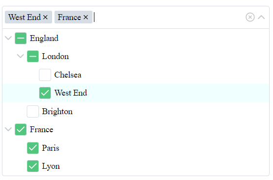
const options = ref([
{
name: 'England',
value: 1,
children: [
{
name: 'London',
value: 2,
children: [
{
name: 'Chelsea',
value: 3,
children: []
},
{
name: 'West End',
value: 4,
children: []
}
]
},
{
name: 'Brighton',
value: 5,
children: []
}
]
},
{
name: 'France',
value: 6,
children: [
{
name: 'Paris',
value: 7,
children: []
},
{
name: 'Lyon',
value: 8,
children: []
}
]
}
])
const value = ref<TreeselectValue>([3])
// Also for value type, you can use value: string | number | (string | number)[] | null
const onInput = (value: TreeselectValue) => {
console.log('onInput', value)
}
return {
onInput,
options,
value
}
}
})
</script>
Props
Core props
| model-value | Array[String | Number] ([]) | An array of value from options prop. This value will be selected on load of the treeselect. The value changes if you check/uncheck checkboxes or remove tags from the input. |
| options | Array[Object] ([]) | It is an array of objects {name: String, value: String | Number, disabled?: Boolean, htmlAttr?: object, isGroupSelectable?: boolean, children: [] }, where children are the same array of objects. Do not use duplicated value field. But you can use duplicated names. Read more. |
| disabled | Boolean (false) | List will be disabled. |
| id | String ('') | id attribute for the accessibility. |
| ariaLabel | String ('') | aria-label attribute for the accessibility. |
| isSingleSelect | Boolean (false) | Converts multi-select to the single value select. Checkboxes will be removed. You should pass only one id instead of array of values. Also you can set showTags to false. It helps to show treeselect as a dropdown. |
| isGroupedValue | Boolean (false) | Return groups if they selected instead of separate ids. Treeselect returns only leaves ids by default. |
| isIndependentNodes | Boolean (false) | All nodes in treeselect work as an independent entity. Check/uncheck action ignore children/parent updates workflow. Disabled nodes ignore children/parent workflow as well. |
| rtl | Boolean (false) | RTL mode. |
| isBoostedRendering | Boolean (false) | Experimental - Improves list rendering performance by using visibility-based optimizations and IntersectionObserver. Useful for efficiently rendering large lists. |
List settings props
| disabledBranchNode | Boolean (false) | It is impossible to select groups. You can select only leaves. |
| openLevel | Number (0) | All groups will be opened to this level. |
| appendToBody | Boolean (false) | List will be appended to the body instead of the input container. |
| alwaysOpen | Boolean (false) | List will be always opened. You can use it for comfortable style changing. If you what to use it as an opened list, turn staticList to true. |
| staticList | Boolean (false) | Add the list as a static DOM element. List doesn't overlap content. This prop will be ignored if you use appendToBody. |
| emptyText | String ('No results found...') | A empty list text. |
| direction | String (auto) | A force direction for the list. Supported values: auto, top, bottom. |
| expandSelected | Boolean (false) | All groups which have checked values will be expanded on the init. |
| saveScrollPosition | Boolean (true) | The list saves the last scroll position before close. If you open the list your scroll will be on the previous position. If you set the value to false - the scroll will have position 0 and the first item will be focused every time. |
| listClassName | String ('') | A class name for list. Useful to change styles for appendToBody mode. |
Input settings props
| showTags | Boolean (true) | Selected values look like tags. The false value shows results as '{count} elements selected'. You can change text if you use tagsCountText prop. For one selected element, you will see a name of this element. |
| tagsCountText | String ('elements selected') | This text will be shown if you use 'showTags'. This text will be inserted after the count of the selected elements - '{count} {tagsCountText}'. |
| tagsSortFn | (a: TagsSortItem, b: TagsSortItem) => number | null (null) | Defines the sorting order for tags in the input field.
TagsSortItem - { value: ValueOptionType, name: string }. |
| showCount | Boolean (false) | Shows count of children near the group's name. |
| clearable | Boolean (true) | Clear icon is available. |
| searchable | Boolean (true) | Search is available. |
| placeholder | String ('Search...') | Placeholder text. |
| grouped | Boolean (true) | Show groups in the input and group leafs if all group selected. |
Emits
| input | (value) => void (undefined) | Returns selected values, action is triggered on change the list value. |
| open | (value) => void (undefined) | Returns selected values, action is triggered on opening the list. |
| close | (value) => void (undefined) | Returns selected values, action is triggered on closing the list. |
| name-change | (name) => void (undefined) | Returns selected name inside the input, action is triggered on on change the list. |
| search | (value) => void (undefined) | Returns entered search value, action is triggered on change search value during the typing. You can try create something like autocomplete with help of this emit. |
| open-close-group | ({ groupId, isClosed }: { groupId: ValueOptionType, isClosed: boolean }) => void (undefined) | Returns groupId and closed/open status of this group, action is triggered on open/close group in the list. |
Additional props
| iconElements | Object({ arrowUp, ... }) | Object contains all svg icons. You can use HTMLElement or a String to reset values from the default Object. Object: iconElements: { arrowUp, arrowDown, arrowRight, attention, clear, cross, check, partialCheck }. After reset of icon you have to update styles if it is necessary, use alwaysOpen prop for more comfortable work with styles changes. |
Slots
| default | undefined | The slot's content will be mounted at the end of the list. |
Option description
Is is description of the one option of the options prop:
| value | String | Number (required!) | It is a value of the node. It should be unique! |
| name | String (required!) | It is the name of the node. Can be duplicated. |
| disabled | Boolean (optional) | The node will be disabled. It is an optional field, you can skip it if no need to work with disabled values. |
| htmlAttr | Object (optional) | The object of the HTML attributes, the value of the object should be a String type. These attributes will be merged into the node HTML tag. |
| isGroupSelectable | Boolean (optional - true) | Determines whether groups are selectable. This behavior is similar to the disabledBranchNode prop but applies specifically to groups. It does not affect regular (non-group) items. |
| children | {name: String, value: String, disabled?: Boolean, htmlAttr?: object, children: [] }[] | Children are the same array of objects. |
Notes
- If you want to change the padding of the element you can use CSS selector. I've added 'group' and 'level' attributes, but you have to use !important.
- Do not use duplicated values for the options. You will see a error with duplicated values. But you can use duplicated names.
- Value prop inside the options prop should be a String or Number.
- If you use isSingleSelect prop, you should pass only a single value without an array.
- If you use isSingleSelect prop, you can set showTags to false. It helps to show treeselect as a dropdown. Also you can disable selecting of group's nodes with help of disabledBranchNode.
- If you use a large list of options and see a problem with performance, try to use isBoostedRendering prop.
Support
You can buy me a coffee if you want to support my work. Thank you!


