Yet Another Github Card - Show your developer skills in social networks


Introduction
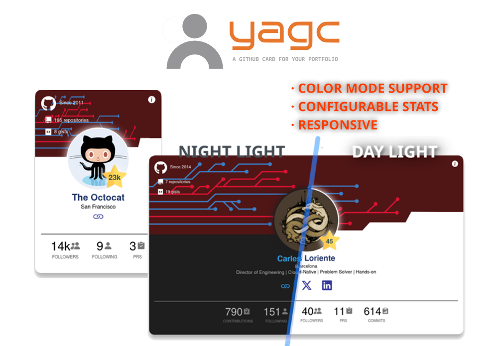
Say hello to YACG 🎉: The GitHub card for your developer portfolio
Features
- Responsive design
- Dual color mode (light & dark)
- Customizable stats
- Different Theme styles
- Free

Share on


Table of contents
What's included
You'll find all the required directories and files within the download, logically grouping common assets and providing compiled and minified variations.
Bundled dependencies
Quick Start
Including the card in your portfolio site
Include the YAGC in your HTML, copy and paste the following code replacing data-user with your GitHub username:
<github-card data-style="defaultTheme" data-user="carlesloriente" data-user-stars="true" data-user-stats='[{"name": "commits"}, {"name": "contributions"}]'></github-card>
<script type="module" src="https://unpkg.com/yet-another-github-card@1.0.10/yagc.min.js"></script>
Documentation
Using the Yet-Another-Github-Card npm package in your project
Select your favourite package manager and follow the instructions below.
npm install yet-another-github-card --save
yarn add yet-another-github-card
composer require yet-another-github-card
The package folder structure looks like this:
  yet-another-github-card/
  ├─ css/
  ├─ images/
  |  ├─ docs/
  |  ├─ favicon_io/
  ├─ themes/
  └─ utils/
     └─ js/
Github Card Data Options
data-style | Set header background image. | defaultTheme |
data-user | Your GitHub username value | `` |
data-user-stars | Count all your obtained stars, includes; repositories and gists | true |
data-user-stats | Show selected stats adding/removing JSON key:value entries. Key: name. Values: 'commits', 'contributions', 'followers', 'following', 'prs' | [{"name": "commits"}, {"name": "prs}] |
Themes
At the moment, three prebuilt themes are available. Feel free to design unique cards by selecting your own colors and backgrounds!
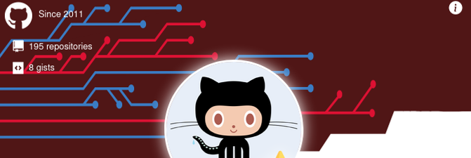
1. DefaultTheme
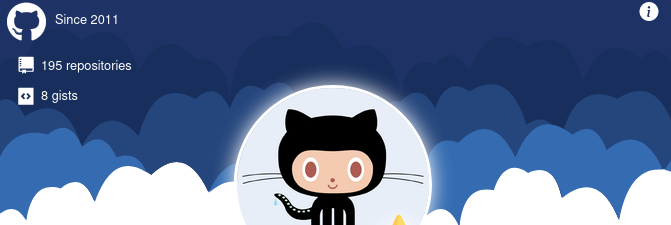
2. Cloud
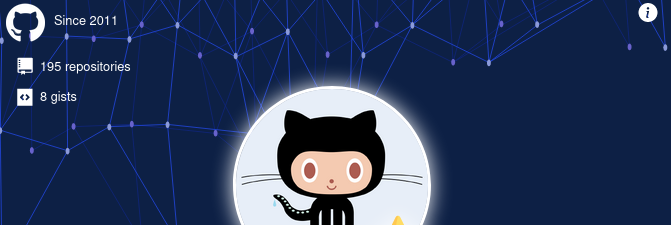
3. Polygon
Local Demo card
The source includes resources for building and running locally your Github Card.
If you want to see it in action, there's a demo included, complete the following steps.
Open with your code editor the file utils/index.html
1.- Locate the custom element github-card, edit data-user attribute with your own GitHub username.
2.- Fill with your preferred settings the attributes: data-user-stars and data-user-stats.
3.- Done, save the file and run the command:
npm run compile-demo
The folder demo will be created and contain all the required files.
To run it throught the bundled web server, run the command:
npm run server-watch
Additionally, if you want execute all these steps altogether, run the command:
npm run build-demo
Bugs and Issues
Have a bug or an issue with this package? Open a new issue here on GitHub!
Contributing
New contributors are always welcome! Check out CONTRIBUTING.md to get involved.
Creator
Carles Loriente is the creator and maintainer of the NOCC Bootstrap theme.
Thanks
Thanks to you.
Copyright and License
Copyright (c) 2026 Carles Loriente. Code released under the MIT license.


