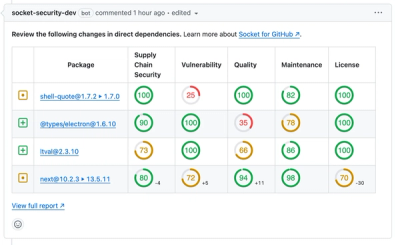
An interactive image viewer library for react.
Zoombox is a lightweight library for adding an intreratcive image viewer into your react app.
Demo
Click here to try live demo
Features
- Easy to integrate, now even more easier with scan mode.
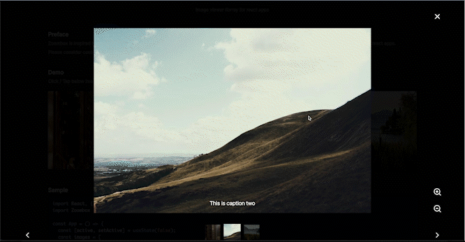
- Caption in images.
- Area specific zoom based on cursor position.
- Image preview for next and previuos image.
- Image drag to view the different parts of it while image zoomed in.
- Control over the behaviour.
- Mobile Responsive
Get Started
yarn add zoombox
or
npm i zoombox
Example
import React, { useState } from "react";
import Zoombox from "zoombox";

const App = () => {
  const [active, setActive] = useState(false);
  const images = [
    {
      src: "https://picsum.photos/id/222/1200/800",
      caption: "This is caption one",
    },
    {
      src: "https://picsum.photos/id/230/1200/800",
      caption: "This is caption two",
    },
    {
      src: "https://picsum.photos/id/120/1200/800",
      caption: "This is caption three",
    },
  ];
  return (
    <>
      <button onClick={() => setActive(true)}>
        Click to Open Zoombox, or click on above images
      </button>
      <Zoombox
        {...{
          images,
          active,
          setActive,
        }}
      />
    </>
  );
};
export default App;
Example for Scan Mode
In scan mode zoombox will automatically scan for the images inside given containerRef and generates the images automatically so in that case you don't need to pass images prop, Zoombox will scan <img/> tag which will have data-zoombox attribute, this will also add click event to images on clicking which zoombox will get opened with that particular image.
import React, { useRef, useState } from 'react';
import Zoombox from 'zoombox';

const App = () => {
  const [active, setActive] = useState(false);

  const images = [
    {
      src: 'https://picsum.photos/id/222/1200/800',
      caption: 'This is caption one'
    },
    {
      src: 'https://picsum.photos/id/230/1200/800',
      caption: 'This is caption two'
    },
    {
      src: 'https://picsum.photos/id/120/1200/800',
      caption: 'This is caption three'
    }
  ];
  const containerRef = useRef(null);
  return (
    <div ref={containerRef}>
      <div>
        {images.map((image) => (
          <img data-zoombox data-caption={image.caption} key={image.src} src={image.src} alt={image.caption} height={200} style={{ margin: '10px' }} />
        ))}
      </div>
      <Zoombox
        {...{
          containerRef,
          active,
          setActive,
          maskClosable: true
        }}
      />
    </div>
  );
};
export default App;
API
images | [{ src: "https://picsum.photos/200", caption?: "This is caption", }] | [] | Array of images with url of image in 'src' with optional 'caption' |
containerRef for scan mode ! | Ref of HTMLElement | [] | This will enable the scan mode, in which zoombox will automatically scan for the images inside given containerRef and generates the images automatically so in that case you don't need to pass images prop, Zoombox will scan <img/> tag which will have data-zoombox attribute and image src will be taken from src attribute and caption will be taken from data-caption attribute. So your img tag should look like this <img src="https://picsum.photos/200", data-zoombox data-caption="Caption goes here"/> this will also add click event to images on clicking which zoombox will get opened with that particular image. |
active* | boolean | false | To tell Zoombox weather to stay visible or not |
setActive* | React.Dispatch <React.SetStateAction > | | To update the external active state |
zIndex | number | 10000 | Sets the z-index css of ZoomBox's parent container |
enableKeyboard MouseControls | boolean | true | Enable / Disable the mouse nad keyboard controls (right arrow -> next slide, left arrow -> prev slide, up arrow -> zoom in, down arrow -> zoom out ) |
maskClosable | boolean | false | If sets to true, closes the zoombox when clicked on background mask. |
enableZoom | 0 or 1 or 2 | 2 | 0 to disable zoom feature, 1 to enable center zoom, 2 for to enable area specific zoom based on cursor position. |
closable | boolean | true | enable/disable close icon |
dbClickToZoom | boolean | true | enable/disable the ability to zoom at 200% when user double clicks the image. |
hideImagePreview | boolean | false | hides the bottom images preview in zoombox |
lockBodyScroll | boolean | false | locks body from scrolling while zoombox is open |
maskOpacity | number | 0.8 | sets the opacity of background mask |
selectedImage | number | 0 | load the image at given index when zoombox gets opened |
showCredits | boolean | false | shows "Image preview powered by Zoombox" in the corner, just in case if you wish to attribute zoombox. |
enableImageDragBeta | boolean | false | It is in Beta mode so might not be perfect to use, When zoom is more than 150% then this will allow user to drag the active image in zoombox and see the different parts of it while zoomed in. |
License
Zoombox is licensed under the MIT License.
Support
Zoombox is free to use and always will be, however if you wish to support you can always buy me a coffee !
Buy me a coffee

Or
