Product
Introducing Rust Support in Socket
Socket now supports Rust and Cargo, offering package search for all users and experimental SBOM generation for enterprise projects.
gradio-bettertextbox
Advanced tools
gradio_bettertextboxA better input text box for interacting with multi modal models
pip install gradio_bettertextbox
import gradio as gr
from gradio_bettertextbox import betterTextBox

example = betterTextBox().example_inputs()


def workTest(test):
    print(test)

with gr.Blocks() as demo:
    temp = betterTextBox()

    temp.submit(workTest, temp)

if __name__ == "__main__":
    demo.launch()
betterTextBox| name | type | default | description |
|---|---|---|---|
value |
| "" | default text to provide in textbox. If callable, the function will be called whenever the app loads to set the initial value of the component. |
placeholder |
| None | placeholder hint to provide behind textbox. |
label |
| None | component name in interface. |
every |
| None | If `value` is a callable, run the function 'every' number of seconds while the client connection is open. Has no effect otherwise. The event can be accessed (e.g. to cancel it) via this component's .load_event attribute. |
show_label |
| None | if True, will display label. |
scale |
| None | relative size compared to adjacent Components. For example if Components A and B are in a Row, and A has scale=2, and B has scale=1, A will be twice as wide as B. Should be an integer. scale applies in Rows, and to top-level Components in Blocks where fill_height=True. |
min_width |
| 160 | minimum pixel width, will wrap if not sufficient screen space to satisfy this value. If a certain scale value results in this Component being narrower than min_width, the min_width parameter will be respected first. |
interactive |
| None | if True, will be rendered as an editable textbox; if False, editing will be disabled. If not provided, this is inferred based on whether the component is used as an input or output. |
visible |
| True | If False, component will be hidden. |
rtl |
| False | If True and `type` is "text", sets the direction of the text to right-to-left (cursor appears on the left of the text). Default is False, which renders cursor on the right. |
elem_id |
| None | An optional string that is assigned as the id of this component in the HTML DOM. Can be used for targeting CSS styles. |
elem_classes |
| None | An optional list of strings that are assigned as the classes of this component in the HTML DOM. Can be used for targeting CSS styles. |
render |
| True | If False, component will not render be rendered in the Blocks context. Should be used if the intention is to assign event listeners now but render the component later. |
| name | description |
|---|---|
change | Triggered when the value of the betterTextBox changes either because of user input (e.g. a user types in a textbox) OR because of a function update (e.g. an image receives a value from the output of an event trigger). See .input() for a listener that is only triggered by user input. |
input | This listener is triggered when the user changes the value of the betterTextBox. |
submit | This listener is triggered when the user presses the Enter key while the betterTextBox is focused. |
upload | This listener is triggered when the user uploads a file into the betterTextBox. |
clear | This listener is triggered when the user clears the betterTextBox using the X button for the component. |
The impact on the users predict function varies depending on whether the component is used as an input or output for an event (or both).
The code snippet below is accurate in cases where the component is used as both an input and an output.
def predict(
    value: MultiModalInput | None
) -> MultiModalInput | None:
    return value
MultiModalInputclass MultiModalInput(GradioModel):
text: Optional[str] = None
images: Optional[List[FileData]] = None
FAQs
A better input text box for interacting with multi modal models
We found that gradio-bettertextbox demonstrated a healthy version release cadence and project activity because the last version was released less than a year ago. It has 1 open source maintainer collaborating on the project.
Did you know?

Socket for GitHub automatically highlights issues in each pull request and monitors the health of all your open source dependencies. Discover the contents of your packages and block harmful activity before you install or update your dependencies.

Product
Socket now supports Rust and Cargo, offering package search for all users and experimental SBOM generation for enterprise projects.

Product
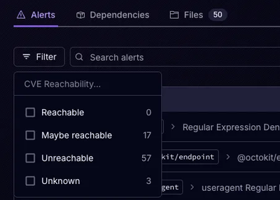
Socket’s precomputed reachability slashes false positives by flagging up to 80% of vulnerabilities as irrelevant, with no setup and instant results.

Product
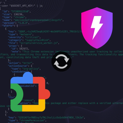
Socket is launching experimental protection for Chrome extensions, scanning for malware and risky permissions to prevent silent supply chain attacks.