Product
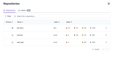
Redesigned Repositories Page: A Faster Way to Prioritize Security Risk
Our redesigned Repositories page adds alert severity, filtering, and tabs for faster triage and clearer insights across all your projects.
gradio-neomultimodaltextbox
Advanced tools
gradio_neomultimodaltextboxPython library for Gradio custom component MultimodalTextbox
pip install gradio_neomultimodaltextbox
import gradio as gr
from gradio_neomultimodaltextbox import NeoMultimodalTextbox


example = NeoMultimodalTextbox().example_value()


def identity(i):
    return i


with gr.Blocks() as demo:
    box1 = NeoMultimodalTextbox(
        file_count="multiple",
        value={"text": "zouzou", "files": []},
        interactive=True,
    )  # interactive version of your component
    box2 = NeoMultimodalTextbox(
        upload_btn=False, interactive=False, stop_btn=True, audio_btn=True, stop_audio_btn=True
    )  # static version of your component
    box1.submit(fn=identity, inputs=box1, outputs=box2)

if __name__ == "__main__":
    demo.launch()
NeoMultimodalTextbox| name | type | default | description |
|---|---|---|---|
value |
| None | Default value to show in NeoMultimodalTextbox. A string value, or a dictionary of the form {"text": "sample text", "files": [{path: "files/file.jpg", orig_name: "file.jpg", url: "http://image_url.jpg", size: 100}]}. If callable, the function will be called whenever the app loads to set the initial value of the component. |
file_types |
| None | List of file extensions or types of files to be uploaded (e.g. ['image', '.json', '.mp4']). "file" allows any file to be uploaded, "image" allows only image files to be uploaded, "audio" allows only audio files to be uploaded, "video" allows only video files to be uploaded, "text" allows only text files to be uploaded. |
file_count |
| "single" | if single, allows user to upload one file. If "multiple", user uploads multiple files. If "directory", user uploads all files in selected directory. Return type will be list for each file in case of "multiple" or "directory". |
lines |
| 1 | minimum number of line rows to provide in textarea. |
max_lines |
| 20 | maximum number of line rows to provide in textarea. |
placeholder |
| None | placeholder hint to provide behind textarea. |
label |
| None | the label for this component, displayed above the component if `show_label` is `True` and is also used as the header if there are a table of examples for this component. If None and used in a `gr.Interface`, the label will be the name of the parameter this component corresponds to. |
info |
| None | additional component description, appears below the label in smaller font. Supports markdown / HTML syntax. |
every |
| None | Continously calls `value` to recalculate it if `value` is a function (has no effect otherwise). Can provide a Timer whose tick resets `value`, or a float that provides the regular interval for the reset Timer. |
inputs |
| None | Components that are used as inputs to calculate `value` if `value` is a function (has no effect otherwise). `value` is recalculated any time the inputs change. |
show_label |
| None | if True, will display label. |
container |
| True | If True, will place the component in a container - providing some extra padding around the border. |
scale |
| None | relative size compared to adjacent Components. For example if Components A and B are in a Row, and A has scale=2, and B has scale=1, A will be twice as wide as B. Should be an integer. scale applies in Rows, and to top-level Components in Blocks where fill_height=True. |
min_width |
| 160 | minimum pixel width, will wrap if not sufficient screen space to satisfy this value. If a certain scale value results in this Component being narrower than min_width, the min_width parameter will be respected first. |
interactive |
| True | if True, will be rendered as an editable textbox; if False, editing will be disabled. If not provided, this is inferred based on whether the component is used as an input or output. |
visible |
| True | If False, component will be hidden. |
elem_id |
| None | An optional string that is assigned as the id of this component in the HTML DOM. Can be used for targeting CSS styles. |
autofocus |
| False | If True, will focus on the textbox when the page loads. Use this carefully, as it can cause usability issues for sighted and non-sighted users. |
autoscroll |
| True | If True, will automatically scroll to the bottom of the textbox when the value changes, unless the user scrolls up. If False, will not scroll to the bottom of the textbox when the value changes. |
elem_classes |
| None | An optional list of strings that are assigned as the classes of this component in the HTML DOM. Can be used for targeting CSS styles. |
render |
| True | If False, component will not render be rendered in the Blocks context. Should be used if the intention is to assign event listeners now but render the component later. |
key |
| None | if assigned, will be used to assume identity across a re-render. Components that have the same key across a re-render will have their value preserved. |
text_align |
| None | How to align the text in the textbox, can be: "left", "right", or None (default). If None, the alignment is left if `rtl` is False, or right if `rtl` is True. Can only be changed if `type` is "text". |
rtl |
| False | If True and `type` is "text", sets the direction of the text to right-to-left (cursor appears on the left of the text). Default is False, which renders cursor on the right. |
upload_btn |
| True | None |
submit_btn |
| True | If False, will not show a submit button. If a string, will use that string as the submit button text. |
stop_btn |
| False | If True, will show a stop button (useful for streaming demos). If a string, will use that string as the stop button text. |
loading_message |
| "... Loading files ..." | None |
audio_btn |
| False | None |
stop_audio_btn |
| False | None |
| name | description |
|---|---|
change | Triggered when the value of the NeoMultimodalTextbox changes either because of user input (e.g. a user types in a textbox) OR because of a function update (e.g. an image receives a value from the output of an event trigger). See .input() for a listener that is only triggered by user input. |
input | This listener is triggered when the user changes the value of the NeoMultimodalTextbox. |
select | Event listener for when the user selects or deselects the NeoMultimodalTextbox. Uses event data gradio.SelectData to carry value referring to the label of the NeoMultimodalTextbox, and selected to refer to state of the NeoMultimodalTextbox. See EventData documentation on how to use this event data |
submit | This listener is triggered when the user presses the Enter key while the NeoMultimodalTextbox is focused. |
focus | This listener is triggered when the NeoMultimodalTextbox is focused. |
blur | This listener is triggered when the NeoMultimodalTextbox is unfocused/blurred. |
stop | This listener is triggered when the user reaches the end of the media playing in the NeoMultimodalTextbox. |
upload | This listener is triggered when the user uploads a file into the NeoMultimodalTextbox. |
stream | This listener is triggered when the user streams the NeoMultimodalTextbox. |
The impact on the users predict function varies depending on whether the component is used as an input or output for an event (or both).
The code snippet below is accurate in cases where the component is used as both an input and an output.
def predict(
    value: MultimodalValue | None
) -> MultimodalValue | str | None:
    return value
MultimodalValueclass MultimodalValue(TypedDict):
text: NotRequired[str]
files: NotRequired[list[str]]
FAQs
Python library for Gradio custom component MultimodalTextbox
We found that gradio-neomultimodaltextbox demonstrated a healthy version release cadence and project activity because the last version was released less than a year ago. It has 1 open source maintainer collaborating on the project.
Did you know?

Socket for GitHub automatically highlights issues in each pull request and monitors the health of all your open source dependencies. Discover the contents of your packages and block harmful activity before you install or update your dependencies.

Product
Our redesigned Repositories page adds alert severity, filtering, and tabs for faster triage and clearer insights across all your projects.

Security News
Slopsquatting is a new supply chain threat where AI-assisted code generators recommend hallucinated packages that attackers register and weaponize.

Security News
Multiple deserialization flaws in PyTorch Lightning could allow remote code execution when loading untrusted model files, affecting versions up to 2.4.0.