plot2html
Helping people publish beautiful automated reports that contribute to transparency, high quality monitoring and faster decision making
With this library, you can create static .html files with text and charts taking advantage of Google Charts API.
Installing this package (on the command line):
pip install plot2html
Python code:
import pandas as pd
temperature = pd.read_csv('https://raw.githubusercontent.com/rafatro/plot2html/main/tests/Temperature_London_Rome.csv',parse_dates=[0])
from plot2html import CreateReport
report = CreateReport("Example of plot2html Report")
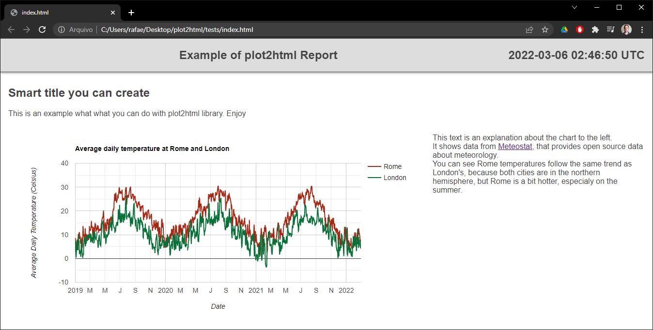
report.text("<h2>Smart title you can create</h2>This is an example what what you can do with plot2html.")
options = {'title': 'Average temperature at London and Rome',
'hAxis': {'title': 'Date'},
'vAxis': {'title': 'Average Daily Temperature (Celsius)'},
'colors': ['#a52714', '#097138']
}
report.plot(data=temperature.pivot(index='date', columns='location', values='tavg').reset_index()
,x='date'
,y=['Rome','London']
,type='line'
,width='2-thirds'
,height=400
,options=options)
report.text('''This text is an explanation about the chart to the left.<br>
It shows data from <a href='https://meteostat.net/'>Meteostat</a>, that provides open source data about meteorology.<br>
You can see Rome temperatures follow the same trend as London's, because both cities are in the northern hemisphere, but Rome is a bit hotter, especialy on the summer.
''',width="third")
report.exporthtml("C:/Users/rafae/Desktop/plot2html/tests/index.html")
You will get this output:
Main arguments
Data: pandas DataFrame with the columns that are going to be used as either as the horizontal axis or the series of the chart.
x: name of the column that will be used as horizontal axis of the chart
y: name (or several names) of the columns that will be used as series of the chart.
type: either 'line' or 'column'. Other alternatives on development.
width: how much horizontal space of the screen is going to be occupied by the chart (or text). Possibilities: 'full' (default), 'half', 'third', '2-thirds' or 'quarter'.
height: height of the chart in pixels.
options: several parameters to be passed to Google Chart API, including title, axis title, colors, font size, annotations, gridlines, legend position etc. See all possibilities on Google Charts documentation site. But please note the notation is a bit different because requires the names of the parameters to be inside single quotes '. So, instead of options={hAxis:{title: 'Time',textStyle:{color: '#01579b',fontSize:20}}} use options={'hAxis':{'title': 'Time','textStyle':{'color': '#01579b','fontSize':20}}}
Enjoy!
Any feedback is welcome. This is just the beginning.