Product
Introducing Reports: An Extensible Reporting Framework for Socket Data
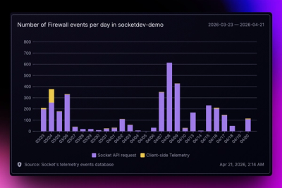
Explore exportable charts for vulnerabilities, dependencies, and usage with Reports, Socket’s new extensible reporting framework.
By André Staltz - Apr 21, 2026
plotly-calplot
Advanced tools
Making it easier to visualize and costumize time relevant or time series data with plotly interaction.
New to the library? Read this Medium article.
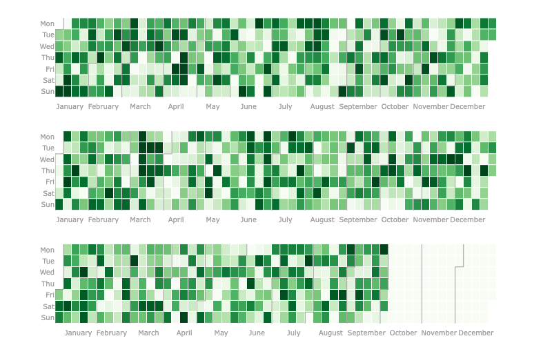
This plot is a very similar to the contribuitions available on Github and Gitlab profile pages and to Calplot - which is a pyplot implementation of the calendar heatmap, thus it is not interactive right off the bat.
The first mention I could find of this plot being made with plotly was in this forum post and it got my attention as something that should be easily available to anyone.
pip install plotly-calplot
In this Medium article I covered lot's of usage methods for this library.
from plotly_calplot import calplot

fig = calplot(df, x="date", y="value")
fig.show()
# you can also adjust layout and your usual plotly stuff
FAQs
Calendar Plot made with Plotly
We found that plotly-calplot demonstrated a healthy version release cadence and project activity because the last version was released less than a year ago. It has 1 open source maintainer collaborating on the project.
Did you know?

Socket for GitHub automatically highlights issues in each pull request and monitors the health of all your open source dependencies. Discover the contents of your packages and block harmful activity before you install or update your dependencies.
Product
Explore exportable charts for vulnerabilities, dependencies, and usage with Reports, Socket’s new extensible reporting framework.
Product
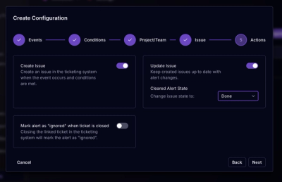
Socket for Jira lets teams turn alerts into Jira tickets with manual creation, automated ticketing rules, and two-way sync.
Company News
Socket won two 2026 Reppy Awards from RepVue, ranking in the top 5% of all sales orgs. AE Alexandra Lister shares what it's like to grow a sales career here.