Product
A New Design for GitHub PR Comments
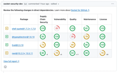
We redesigned our GitHub PR comments to deliver clear, actionable security insights without adding noise to your workflow.
By André Staltz - Apr 10, 2025
Visualize classified time series data with interactive Sankey plots in Google Earth Engine.
![]()


![]()
![]()
Visualize changes in classified time series data with interactive Sankey plots in Google Earth Engine

Use Earth Engine to visualize changes in land cover, plant health, burn severity, or any other time series of classified imagery with interactive Sankey plots. Use a library of built-in datasets for convenience or define your own custom datasets for flexibility.
pip install sankee
conda install -c conda-forge sankee
Visualize annual changes in land cover using popular LULC datasets with a couple lines of code. Just choose a dataset, an area of interest, and a list of years to generate a Sankey diagram from a premade dataset. Below, we can look at 30 years of vegetation recovery in the area devastated by the Mt. St. Helens eruption.
import sankee
import ee

ee.Initialize()

sankee.datasets.LCMS_LC.sankify(
  years=[1990, 2000, 2010, 2020],
  region=ee.Geometry.Point([-122.192688, 46.25917]).buffer(2000),
  max_classes=3,
  title="Mt. St. Helens Recovery"
)

Check out the example notebook for an interactive demo.
Any classified images can be used by defining the dataset parameters (which pixel values correspond to which labels and colors). For example, we can look at classified Dynamic World scenes just two weeks apart that show substantial snow loss on Mountain Jefferson during the 2021 Heat Dome in the Pacific Northwest.
import sankee
import ee

ee.Initialize()

# Load a set of classified images
img_list = [
    ee.Image("GOOGLE/DYNAMICWORLD/V1/20210616T185919_20210616T190431_T10TEQ"),
    ee.Image("GOOGLE/DYNAMICWORLD/V1/20210706T185919_20210706T190638_T10TEQ")
]

# Which band contains the classified data?
band = "label"

# What labels correspond to which pixel values?
labels = {
    0: "Water", 1: "Trees", 2: "Grass", 3: "Flooded", 4: "Crops",
    5: "Shrub / Scrub", 6: "Build", 7: "Bare", 8: "Snow / Ice",
}

# What colors should be applied to which pixel values?
palette = {
    0: "#419BDF", 1: "#397D49", 2: "#88B053", 3: "#7A87C6", 4: "#E49635",
    5: "#DFC35A", 6: "#C4281B", 7: "#A59B8F", 8: "#B39FE1"
}

plot = sankee.sankify(
    image_list=img_list,
    band=band,
    labels=labels,
    palette=palette,
    region=ee.Geometry.Point([-121.80183, 44.67655]).buffer(3000),
    max_classes=3,
    title="Mt. Jefferson Snow Loss - June 2021"
)

sankee premade datasets are usable through the geemap interactive GUI. Check out the documentation and video tutorials by @giswqs.
If you find bugs or have feature requests, please open an issue!
FAQs
Visualize classified time series data with interactive Sankey plots in Google Earth Engine.
We found that sankee demonstrated a healthy version release cadence and project activity because the last version was released less than a year ago. It has 1 open source maintainer collaborating on the project.
Did you know?

Socket for GitHub automatically highlights issues in each pull request and monitors the health of all your open source dependencies. Discover the contents of your packages and block harmful activity before you install or update your dependencies.
Product
We redesigned our GitHub PR comments to deliver clear, actionable security insights without adding noise to your workflow.
Product
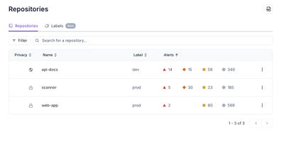
Our redesigned Repositories page adds alert severity, filtering, and tabs for faster triage and clearer insights across all your projects.

Security News
Slopsquatting is a new supply chain threat where AI-assisted code generators recommend hallucinated packages that attackers register and weaponize.