


ng2-color-picker
Simple color picker for Angular 2
Dependencies
The module relies on ngx-bootstrap for dropdown functionality.
Installation
To include in your project install via NPM with:
npm install --save ng2-color-picker
You will then need to include the module to your app.module.ts:
import { ColorPickerModule } from 'ng2-color-picker';
@NgModule({
imports: [
ColorPickerModule
]
})
Finally, include the component in your HTML as per the next section.
HTML Component Markup
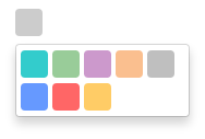
Once the module is installed, you will need to add HTML markup to include the picker in a component.
The minimum requirement is an [(ngModel)] attribute, which should provide a string representation of a color, and an [availableColors] attribute, which should provide a string[] of available colors.
<color-picker
    [(ngModel)]="color"
    [availableColors]="availableColors">
</color-picker>
It is possible to configure ng2-color-picker by providing a configuration object to the [pickerConfig] attribute (see the next section for more details on this object):
<color-picker
    [(ngModel)]="color"
    [availableColors]="availableColors"
    [pickerConfig]="pickerOptions">
</color-picker>
Configuration
ng2-color-picker exposes an interface to provide an indication of valid configuration properties, this can be referenced as a type for your configuration object by importing it:
import { IColorPickerConfiguration } from 'ng2-color-picker';
Which can then be used as the configuration object type in your component:
public pickerOptions: IColorPickerConfiguration;
Current list of configuration options, types and default values:
| width | number | 25 | Width of the picker control. |
| height | number | 25 | Height of the picker control. |
| borderRadius | number | 4 | Radius of the picker control border. |


