
Company News
Andrew Becherer Joins Socket as Chief Information Security Officer
Socket’s first CISO brings deep experience securing high-growth SaaS companies as open source supply chain threats accelerate.
By Sarah Gooding - Jun 11, 2026
@allem-ui/changelog
Advanced tools

Changelog and release timeline components for Allem UI -- timeline layouts, version badges, and grouped change entries.
npm install @allem-ui/changelog @allem-ui/react @allem-ui/theme
Add the following to your main CSS file (e.g. globals.css) so Tailwind generates the utility classes used by the components:
@import "tailwindcss";
@source "@allem-ui/react";
@source "@allem-ui/changelog";
@source "@allem-ui/theme";
Note: The
@sourcedirective tells Tailwind CSS v4 to scan the package for class names. Without it, component styles like padding, borders, and colors won't be generated.
import {
  ChangelogTimeline,
  ChangelogEntry,
  VersionBadge,
  ChangelogGroup,
  ChangelogGroupItem,
} from "@allem-ui/changelog";

export function ReleasePage() {
  return (
    <ChangelogTimeline>
      <ChangelogEntry date="2025-01-15">
        <VersionBadge type="major">v2.0.0</VersionBadge>
        <ChangelogGroup type="added">
          <ChangelogGroupItem>New DataGrid component</ChangelogGroupItem>
          <ChangelogGroupItem>Dark mode improvements</ChangelogGroupItem>
        </ChangelogGroup>
        <ChangelogGroup type="fixed">
          <ChangelogGroupItem>Modal focus trap on mobile</ChangelogGroupItem>
        </ChangelogGroup>
      </ChangelogEntry>
    </ChangelogTimeline>
  );
}
| Component | Description |
|---|---|
ChangelogTimeline | Vertical timeline container for changelog entries |
ChangelogEntry | Single release entry with date and content |
VersionBadge | Colored badge for major, minor, and patch versions |
ChangelogGroup | Groups changes by type (added, fixed, changed, removed) |
ChangelogGroupItem | Individual change item within a group |
dark: Tailwind prefixThis is a standalone package in the Allem UI monorepo. For core components, see @allem-ui/react.
If you find Allem UI useful, consider supporting its development:

FAQs
Changelog and release timeline components for Allem UI
The npm package @allem-ui/changelog receives a total of 12 weekly downloads. As such, @allem-ui/changelog popularity was classified as not popular.
We found that @allem-ui/changelog demonstrated a healthy version release cadence and project activity because the last version was released less than a year ago. It has 1 open source maintainer collaborating on the project.
Did you know?

Socket for GitHub automatically highlights issues in each pull request and monitors the health of all your open source dependencies. Discover the contents of your packages and block harmful activity before you install or update your dependencies.
Company News
Socket’s first CISO brings deep experience securing high-growth SaaS companies as open source supply chain threats accelerate.
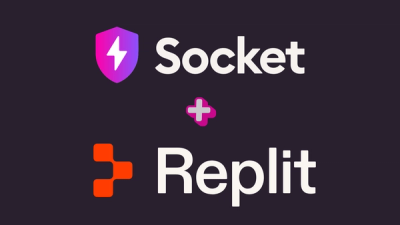
Company News
Replit is integrating Socket Firewall into its AI-powered development experience to help protect builders from malicious open source packages.

Security News
npm confirmed a tooling bug incorrectly marked several one-character packages as security holders and said it was working on a rollback.