

Company News
AWS Security Hub Adds Socket for Supply Chain Security
Socket is now in the AWS Security Hub Extended plan. Adopt it through AWS, apply committed spend, and block malicious open source packages.
By Feross Aboukhadijeh - Aug 04, 2026
@allxsmith/bestax-bulma
Advanced tools
A fully-typed React component library for the Bulma CSS framework. Build modern UIs quickly with reusable, accessible, and customizable Bulma-based React components.






TypeScript-first React component library for the Bulma v1 CSS framework — 80+ fully typed, tree-shakeable components, including extras like Carousel, Dialog, Sidebar, Steps, and date/time pickers.
Requires React ^18 || ^19. Bulma v1 is the only runtime dependency and installs automatically.
Part of the bestax monorepo — see also create-bestax for scaffolding new projects.
Looking for full documentation, guides, API references, and best practices?
👉 Visit our official docs at https://bestax.io
The documentation site is the best place to learn about all bestax-bulma features, usage patterns, and updates. We strongly recommend using the docs as your primary resource!
Starting fresh? Scaffold a ready-to-go app instead: npm create bestax@latest my-app.
npm install @allxsmith/bestax-bulma
# or
pnpm add @allxsmith/bestax-bulma
The library bundles its own CSS (Bulma v1 + the bestax extras). Import it once in your main JS/TS file:
import '@allxsmith/bestax-bulma/bestax.css';
Prefer stock Bulma? That works too — add extras.css for the bestax-only components' styles:
import 'bulma/css/bulma.min.css';
import '@allxsmith/bestax-bulma/extras.css';
More flavors are shipped as subpath exports — prefixed classes (versions/bestax-prefixed.css + <ConfigProvider classPrefix="bestax-">), no-helpers, no-dark-mode, and raw SCSS at @allxsmith/bestax-bulma/scss/*. See the installation guide.
Five icon libraries are supported as optional peer dependencies: Font Awesome (@fortawesome/fontawesome-free), Material Design Icons (@mdi/font), ionicons, material-icons, and material-symbols.
npm install @fortawesome/fontawesome-free
Set the default for your whole app with ConfigProvider, e.g. <ConfigProvider iconLibrary="fa">.
import '@allxsmith/bestax-bulma/bestax.css';
import { Button } from '@allxsmith/bestax-bulma';

function App() {
  return (
    <Button color="primary" onClick={() => alert('Clicked!')}>
      Click Me
    </Button>
  );
}

export default App;
Wrap your app in Theme to override Bulma's --bulma-* CSS variables and control the color scheme:
import { Theme } from '@allxsmith/bestax-bulma';

<Theme isRoot colorMode="system">
  {/* colorMode: 'light' | 'dark' | 'system' */}
  <App />
</Theme>;
Theme colorMode, --bulma-* variable overrides, and prefixed-class builds via ConfigProvider.View the package on npmjs:
👉 https://www.npmjs.com/package/@allxsmith/bestax-bulma
For full documentation, guides, and best practices, please use our official docs site:
Always refer to the documentation site first:
It's the most complete and up-to-date source for everything bestax-bulma!
Explore live, interactive component examples in our Storybook:
Building with an AI agent (Claude Code, Cursor, Copilot)? bestax-bulma ships LLM-optimized docs:
📘 LLMs guide — how to use the library with AI tools
📄 llms.txt — curated index · llms-full.txt — the full docs in one file · every docs page is also served as raw markdown
📦 In the npm package — the tarball ships llms.txt, AGENTS.md, and CLAUDE.md pointer files, so agents exploring node_modules land on these resources by filename
🧩 Agent Skills — teach your agent the bestax way:
| Skill | Use it when… |
|---|---|
bestax-layout-scaffold | Turning a high-level request (dashboard, landing page, …) into a responsive page |
bestax-form | Building forms — Field/Control composition and the full input inventory |
bestax-theming | Customizing colors, fonts, dark mode via Theme and --bulma-* variables |
bestax-custom-component | Building a new custom component beyond stock Bulma, the bestax way |
bestax-icons | Adding icons — Icon/IconText and the five supported icon libraries |
bestax-optimize | Shrinking the built CSS — flavor builds, modular Sass, import hygiene |
bestax-migrate | Moving an app off react-bulma-components (v4) onto bestax-bulma |
npx skills add https://github.com/allxsmith/bestax --skill bestax-layout-scaffold
New projects get the skills automatically with npm create bestax@latest my-app --skills (plus a generated CLAUDE.md).
bestax-bulma is built on top of the incredible Bulma CSS framework, © Jeremy Thomas and licensed under the MIT License. Some example content and documentation is adapted from the Bulma website (CC BY-NC-SA 4.0), © Jeremy Thomas.
If you find Bulma useful, please consider sponsoring Jeremy Thomas to support its continued development.
We are not affiliated with Bulma or Jeremy Thomas in any way — we're just big fans of the Bulma framework!
Source code licensed MIT
FAQs
A fully-typed React component library for the Bulma CSS framework. Build modern UIs quickly with reusable, accessible, and customizable Bulma-based React components.
The npm package @allxsmith/bestax-bulma receives a total of 257 weekly downloads. As such, @allxsmith/bestax-bulma popularity was classified as not popular.
We found that @allxsmith/bestax-bulma demonstrated a healthy version release cadence and project activity because the last version was released less than a year ago. It has 1 open source maintainer collaborating on the project.
Did you know?

Socket for GitHub automatically highlights issues in each pull request and monitors the health of all your open source dependencies. Discover the contents of your packages and block harmful activity before you install or update your dependencies.
Company News
Socket is now in the AWS Security Hub Extended plan. Adopt it through AWS, apply committed spend, and block malicious open source packages.
Research
/Security News
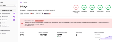
Popular npm packages keyv and cacheable compromised.

Security News
A misconfiguration gave three Anthropic models internet access, and one, believing it was in a simulation, shipped a credential-stealing package to PyPI.