
jumbotron - Angular UI open source library built with material design in order to illustrate a highlighted/important information for the user - Angular 8 supported


Built by and for developers :heart:
Do you have any question or suggestion ? Please do not hesitate to contact us!
Alternatively, provide a PR | open an appropriate issue here
If you like this project, support angular-material-extensions
by starring :star: and sharing it :loudspeaker:
Table of Contents
View all the directives and components in action at https://angular-material-extensions.github.io/jumbotron
Dependencies
- Angular (requires Angular 2 or higher)
Requirements (peer dependencies):
npm i @angular/cdk @angular/material @angular/flex-layout @angular/animations
Additional requirements Theme (Material Design)
- The easiest way to import material design icons is to provide a link in your
index.html file like below:
<link href="https://fonts.googleapis.com/icon?family=Material+Icons" rel="stylesheet">
- Install of the official npm module of the material design icons
npm i -s material-design-icons
- Import them in your
angular.json file
"styles": [
        "styles.css",
        "../node_modules/material-design-icons/iconfont/material-icons.css"
      ],
Install above dependencies via npm.
Now install @angular-material-extensions/jumbotron via:
npm install --save @angular-material-extensions/jumbotron
SystemJS
Note:If you are using SystemJS, you should adjust your configuration to point to the UMD bundle.
In your systemjs config file, map needs to tell the System loader where to look for jumbotron:
map: {
  'jumbotron': 'node_modules/@angular-material-extensions/jumbotron/bundles/jumbotron.umd.js',
}
Once installed you need to import the main module:
import { MatJumbotronModule } from '@angular-material-extensions/jumbotron';
The only remaining part is to list the imported module in your application module. The exact method will be slightly
different for the root (top-level) module for which you should end up with the code similar to (notice MatJumbotronModule.forRoot()):
import { MatJumbotronModule } from '@angular-material-extensions/jumbotron';

@NgModule({
  declarations: [AppComponent, ...],
  imports: [MatJumbotronModule.forRoot(), ...],
  bootstrap: [AppComponent]
})
export class AppModule {
}
Other modules in your application can simply import MatJumbotronModule:
import { MatJumbotronModule } from '@angular-material-extensions/jumbotron';

@NgModule({
  declarations: [OtherComponent, ...],
  imports: [MatJumbotronModule, ...],
})
export class OtherModule {
}
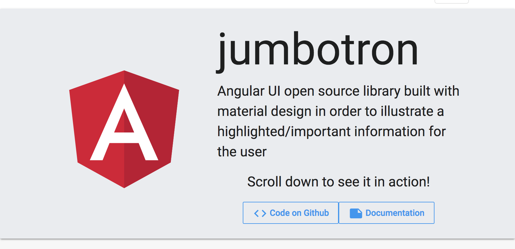
mat-jumbotron a material card layout that holds (optional) an image and the content of the mat-jumbotron-contentmat-jumbotron-content is the main content of the jumbotron and can contains anything! It's your template
Example
<mat-jumbotron imgURL="assets/logo.svg">
  <mat-jumbotron-content>
    <h1 class="display-1" ngClass.xs="display-3 text-center" ngClass.sm="display-3">jumbotron</h1>
    <p class="headline" ngClass.xs="text-center">Angular UI open source library built
      with material design in order to illustrate a highlighted/important information for the user
    </p>

    <p class="text-center"> Scroll down to see it in action!</p>

    <div fxLayout="row" fxLayout.xs="column"
         fxLayoutGap.xs="1rem"
         fxLayoutAlign="center center">
      <a mat-stroked-button
         color="primary"
         target="_blank"
         href="https://github.com/angular-material-extensions/jumbotron">
        <mat-icon>code</mat-icon>
        Code on Github
      </a>
      <a mat-stroked-button
         color="primary"
         target="_blank"
         href="doc/index.html">
        <mat-icon>note</mat-icon>
        Documentation
      </a>
    </div>

  </mat-jumbotron-content>
</mat-jumbotron>
the result will be the screen shot displayed above!
For a live example, please visit the Demo App
API
mat-jumbotron
| option | bind | type | default | description |
|---|
| imageURL | Input() | string | - | the image src url to be displayed in the jumbotron |
Example
Please checkout the full documentation here
or follow the official tutorial
Run Demo App Locally
$ git clone https://github.com/angular-material-extensions/jumbotron.git
- link the @angular-material-extensions/jumbotron package
use gulp globally
$ gulp link
use gulp locally
$ npx gulp link
for some mac os users, you may use the sudo command with gulp
use gulp with sudo
$ sudo gulp link
or locally
$ sudo npx gulp link
- navigate to the demo app directory
$ cd demo
$ npm i
$ npm run start
or
$ ng serve --open
- the app is now hosted by
http://localhost:4200/
Development
- clone this repo
- Install the dependencies by running
npm i - build the library
npm run build or gulp build
To generate all *.js, *.d.ts and *.metadata.json files:
$ npm run build
- Link the library
- on windows
gulp link or locally npx gulp link - on mac/linux
sudo gulp link or locally sudo npx gulp link
- Navigate to the demo app's directory
cd demo
_ npm i
_ npm start
extras
To lint all *.ts files:
$ npm run lint
Other Angular Material Extensions Libraries
Support
Built by and for developers :heart: we will help you :punch:
License
Copyright (c) 2019 Anthony Nahas. Licensed under the MIT License (MIT)


