@angular-material-extensions/select-icon - Angular component that allows to select an option in form of a material design icon button


Built by and for developers :heart:
Do you have any question or suggestion ? Please do not hesitate to contact us!
Alternatively, provide a PR | open an appropriate issue here
If you like this project, support angular-material-extensions
by starring :star: and sharing it :loudspeaker:
Table of Contents
View all the directives and components in action at https://angular-material-extensions.github.io/select-country
Library's components
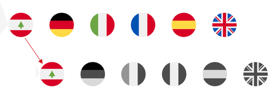
<mat-select-icon> used to display the main component
Dependencies
- Angular developed and tested with
10.x
1. Install via ng add. (Recommended)
If Angular Material Design is not setup, just run ng add @angular/material learn more
Now add the library via the angular schematics
ng add @angular-material-extensions/select-icon
2. Install via npm. (Alternative)
Now install @angular-material-extensions/select-icon via:
npm install --save @angular-material-extensions/select-icon
Import the library
If you installed the library via angular schematics, you can skip this step
import { MatSelectIconModule } from '@angular-material-extensions/select-icon';

@NgModule({
  declarations: [AppComponent, ...],
  imports: [MatSelectIconModule, ...],
  bootstrap: [AppComponent]
})
export class AppModule {
}
Other modules in your application like for lazy loading import MatSelectIconModule into your feature module:
API
| option | bind | type | default | description |
|---|
| icons | Input() | MatSelectIcon[] | - | the icons to display |
| value | Input() | MatSelectIcon | - | the selected value |
| onIconSelected | Output() | EventEmitter<MatSelectIcon> | - | emits the selected icon as object (see the interface below) |
interface MatSelectIcon {
url: string;
value?: any;
color?: ThemePalette;
tags?: string[];
}
<mat-select-icon [icons]="icons" (onIconSelected)="onIconSelected($event)"></mat-select-icon>
import { MatSelectIcon } from '@angular-material-extensions/select-icon';
icons: MatSelectIcon[] = [
{
url: 'assets/icons/countrys-flags/lebanon.svg'
},
{
url: 'assets/icons/countrys-flags/germany.svg',
color: 'warn'
},
{
url: 'assets/icons/countrys-flags/italy.svg',
color: 'primary'
},
{
url: 'assets/icons/countrys-flags/france.svg',
color: 'primary'
},
{
url: 'assets/icons/countrys-flags/spain.svg',
color: 'accent'
},
{
url: 'assets/icons/countrys-flags/united-kingdom.svg',
color: 'accent'
}
];
onIconSelected(selectedIcon: MatSelectIcon) {
console.log('selected icon');
}
with reactive forms
<mat-select-icon [icons]="icons" [formControl]="selectIconFC"></mat-select-icon>
import { MatSelectIcon } from '@angular-material-extensions/select-icon';

selectIconFC: FormControl = new FormControl();
with selected value
<mat-select-icon [icons]="icons" [formControl]="selectIconDefault"></mat-select-icon>
import { MatSelectIcon } from '@angular-material-extensions/select-icon';

selectIconDefault: FormControl = new FormControl(this.icons[0]);
Run Demo App Locally
Build the library
$ npm run build:lib
Serve the demo app
$ npm start
Other Angular Libraries
Support
Built by and for developers :heart: we will help you :punch:

This project is supported by jetbrains with 1 ALL PRODUCTS PACK OS LICENSE incl. webstorm
License
Copyright (c) 2020 Anthony Nahas. Licensed under the MIT License (MIT)
