Product
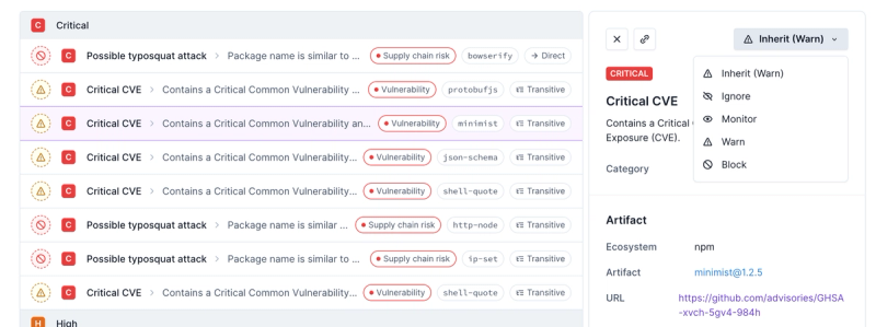
Introducing Enhanced Alert Actions and Triage Functionality
Socket now supports four distinct alert actions instead of the previous two, and alert triaging allows users to override the actions taken for all individual alerts.
@anypoint-web-components/anypoint-checkbox
Advanced tools
Readme
This component has been moved to anypoint-web-components/awc.
====
Anypoint and Material DS styled checkbox.
At the moment of publication of the element, the spec allowing custom elements to be accepted by the <form> element (Form-associated custom elements) is work in progress.
Custom form element has to be used with custom elements that needs to be registered in a form. We suggest using iron-form.
This element supports form-associated custom elements spec that allows to use custom elements with <form> and <fieldset> elements. A browser may not yet support this feature.
If the API is enable then the form element returns anypoint-checkbox is form.elements list and collect value of the control when submitted.
Checkboxes should be used with forms to select one of the available options. Unlike switch button which toggle action selects the control and immediately executes system related action, change of state of a checkbox does not carry any other related action than selecting an option. In other words, when change of the state of the control triggers change in the UI a switch button should be used instead of a checkbox.
npm i --save @anypoint-web-components/anypoint-checkbox
<html>
  <head>
    <script type="module">
      import '@anypoint-web-components/anypoint-checkbox/anypoint-checkbox.js';
    </script>
  </head>
  <body>
    <anypoint-checkbox>Regular checkbox</anypoint-checkbox>
    <anypoint-checkbox checked>Checked checkbox</anypoint-checkbox>
    <anypoint-checkbox indeterminate>Indeterminate checkbox</anypoint-checkbox>
    <anypoint-checkbox required>Required checkbox</anypoint-checkbox>
    <anypoint-checkbox disabled>Disabled checkbox</anypoint-checkbox>
  </body>
</html>
import { LitElement, html } from 'lit-element';
import '@anypoint-web-components/anypoint-checkbox/anypoint-checkbox.js';

class SimpleElement extends ControlStateMixin(ButtonStateMixin(LitElement)) {
  render() {
    return html`
    <anypoint-checkbox>Regular checkbox</anypoint-checkbox>
    <anypoint-checkbox checked>Checked checkbox</anypoint-checkbox>
    <anypoint-checkbox indeterminate>Indeterminate checkbox</anypoint-checkbox>
    <anypoint-checkbox required>Required checkbox</anypoint-checkbox>
    <anypoint-checkbox disabled>Disabled checkbox</anypoint-checkbox>
    `;
  }
}
window.customElements.define('simple-element', SimpleElement);
npm i --save @polymer/iron-form
<script type="module" src="node_modules/@polymer/iron-form/iron-form.js"></script>
<script type="module" src="node_modules/@anypoint-web-components/anypoint-checkbox/anypoint-checkbox.js"></script>
<script type="module" src="node_modules/@anypoint-web-components/anypoint-button/anypoint-button.js"></script>
<iron-form>
  <form>
   <anypoint-checkbox name="subscribe" value="newsletter">Subscribe to our newsletter</anypoint-checkbox>
   <anypoint-checkbox name="terms" value="accepted" checked required>Agree to terms and conditions</anypoint-checkbox>
   <anypoint-checkbox name="disabled" value="noop" disabled>This is never included</anypoint-checkbox>
  </form>
  <anypoint-button id="submit"></anypoint-button>
</iron-form>
<script>
  document.getElementById('submit').addEventListener('click', () => {
    const values = document.querySelector('iron-form').serializeForm();
    console.log(values);
  });
</script>
git clone https://github.com/anypoint-web-components/anypoint-checkbox
cd anypoint-checkbox
npm install
npm start
npm test
FAQs
Anypoint and Material DS styled checkbox
The npm package @anypoint-web-components/anypoint-checkbox receives a total of 559 weekly downloads. As such, @anypoint-web-components/anypoint-checkbox popularity was classified as not popular.
We found that @anypoint-web-components/anypoint-checkbox demonstrated a not healthy version release cadence and project activity because the last version was released a year ago. It has 4 open source maintainers collaborating on the project.
Did you know?

Socket for GitHub automatically highlights issues in each pull request and monitors the health of all your open source dependencies. Discover the contents of your packages and block harmful activity before you install or update your dependencies.

Product
Socket now supports four distinct alert actions instead of the previous two, and alert triaging allows users to override the actions taken for all individual alerts.

Security News
Polyfill.io has been serving malware for months via its CDN, after the project's open source maintainer sold the service to a company based in China.

Security News
OpenSSF is warning open source maintainers to stay vigilant against reputation farming on GitHub, where users artificially inflate their status by manipulating interactions on closed issues and PRs.