Product
Introducing Enhanced Alert Actions and Triage Functionality
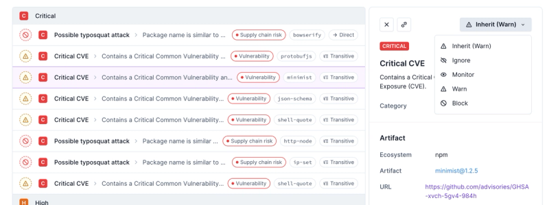
Socket now supports four distinct alert actions instead of the previous two, and alert triaging allows users to override the actions taken for all individual alerts.
@ausbom/icon
Advanced tools
Readme
import { SystemIcon } from '@ausbom/icon';
import ArrowLeft16 from '@ausbom/icon/lib/icons/system/ArrowLeft16';
<SystemIcon
icon={ArrowLeft16}
size={16}
primaryColor="#1E1E1E"
secondaryColor="#707070"
/>
There a number of system icons available as React components. You can find them in @ausbom/icon/lib/icons/system.
Each of these icon components can take a primaryColor and secondaryColor. While it's recommended to use them with the SystemIcon component, it is possible to just render them by themselves
Example:
import { SystemIcon } from '@ausbom/icon';
import ArrowLeft16 from '@ausbom/icon/lib/icons/system/ArrowLeft16'

// Used as standalone
<ArrowLeft16 primaryColor="#1E1E1E" secondaryColor="#707070" />

// Used with SystemIcon
<SystemIcon
  icon={ArrowLeft16}
  size={16}
  primaryColor="#1E1E1E"
  secondaryColor="#707070"
/>
Each icon provided by the design system is intended to be used at a certain size, ensure that you are using an icon that is designed to be displayed at the size you need.
If your project needs an icon that isn't provided in the design system, you can still use SystemIcon because the icon prop can take any React component that renders SVG
In order for your icon to
Example:
import { SystemIcon } from '@ausbom/icon';

const MyCustomIcon = props => {
  return (
    <svg>
      <path fill={props.primaryColor} class="__primary" ... />
      <path fill={props.secondaryColor} class="__secondary" ... />
    </svg>
  )
}

// Used with SystemIcon
<SystemIcon
  icon={MyCustomIcon}
  size={16}
  primaryColor="#1E1E1E"
  secondaryColor="#707070"
/>
Classes (.__primary and .__secondary) are applied to elements inside the provided system icon SVGs so that dual-colored icons can be colorised by css if needed. This can be useful for things like hover states.
For dual-colored icon components that you provide yourself, you'll need to add these classes to the correct elements.
.my-component .icon {
  .__primary {
    fill: red;
  }

  .__secondary {
    fill: blue;
  }
}
FAQs
The icon component provides a refined set of functional icons to use in services and products. The icons are broken into three categories to help users navigate the service, identify important information and understand the forecast story.
The npm package @ausbom/icon receives a total of 63 weekly downloads. As such, @ausbom/icon popularity was classified as not popular.
We found that @ausbom/icon demonstrated a healthy version release cadence and project activity because the last version was released less than a year ago. It has 5 open source maintainers collaborating on the project.
Did you know?

Socket for GitHub automatically highlights issues in each pull request and monitors the health of all your open source dependencies. Discover the contents of your packages and block harmful activity before you install or update your dependencies.

Product
Socket now supports four distinct alert actions instead of the previous two, and alert triaging allows users to override the actions taken for all individual alerts.

Security News
Polyfill.io has been serving malware for months via its CDN, after the project's open source maintainer sold the service to a company based in China.

Security News
OpenSSF is warning open source maintainers to stay vigilant against reputation farming on GitHub, where users artificially inflate their status by manipulating interactions on closed issues and PRs.