@binssoft/ngx-dialogs
All type of dialogs in one package for angular


Please support this project by simply putting a Github star. Share this library with friends on Twitter and everywhere else you can.
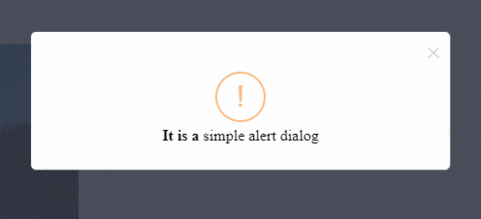
Table of contents:
Getting started
Installation
npm install @binssoft/ngx-dialogs --save
Implementation
import "NgxDialogsModule" in your application module. For example: app.module.ts
import {NgxDialogsModule} from '@binssoft/ngx-dialogs';
@NgModule({
    imports :[
	    NgxDialogsModule
	    ...
    ]
})
export class AppModule { }
add configration in your component. For example : MyOwn.component.ts
import {NgxDialog} from '@binssoft/ngx-dialogs';

export  class  MyOwnComponent  implements  OnInit {
    constructor(
	    private alert :  NgxDialogs
    ) { }
}
Simple Alert Dialog
this.alert.create({
    title: 'Simple Dialog',
    message: 'It is a simple alert dialog',
}, ()=>{ alert('after close') });
Dialog with custom style
this.alert.create({
    title: 'Custom style Dialog',
    message: 'It is a custom style alert dialog',
    customCssClass: 'custom-alert'
}, ()=>{ alert('after close') });
Dialog with custom buttons
this.alert.create({
    title: 'Dialog with Buttons',
    message: 'It is a alert box with buttons',
    buttons : [
		    {
			    title : 'Ok',
			    class: 'ok-btn',
			    event : ()=>{
				    alert('you press ok');
			    }
		    },
		    {
			    title : 'Yes',
			    class: 'yes-btn',
			    event : ()=>{
				    alert('you press yes');
			    }
		    },
		    {
			    title : 'No',
			    class: 'no-btn',
			    event : ()=>{
			    alert('you press No');
		    }
	    }
    ]
});
Confirm Dialog
this.alert.create({
    title: 'Confirm Dialog',
    message: 'It is a confirm dialog box',
    confirm: ()=> {
	    alert('you click "yes"');
    },
    cancel: ()=> {
	    alert('you click "cancel"');
    },
});
Dialog with static background
this.alert.create({
    title :'Dialog with static background',
    message : 'It is a dialog with static backgrond. only close by clicking on "x" ',
    strict: true
});
Modal Dialog
export class MyOwnComponent implements OnInit {
    modalDialogConfig: any = {};
    openModalDialog() {
	    this.modalDialogConfig = {};
	    this.modalDialogConfig['title'] = 'Simple Modal';
	    this.modalDialogConfig['type'] = 'M';
	    this.modalDialogConfig['strict'] = true;
    }
}
HTML
<a href="javascript:void(0)" (click)="openModalDialog()">Click HERE </a>
<ngx-dialogs [config]="modalDialogConfig">
    <p>It is a modal dialog</p>
    <button (click)="openAlertWithButton()">Open Simple Alert</button>
</ngx-dialogs>
Image Lightbox Dialog
openLightBoxDialog() {
	this.alert.create({
    	"src": 'path/to/big/image/img.jpg'
	});
}
HTML
<img title="Click to open light box" src="path/to/thumb/img-thumb.jpg" (click)="openLightBoxDialog()"/>
Close Dialog dynamiclly
this.alert.remove();
Settings Option
| Name | Description | Default Value | Example | Mandatory |
|---|
title | to display the heading of the dialog | NULL | 'title':'Sample Heading' | NO |
message | to display the message of the dialog | NULL | 'message':'Message of the alert box' | YES |
verticalAlign | to set vertical position of dialog | NULL | 'verticalAlign':'top/end' | NO |
duration | to set to close dialog autmatically after nth Sec | NULL | 'duration':nth(s) | NO |
icon | to display icon within the dialog | NULL | 'icon':success/error/info/warning | NO |
src | to add the image path for lightbox dialog | NULL | 'src':'http://test-domain/img.jpg' | YES(if it is a image lightbox dialog) |
strict | to make the dialog background static | false | 'strict': true | NO |
customCssClass | to add custom css clas with the dialog | NULL | 'customCssClass': 'custom-dialog' | NO |
type | to manage the dialog width | 'S' | 'type': 'S/M/L/XL' | NO |
confirm | event only for confirm dialog | ()=>{} | confirm:()=>{ alert('click on confirm'); } | YES(if you want confirm message box) |
buttons | to manage multiple custom buttons in the dialog | [] | buttons : [ {title : 'Ok',class: 'ok-btn',event : ()=>{alert('you press ok');}},] | NO |
buttons.title | to add the text of the button | 'OK' | buttons : [ {title : 'Ok'}] | YES |
buttons.class | to add the custom class of the button | 'ok-btn' | buttons : [ {class : 'ok-btn'}] | NO |
buttons.event | event of the perticular button | ()=>{} | buttons : [ {event : ()=>{alert('you press ok');}}] | YES |
Demo
Click Here for the demo
Creator
Tonmoy Nandy
License
The MIT License (MIT)
Keywords
angular ng dialog modal confirm alert


