Brightlayer UI Progress Icons


This is a library of icons with dynamic fill capabilities that can be used to show progress (similar to a traditional progress spinner or bar). These can be used to show health, battery life, etc.
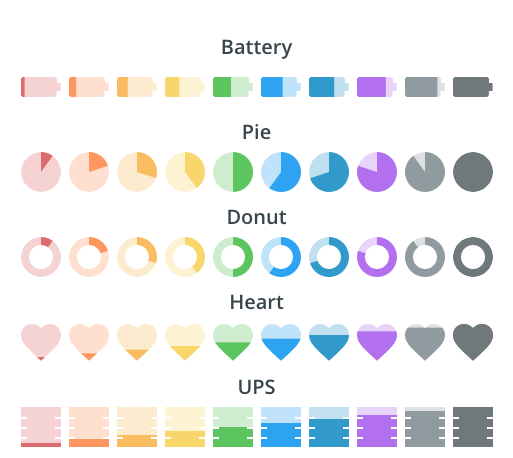
Currently, we have icons available for:
Installation
To install the Brightlayer UI progress icons from NPM as a dependency for your project, you can run one of the following commands in your project root:
yarn add @brightlayer-ui/ng-progress-icons // for Angular components
Using the progress icons in your application
The progress icon components can be imported and used like you would use any other component. You can manually set the desired color for the icon, otherwise it will inherit the text color of its parent container;
import { NgProgressIconsModule } from '@brightlayer-ui/ng-progress-icons';
...
imports: [
NgProgressIconsModule
],
<battery-progress percent="80" size="36" color="green" [charging]="true" [outlined]="true"></battery-progress>
<heart-progress percent="99" size="36" color="pink" [outlined]="true"></heart-progress>
<pie-progress percent="30" size="36" color="#0000ff" ring="4" [outlined]="true"></pie-progress>
<ups-progress percent="10" size="36" color="#0000ff" [outlined]="true"></ups-progress>
API
Shared Attributes
These props are available on all of the progress icons in this package.
| @Input | Description | Type | Required | Default |
|---|
| backgroundColor | Background color for the unfilled area | string | no | |
| color | The color used for the icon fill | string | no | 'currentColor' |
| labelColor | Label text color | string | no | |
| labelPosition | Where to display the text label | top, bottom, center, right, left | no | center |
| labelSize | Size of the label in px | number | no | size/4 |
| outlined | Whether to use the outlined style | boolean | no | false |
| percent | The amount to fill the icon (0-100) | number | no | 100 |
| showPercentLabel | Option to show percentage overlay | boolean | no | false |
| size | The size of the icon (in px) | number | no | 24 |
Any other props supplied will be provided to the root element (svg).
Battery Attributes
The battery supports all of the shared attributes above and the following additional attribute:
| @Input | Description | Type | Required | Default |
|---|
| charging | Whether to show the charging indicator | boolean | no | false |
Pie Attributes
The pie supports all of the shared attributes above and the following additional attribute:
| @Input | Description | Type | Required | Default |
|---|
| ring | The thickness of the outer ring (1 = thin ring, 10 = full circle ) | number | no | 10 |
Building & Packaging
These progress icons are currently created manually by modifying the svg files from the design folder with various clip paths and fill algorithms. They are then packaged up for distribution via npm.
The Angular icons are built using the library packages built into the Angular CLI (read more).
To create a new component:
cd icons/progress/angular
ng generate component component-name --project=ng-progress-icons
And then to create the /dist version:
ng build ng-progress-icons
or
yarn build
Once you have built the library, you can publish to npm via:
cd dist/ng-progress-icons
npm version patch
npm publish


