Research
/Security News
Intercom’s npm Package Compromised in Ongoing Mini Shai-Hulud Worm Attack
Compromised intercom-client@7.0.4 npm package is tied to the ongoing Mini Shai-Hulud worm attack targeting developer and CI/CD secrets.
@chakra-ui/button
Advanced tools
Buttons are used as triggers for actions. They are used in forms, toolbars, dialog footers and as stand-alone action triggers.
yarn add @chakra-ui/button
# or
npm i @chakra-ui/button
import { Button } from "@chakra-ui/button"
<Button colorScheme="green">Button</Button>
Use the size prop to change the size of the button. You can set the value to
xs, sm, md, or lg.
<Stack>
  <Button size="xs">Button</Button>
  <Button size="sm">Button</Button>
  <Button size="md">Button</Button>
  <Button size="lg">Button</Button>
</Stack>
Use the variant prop to change the visual style of the Button. You can set the
value to solid, ghost, outline, or link.
<ButtonGroup>
  <Button variant="solid">Button</Button>
  <Button variant="outline">Button</Button>
  <Button variant="ghost">Button</Button>
  <Button variant="link">Button</Button>
</ButtonGroup>
You can add left and right icons to the Button components.
<ButtonGroup>
  <Button leftIcon={<EmailIcon />} variant="solid">
    Email
  </Button>
  <Button rightIcon={<ArrowForwardIcon />} variant="outline">
    Call us
  </Button>
</ButtonGroup>
Pass isLoading prop to the Button component to show its loading state. You can
optionally pass loadingText prop.
You can also use a custom spinner to render your own spinner component.
<Stack>
  <Button isLoading colorScheme="teal" variant="solid">
    Email
  </Button>

  <Button
    isLoading
    colorScheme="teal"
    variant="outline"
    spinner={<BarSpinner />}
  >
    Submit
  </Button>
</Stack>
React-Bootstrap provides a set of React components that implement the Bootstrap framework. It offers a wide range of pre-styled components, including buttons, which can be customized using Bootstrap's utility classes. Compared to @chakra-ui/button, React-Bootstrap buttons are more tightly coupled with the Bootstrap design system.
Material-UI is a popular React component library that implements Google's Material Design. It provides a comprehensive set of components, including buttons, that are highly customizable and come with built-in accessibility. Material-UI buttons offer a different design aesthetic compared to @chakra-ui/button, focusing on Material Design principles.
Ant Design (antd) is a React UI library that provides a set of high-quality components, including buttons, following the Ant Design guidelines. It is widely used in enterprise applications and offers a rich set of features and customization options. Ant Design buttons have a distinct look and feel compared to @chakra-ui/button.
FAQs
Did you know?

Socket for GitHub automatically highlights issues in each pull request and monitors the health of all your open source dependencies. Discover the contents of your packages and block harmful activity before you install or update your dependencies.

Research
/Security News
Compromised intercom-client@7.0.4 npm package is tied to the ongoing Mini Shai-Hulud worm attack targeting developer and CI/CD secrets.

Research
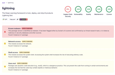
Socket detected a malicious supply chain attack on PyPI package lightning versions 2.6.2 and 2.6.3, which execute credential-stealing malware on import.

Research
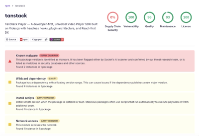
A brand-squatted TanStack npm package used postinstall scripts to steal .env files and exfiltrate developer secrets to an attacker-controlled endpoint.