


💫 <images-switch>
Simple images-switch Lit component, you can switch between SVG image in background. Higly
examples •
usage •
api •
accessibility •
todo •
🕹️ Examples

--switch-width: 150px;
--switch-height: 60px;
--circle-margin: 15px;
--switch-border: 4px solid #000;
--switch-border-checked: 4px solid #00a2ed;
--switch-bk-color: #fff;
--switch-bk-ck-color: #00a2ed;
--switch-bk-disabled-color: #ccc;
--circle-bkcolor: #000;
--circle-ck-bkcolor: whitesmoke;
--text-font-family: 'Segoe UI', Tahoma, Geneva, Verdana, sans-serif;
--text-font-size: 2rem;
--text-font-weight: 300;
<images-switch truetext="On" falsetext="Off"></images-switch>
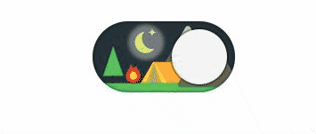
--switch-width: 160px;
--switch-height: 80px;

--circle-margin: 9px;

--circle-bkcolor: whitesmoke;
--circle-ck-bkcolor: whitesmoke;

--switch-bk-ck-url: url(/images/dark_o.svg);
--switch-bk-url: url(/images/light_o.svg);
--switch-bk-disabled-url: url(/images/disabled_o.svg);
<images-switch></images-switch>
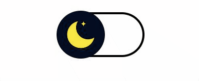
--switch-width: 160px;
--switch-height: 80px;
--switch-border: 4px solid #000;
--switch-border-checked: 4px solid #faf614;
--circle-url: url(/images/moon.svg);

--color-scale-purple-6: #6e40c9;
--color-scale-purple-9: #271052;

--circle-margin: -7px;
--bk-ck-color: var(--color-scale-purple-9);
--circle-bkcolor: #040d21;
--circle-ck-bkcolor: var(--color-scale-purple-6);
<images-switch></images-switch>
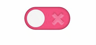
--switch-width: 160px;
--switch-height: 80px;
--circle-margin: 9px;

--border: none;
--switch-bk-color: #ff5683;
--switch-bk-ck-color: #72e06f;
--switch-bk-disabled-color: #bbb;
--circle-bkcolor: whitesmoke;
--circle-ck-bkcolor: whitesmoke;

--switch-bk-ck-url: url(/images/check.svg);
--switch-bk-url: url(/images/cross.svg);

--switch-shadow: inset 0 0 10px rgba(0, 0, 0, 0.6);
--circle-shadow: 0 0 0px 2px rgba(100, 100, 100, 0.2);
--circle-shadow-focus-on: 0 0 5px 6px #FFDE03;
--circle-shadow-hover-on: 0 0 5px 6px #FFDE03;

--text-font-family: 'Segoe UI', Tahoma, Geneva, Verdana, sans-serif;
<images-switch></images-switch>
🚀 Usage
- Install package
npm install --save @cicciosgamino/images-switch
- Import
<script type="module">
import '@cicciosgamino/images-switch'
</script>
- Place in your HTML
<images-switch truetext="On" falsetext="Off"></images-switch>
🐝 API
📒 Properties/Attributes
| Name | Type | Default | Description |
|---|
| value | String | '' | Input value field |
| checked | Boolean | false | Input checked attribute |
| disabled | Boolean | false | Input diabled attribute |
| trueText | String | '' | Property to set the text of the switch when true |
| falseText | String | '' | Property to set the text of the switch when false |
Methods
None
Events
| Event Name | Target | Detail | Description |
|---|
| change | images-switch | { checked: checked } | Fired when the switch changes status |
🧁 CSS Custom Properties
| Name | Default | Description |
|---|
--switch-width | 80px | Switch width |
--switch-height | 40px | Switch height |
--switch-border | none | Switch border when unchecked |
--switch-border-checked | none | Switch border when checked |
--switch-shadow | none | Switch shadow (out or inside switch border) |
--switch-bk-color | transparent | Switch background-color when unchecked |
--switch-bk-ck-color | transparent | Switch background-color when checked |
--switch-bk-disabled-color | transparent | Switch background-color when disabled |
--switch-bk-focus-color | transparent | Switch background-color when focus |
--switch-bk-hover-color | transparent | Switch background-color when hover |
--switch-bk-url | none | Switch background SVG url when unchecked |
--switch-bk-ck-url | none | Switch background SVG url when checked |
--switch-bk-disabled-url | none | Switch background SVG url when disabled |
--circle-url | none | Circle SVG url |
--circle-ck-url | none | Circle SVG url when checked (TODO) |
--circle-disabled-url | none | Circle SVG url when disabled (TODO) |
--circle-margin | 3px | Circle margin |
--circle-bkcolor | transparent | Circle background-color when unchecked |
--circle-ck-bkcolor | transparent | Circle background-color when checked |
--circle-shadow | none | Circle shadow |
--circle-shadow-focus-on | none | Circle shadow when focus |
--circle-shadow-hover-on | none | Circle shadow when hover |
--text-font-family | sans-serif | Font-family if text is used |
--text-font-size | 2rem | Font-size if text is used |
--text-font-weight | 300 | Font-weight if text is used |
--text-absolute-top | -1.5rem | Absolute position top |
--text-absolute-right | -7rem | Absolute position right |
🤖 Write HTML and JavaScript
Import the component's JavaScript module, use the component in your HTML, and control it with JavaScript, just like you would with a built-in element such as <button>:
<!doctype html>
<html>
<head>
<meta charset="utf-8">
<title>My Example App</title>
<script src="./node_modules/@webcomponents/webcomponentsjs/webcomponents-loader.js"></script>
</head>
<body>
<images-switch></images-switch>
<script type="module">
import '@cicciosgamino/images-switch'
const s = document.querySelector('images-switch')
</script>
</body>
</html>
🚀 Serve
Serve your HTML with any server or build process that supports bare module specifier resolution (see next section):
npm install -g @web/dev-server
npm install
npm run serve
Bare module specifiers
All @cicciosgamino Lit components JavaScript modules that use bare module specifiers. Bare module specifiers are not yet supported by browsers, so it is necessary to use a tool that transforms
them to a path (for example from @cicciosgamino/images-switch to ./node_modules/@cicciosgamino/images-switch/images-switch.js).
Two great choices for tools that do this are:
Contributing
Got something interesting you'd like to share? Learn about contributing.
💪 Accessibility
Actually acessibility is handled with the role=switch and mirrororing the checked and disabled attributes from the native checkbox input element to the <images-switch> web component.
🔧 TODO
CSS encapsulation
The elements HTML structure is initialized in a Shadow DOM, so it is impossible to apply CSS to it. If you need to change the element's default style for any reason, you should open up a new issue (or a pull request!), describing your use case, and we'll work with you on solving the problem.
Browser support
Browsers without native custom element support require a polyfill. Legacy browsers require various other polyfills. See [examples/index.html][example] for details.
- Chrome
- Firefox
- Safari
- Microsoft Edge
🧑💻 Author
 |
|---|
| @cicciosgamino |
Support
Reach out to me at one of the following places:
Donate
Donate help and contibutions!
License
GNU General Public License v3.0
Made 🧑💻 by @cicciosgamino


