Product
Introducing Enhanced Alert Actions and Triage Functionality
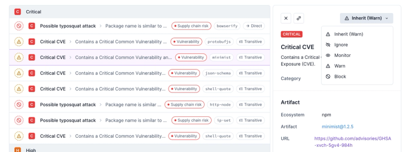
Socket now supports four distinct alert actions instead of the previous two, and alert triaging allows users to override the actions taken for all individual alerts.
@commercetools-uikit/icons
Advanced tools
Readme
All SVG icons are rendered as React components.
import { ExportIcon } from '@commercetools-uikit/icons';
<ExportIcon />;
| Props | Type | Required | Values | Default | Description |
|---|---|---|---|---|---|
size | string | 'small', 'medium', 'big', 'scale' | 'big' | Specifies the icon size (if scale is selected, the dimensions will scale according with the parents) | |
color | string | 'solid', 'neutral60', 'info', 'primary', 'primary40', 'warning', 'error' | 'solid' | Specifies the icon color |
Main use cases are:
Buttons
<SecondaryButton
  onClick={() => {}}
  iconLeft={<ExportIcon />}
  label={this.props.intl.formatMessage(messages.exportList)}
/>
Icon Buttons
<IconButton
  onClick={() => {}}
  icon={<ExportIcon />}
  label={this.props.intl.formatMessage(messages.exportList)}
/>
If you need to render an SVG icon that is not part of the default set of icons, it's possible to render it using a special component <InlineSvg>.
The component is exported as a separate entry point:
import InlineSvg from '@commercetools-uikit/icons/inline-svg';
import InlineSvg from '@commercetools-uikit/icons/inline-svg';

const svg = `<svg><path ... /></svg>`;

const App = () => <InlineSvg data={svg} color="primary" size="medium" />;
The component accepts the same props as the <*Icon> components color and size. Additionally it requires the data prop, which is the actual SVG content.
The data passed to the component is run through a DOM sanitizer to prevent unwanted XSS injections.
This component can be used whenever the icon has to be rendered dynamically on runtime. For example in the Merchant Center this can be the case for the navigation menu icons, etc.
The leading icon is a an eye-catching visual element that should be used when an additional visual prominence is needed for a content section in the UI. The different colours in combination with the icons can be utilised to create certain categorisation of the elements in the UI.
The component is exported as a separate entry point:
import LeadingIcon from '@commercetools-uikit/icons/leading-icon';
import LeadingIcon from '@commercetools-uikit/icons/leading-icon';
import { ExportIcon } from '@commercetools-uikit/icons';

const app = () => <LeadingIcon icon={<ExportIcon />} />;
| Props | Type | Required | Values | Default | Description |
|---|---|---|---|---|---|
size | string | '10', '20', '30', '40' | '20' | Specifies the icon size | |
color | string | 'accent', 'brown', 'neutral', 'purple', 'turquoise', 'white' | 'neutral' | Specifies the icon's background color and fill color | |
isInverted | boolean | true, false | false | Specifies whether the icon has a light background and dark fill (false), or dark background and light fill (true) | |
icon | ReactElement | UI Kit <Icon/> component | Icon that is displayed within the component, you must supply a child icon with with this prop or the svg prop | ||
svg | string | A custom SVG to display | Icon that is displayed using the InlineSvg component, you must supply a child icon with with this prop or the icon prop |
This component can be used wherever it is necessary to display a themed icon.
This component is meant to be used whenever consumers need to render an icon which is not part of the ui-kit icon set.
In order to keep visual consistency, we want to keep the available sizes of all icons equal. Bear in mind we would expect custom SVG icons to not contain size attributes so it can be controlled based on the components size attribute.
The component is exported as a separate entry point:
import CustomIcon from '@commercetools-uikit/icons/custom-icon';
import CustomIcon from '@commercetools-uikit/icons/custom-icon';
import { YourCustomIcon } from './your-custom-icon-directory';

const app = () => <Icon icon={<YourCustomIcon />} />;
| Props | Type | Required | Values | Default | Description |
|---|---|---|---|---|---|
size | string | '10', '20', '30', '40' | '20' | Specifies the icon size | |
icon | unionPossible values: , ReactElement, string | - | A ReactNode or string that display a custom SVG | Icon displayed as a child of this component | |
hasBorder | boolean | true, false | false | Specifies whether the element displays a border |
FAQs
All SVG icons are rendered as React components.
The npm package @commercetools-uikit/icons receives a total of 21,949 weekly downloads. As such, @commercetools-uikit/icons popularity was classified as popular.
We found that @commercetools-uikit/icons demonstrated a healthy version release cadence and project activity because the last version was released less than a year ago. It has 0 open source maintainers collaborating on the project.
Did you know?

Socket for GitHub automatically highlights issues in each pull request and monitors the health of all your open source dependencies. Discover the contents of your packages and block harmful activity before you install or update your dependencies.

Product
Socket now supports four distinct alert actions instead of the previous two, and alert triaging allows users to override the actions taken for all individual alerts.

Security News
Polyfill.io has been serving malware for months via its CDN, after the project's open source maintainer sold the service to a company based in China.

Security News
OpenSSF is warning open source maintainers to stay vigilant against reputation farming on GitHub, where users artificially inflate their status by manipulating interactions on closed issues and PRs.