Product
Introducing Rust Support in Socket
Socket now supports Rust and Cargo, offering package search for all users and experimental SBOM generation for enterprise projects.
@commercetools-uikit/search-text-input
Advanced tools
A controlled search text input component for single-line strings with validation states.
A controlled search text input component for single-line strings with validation states.
yarn add @commercetools-uikit/search-text-input
npm --save install @commercetools-uikit/search-text-input
Additionally install the peer dependencies (if not present)
yarn add react
npm --save install react
import SearchTextInput from '@commercetools-uikit/search-text-input';

const Example = () => (
  <SearchTextInput
    value="foo"
    onChange={(event) => alert(event.target.value)}
    onSubmit={(val) => alert(val)}
    onReset={() => alert('reset')}
  />
);

export default Example;
| Props | Type | Required | Default | Description |
|---|---|---|---|---|
id | string | Used as HTML id property. An id is auto-generated when it is not specified. | ||
autoComplete | string | Used as HTML autocomplete property | ||
aria-invalid | boolean | Indicate if the value entered in the input is invalid. | ||
aria-errormessage | string | HTML ID of an element containing an error message related to the input. | ||
name | string | Used as HTML name of the input component property. | ||
value | string | ✅ | Value of the input component. | |
onChange | ChangeEventHandler | Called with an event containing the new value. Required when input is not read only. Parent should pass it back as value. | ||
onBlur | FocusEventHandler | Called when input is blurred | ||
onFocus | FocusEventHandler | Called when input is focused | ||
onSubmit | FunctionSee signature. | ✅ | Handler when the search button is clicked. | |
onReset | FunctionSee signature. | ✅ | Handler when the clear button is clicked. | |
isAutofocussed | boolean | Focus the input on initial render | ||
isCondensed | boolean | Use this property to reduce the paddings of the component for a ui compact variant | ||
isDisabled | boolean | Indicates that the input cannot be modified (e.g not authorized, or changes currently saving). | ||
isReadOnly | boolean | Indicates that the field is displaying read-only content | ||
hasError | boolean | Indicates if the input has invalid values | ||
hasWarning | boolean | Indicates if the input has warning values | ||
placeholder | string | Placeholder text for the input | ||
isClearable | boolean | true | Indicates if the input should be cleared when the clear button is clicked. Defaults to true. | |
horizontalConstraint | unionPossible values: , 3, 4, 5, 6, 7, 8, 9, 10, 11, 12, 13, 14, 15, 16, 'scale', 'auto' | 'scale' | Horizontal size limit of the input fields. |
onSubmit(searchValue: string) => void
onReset() => void
data-* propsThe component further forwards all data- attributes to the underlying input component.
SearchTextInput.isEmptyReturns true when the value is considered empty, which is when the value is empty or consists of spaces only.
SearchTextInput.isEmpty(''); // -> true
SearchTextInput.isEmpty(' '); // -> true
SearchTextInput.isEmpty('tree'); // -> false
FAQs
A controlled search text input component for single-line strings with validation states.
The npm package @commercetools-uikit/search-text-input receives a total of 2,000 weekly downloads. As such, @commercetools-uikit/search-text-input popularity was classified as popular.
We found that @commercetools-uikit/search-text-input demonstrated a healthy version release cadence and project activity because the last version was released less than a year ago. It has 3 open source maintainers collaborating on the project.
Did you know?

Socket for GitHub automatically highlights issues in each pull request and monitors the health of all your open source dependencies. Discover the contents of your packages and block harmful activity before you install or update your dependencies.

Product
Socket now supports Rust and Cargo, offering package search for all users and experimental SBOM generation for enterprise projects.

Product
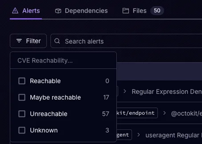
Socket’s precomputed reachability slashes false positives by flagging up to 80% of vulnerabilities as irrelevant, with no setup and instant results.

Product
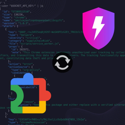
Socket is launching experimental protection for Chrome extensions, scanning for malware and risky permissions to prevent silent supply chain attacks.