Product
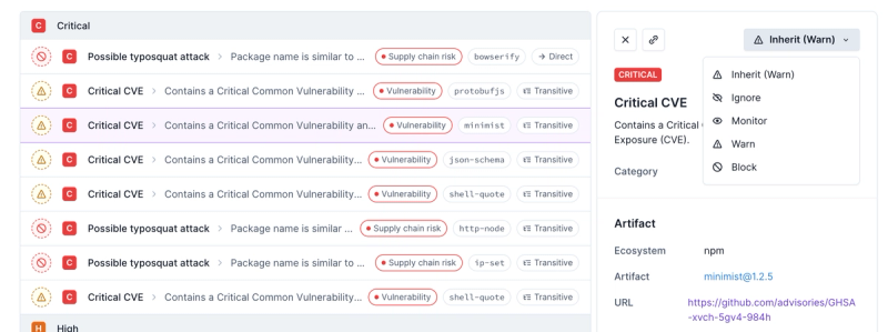
Introducing Enhanced Alert Actions and Triage Functionality
Socket now supports four distinct alert actions instead of the previous two, and alert triaging allows users to override the actions taken for all individual alerts.
@conform-to/react
Advanced tools
Readme
By default, the browser calls the reportValidity() API on the form element when a submission is triggered. This checks the validity of all the fields and reports through the error bubbles.
This hook enhances the form validation behaviour by:
import { useForm } from '@conform-to/react';
function LoginForm() {
const [form, { email, password }] = useForm({
/**
* If the form id is provided, Id for label,
* input and error elements will be derived.
*/
id: undefined,
/**
* Define when the error should be reported initially.
* Support "onSubmit", "onChange", "onBlur".
*
* Default to `onSubmit`.
*/
initialReport: 'onBlur',
/**
* An object representing the initial value of the form.
*/
defaultValue: undefined,
/**
* The last submission result from the server
*/
lastSubmission: undefined,
/**
* An object describing the constraint of each field
*/
constraint: undefined,
/**
* Enable native validation before hydation.
*
* Default to `false`.
*/
fallbackNative: false,
/**
* Accept form submission regardless of the form validity.
*
* Default to `false`.
*/
noValidate: false,
/**
* A function to be called when the form should be (re)validated.
* Only sync validation is supported
*/
onValidate({ form, formData }) {
// ...
},
/**
* The submit event handler of the form.
*/
onSubmit(event, { formData, submission, action, encType, method }) {
// ...
},
});
// ...
}
It is a group of properties required to hook into form events. They can also be set explicitly as shown below:
function RandomForm() {
  const [form] = useForm();

  return (
    <form
      ref={form.props.ref}
      id={form.props.id}
      onSubmit={form.props.onSubmit}
      noValidate={form.props.noValidate}
    >
      {/* ... */}
    </form>
  );
}
Yes! It will fallback to native form submission as long as the submit event is not default prevented.
import { useFrom } from '@conform-to/react';
import { Form } from '@remix-run/react';

function LoginForm() {
  const [form] = useForm();

  return (
    <Form method="post" action="/login" {...form.props}>
      {/* ... */}
    </Form>
  );
}
This hook enables you to work with nested object by monitoring the state of each nested field and prepraing the config required.
import { useForm, useFieldset, conform } from '@conform-to/react';

interface Address {
  street: string;
  zipcode: string;
  city: string;
  country: string;
}

function Example() {
  const [form, { address }] = useForm<{ address: Address }>();
  const { city, zipcode, street, country } = useFieldset(
    form.ref,
    address,
  );

  return (
    <form {...form.props}>
      <fieldset>
        <legned>Address</legend>
        <input {...conform.input(street)} />
        <div>{street.error}</div>
        <input {...conform.input(zipcode)} />
        <div>{zipcode.error}</div>
        <input {...conform.input(city)} />
        <div>{city.error}</div>
        <input {...conform.input(country)} />
        <div>{country.error}</div>
      </fieldset>
      <button>Submit</button>
    </form>
  );
}
If you don't have direct access to the form ref, you can also pass a fieldset ref.
import { type FieldConfig, useFieldset } from '@conform-to/react';
import { useRef } from 'react';

function Fieldset(config: FieldConfig<Address>) {
  const ref = useRef<HTMLFieldsetElement>(null);
  const { city, zipcode, street, country } = useFieldset(ref, config);

  return <fieldset ref={ref}>{/* ... */}</fieldset>;
}
conform utilises the DOM as its context provider / input registry, which maintains a link between each input / button / fieldset with the form through the form property. The ref object allows it to restrict the scope to form elements associated to the same form only.
function ExampleForm() {
  const formRef = useRef();
  const inputRef = useRef();

  useEffect(() => {
    // Both statements will log `true`
    console.log(formRef.current === inputRef.current.form);
    console.log(formRef.current.elements.namedItem('title') === inputRef.current)
  }, []);

  return (
    <form ref={formRef}>
      <input ref={inputRef} name="title">
    </form>
  );
}
This hook enables you to work with array and support the list intent button builder to modify a list. It can also be used with useFieldset for nested list at the same time.
import { useForm, useFieldList, list } from '@conform-to/react';

/**
 * Consider the schema as follow:
 */
type Schema = {
  items: string[];
};

function Example() {
  const [form, { items }] = useForm<Schema>();
  const itemsList = useFieldList(form.ref, items);

  return (
    <fieldset ref={ref}>
      {itemsList.map((item, index) => (
        <div key={item.key}>
          {/* Setup an input per item */}
          <input {...conform.input(item)} />

          {/* Error of each item */}
          <span>{item.error}</span>

          {/* Setup a delete button (Note: It is `items` not `item`) */}
          <button {...list.remove(items.name, { index })}>Delete</button>
        </div>
      ))}

      {/* Setup a button that can append a new row with optional default value */}
      <button {...list.append(items.name, { defaultValue: '' })}>add</button>
    </fieldset>
  );
}
It returns a ref object and a set of helpers that dispatch corresponding dom event.
import { useForm, useInputEvent } from '@conform-to/react';
import { Select, MenuItem } from '@mui/material';
import { useState, useRef } from 'react';

function MuiForm() {
  const [form, { category }] = useForm();
  const [value, setValue] = useState(category.defaultValue ?? '');
  const [ref, control] = useInputEvent({
    onReset: () => setValue(category.defaultValue ?? ''),
  });
  const inputRef = useRef<HTMLInputElement>(null);

  return (
    <form {...form.props}>
      {/* Render a shadow input somewhere */}
      <input
        ref={ref}
        {...conform.input(category, { hidden: true })}
        onChange={(e) => setValue(e.target.value)}
        onFocus={() => inputRef.current?.focus()}
      />

      {/* MUI Select is a controlled component */}
      <TextField
        label="Category"
        inputRef={inputRef}
        value={value}
        onChange={control.change}
        onBlur={control.blur}
        select
      >
        <MenuItem value="">Please select</MenuItem>
        <MenuItem value="a">Category A</MenuItem>
        <MenuItem value="b">Category B</MenuItem>
        <MenuItem value="c">Category C</MenuItem>
      </TextField>
    </form>
  );
}
It provides several helpers to remove the boilerplate when configuring a form control and derives attributes for accessibility concerns and helps focus management.
You can also create a wrapper on top if you need to integrate with custom input component.
Before:
import { useForm } from '@conform-to/react';

function Example() {
  const [form, { title, description, category }] = useForm();

  return (
    <form {...form.props}>
      <input
        type="text"
        name={title.name}
        form={title.form}
        defaultValue={title.defaultValue}
        requried={title.required}
        minLength={title.minLength}
        maxLength={title.maxLength}
        min={title.min}
        max={title.max}
        multiple={title.multiple}
        pattern={title.pattern}
      />
      <textarea
        name={description.name}
        form={description.form}
        defaultValue={description.defaultValue}
        requried={description.required}
        minLength={description.minLength}
        maxLength={description.maxLength}
      />
      <select
        name={category.name}
        form={category.form}
        defaultValue={category.defaultValue}
        requried={category.required}
        multiple={category.multiple}
      >
        {/* ... */}
      </select>
    </form>
  );
}
After:
import { useForm, conform } from '@conform-to/react';

function Example() {
  const [form, { title, description, category }] = useForm();

  return (
    <form {...form.props}>
      <input {...conform.input(title, { type: 'text' })} />
      <textarea {...conform.textarea(description)} />
      <select {...conform.select(category)}>{/* ... */}</select>
    </form>
  );
}
It parses the formData based on the naming convention with the validation result from the resolver.
import { parse } from '@conform-to/react';

const formData = new FormData();
const submission = parse(formData, {
  resolve({ email, password }) {
    const error: Record<string, string> = {};

    if (typeof email !== 'string') {
      error.email = 'Email is required';
    } else if (!/^[^@]+@[^@]+$/.test(email)) {
      error.email = 'Email is invalid';
    }

    if (typeof password !== 'string') {
      error.password = 'Password is required';
    }

    if (error.email || error.password) {
      return { error };
    }

    return {
      value: { email, password },
    };
  },
});
This enable Constraint Validation with ability to enable custom constraint using data-attribute and customizing error messages. By default, the error message would be the attribute that triggered the error (e.g. required / type / 'minLength' etc).
import { useForm, validateConstraint } from '@conform-to/react';
import { Form } from 'react-router-dom';

export default function SignupForm() {
    const [form, { email, password, confirmPassword }] = useForm({
        onValidate(context) {
            // This enables validating each field based on the validity state and custom cosntraint if defined
            return validateConstraint(
              ...context,
              constraint: {
                // Define custom constraint
                match(value, { formData, attributeValue }) {
                    // Check if the value of the field match the value of another field
                    return value === formData.get(attributeValue);
                },
            });
        }
    });

    return (
        <Form method="post" {...form.props}>
            <div>
                <label>Email</label>
                <input
                    name="email"
                    type="email"
                    required
                    pattern="[^@]+@[^@]+\\.[^@]+"
                />
                {email.error === 'required' ? (
                    <div>Email is required</div>
                ) : email.error === 'type' ? (
                    <div>Email is invalid</div>
                ) : null}
            </div>
            <div>
                <label>Password</label>
                <input
                    name="password"
                    type="password"
                    required
                />
                {password.error === 'required' ? (
                    <div>Password is required</div>
                ) : null}
            </div>
            <div>
                <label>Confirm Password</label>
                <input
                    name="confirmPassword"
                    type="password"
                    required
                    data-constraint-match="password"
                />
                {confirmPassword.error === 'required' ? (
                    <div>Confirm Password is required</div>
                ) : confirmPassword.error === 'match' ? (
                    <div>Password does not match</div>
                ) : null}
            </div>
            <button>Signup</button>
        </Form>
    );
}
It provides serveral helpers to configure an intent button for modifying a list.
import { list } from '@conform-to/react';

function Example() {
  return (
    <form>
      {/* To append a new row with optional defaultValue */}
      <button {...list.append('name', { defaultValue })}>Append</button>

      {/* To prepend a new row with optional defaultValue */}
      <button {...list.prepend('name', { defaultValue })}>Prepend</button>

      {/* To remove a row by index */}
      <button {...list.remove('name', { index })}>Remove</button>

      {/* To replace a row with another defaultValue */}
      <button {...list.replace('name', { index, defaultValue })}>
        Replace
      </button>

      {/* To reorder a particular row to an another index */}
      <button {...list.reorder('name', { from, to })}>Reorder</button>
    </form>
  );
}
It returns the properties required to configure an intent button for validation.
import { validate } from '@conform-to/react';

function Example() {
  return (
    <form>
      {/* To validate a single field by name */}
      <button {...validate('email')}>Validate email</button>

      {/* To validate the whole form */}
      <button {...validate()}>Validate</button>
    </form>
  );
}
It lets you trigger an intent without requiring users to click on a button. It supports both list and validate intent.
import {
  useForm,
  useFieldList,
  conform,
  list,
  requestIntent,
} from '@conform-to/react';
import DragAndDrop from 'awesome-dnd-example';

export default function Todos() {
  const [form, { tasks }] = useForm();
  const taskList = useFieldList(form.ref, tasks);

  const handleDrop = (from, to) =>
    requestIntent(form.ref.current, list.reorder({ from, to }));

  return (
    <form {...form.props}>
      <DragAndDrop onDrop={handleDrop}>
        {taskList.map((task, index) => (
          <div key={task.key}>
            <input {...conform.input(task)} />
          </div>
        ))}
      </DragAndDrop>
      <button>Save</button>
    </form>
  );
}
This is an utility for checking if the provided element is a form element (input / select / textarea or button) which also works as a type guard.
function Example() {
  return (
    <form
      onFocus={(event) => {
        if (isFieldElement(event.target)) {
          // event.target is now considered one of the form elements type
        }
      }}
    >
      {/* ... */}
    </form>
  );
}
FAQs
Conform view adapter for react
The npm package @conform-to/react receives a total of 33,079 weekly downloads. As such, @conform-to/react popularity was classified as popular.
We found that @conform-to/react demonstrated a healthy version release cadence and project activity because the last version was released less than a year ago. It has 1 open source maintainer collaborating on the project.
Did you know?

Socket for GitHub automatically highlights issues in each pull request and monitors the health of all your open source dependencies. Discover the contents of your packages and block harmful activity before you install or update your dependencies.

Product
Socket now supports four distinct alert actions instead of the previous two, and alert triaging allows users to override the actions taken for all individual alerts.

Security News
Polyfill.io has been serving malware for months via its CDN, after the project's open source maintainer sold the service to a company based in China.

Security News
OpenSSF is warning open source maintainers to stay vigilant against reputation farming on GitHub, where users artificially inflate their status by manipulating interactions on closed issues and PRs.