Product
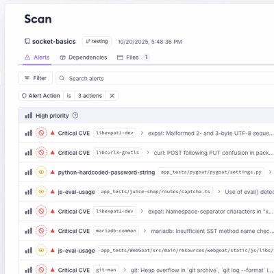
Unify Your Security Stack with Socket Basics
A single platform for static analysis, secrets detection, container scanning, and CVE checks—built on trusted open source tools, ready to run out of the box.
@contentful/f36-menu
Advanced tools
Menu is a component that offers a list of choices to the user, such as a set of actions or links. Menu uses Popover component as a base.
import { Menu } from '@contentful/f36-components';
You can use following components to build a menu:
<Menu>: The main wrapper that provides nested components with all the context and state.<Menu.Trigger> The wrapper for the menu list trigger. Must be a direct child of <Menu>.ref. Consider using forwardRef for functional components.<Menu.List>: The wrapper for the menu items. Must be a direct child of <Menu>.<Menu.Item> The trigger that handles menu selection. Must be a direct child of <Menu.List>.<Menu.Divider> A visual separator for menu items.<Menu.SectionTitle> A title that you can use in the menu list.<Menu.ListHeader> The wrapper for one menu item that will be sticked to the top of the menu list. <Menu.Item> must be provided as a child.<Menu.ListFooter> The wrapper for one menu item that will be sticked to the bottom of the menu list. <Menu.Item> must be provided as a child.<Menu.Submenu> The wrapper for for submenu components. Structure of the children remains the same like in <Menu>, except you should use <Menu.SubmenuTrigger> instead of <Menu.Trigger>.<Menu.SubmenuTrigger> The wrapper for the submenu list trigger. Must be a direct child of <Menu.Submenu>.By default the Menu component is uncontrolled. So when user clicks on the trigger, the menu opens/closes.
But you can control it by passing isOpen prop and onClose, onOpen callbacks.
In most cases, you will use the controlled approach.
But if you have to provide your own toggle menu logic on the trigger component, you can do this by providing onClick callback on trigger component and omitting onOpen callback on the Menu component.
By default props like closeOnSelect, closeOnBlur, closeOnEsc that you pass to Menu will be shared to all submenus
but you can redefine them on any submenu by passing those props directly to that Submenu.
button for Menu.TriggerisInitiallyFocused prop set to true.ArrowUp and ArrowDown) to navigate through menu items.Esc key will close the popover. If you set closeOnEsc to false, it will not close.closeOnBlur to false, it will not close.Menu.List, Menu.Trigger and Menu.Item are provided.FAQs
Did you know?

Socket for GitHub automatically highlights issues in each pull request and monitors the health of all your open source dependencies. Discover the contents of your packages and block harmful activity before you install or update your dependencies.

Product
A single platform for static analysis, secrets detection, container scanning, and CVE checks—built on trusted open source tools, ready to run out of the box.

Product
Socket is launching experimental protection for the Hugging Face ecosystem, scanning for malware and malicious payload injections inside model files to prevent silent AI supply chain attacks.

Research
/Security News
The Socket Threat Research Team uncovered a coordinated campaign that floods the Chrome Web Store with 131 rebranded clones of a WhatsApp Web automation extension to spam Brazilian users.