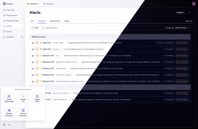
Product
A Fresh Look for the Socket Dashboard
We’ve redesigned the Socket dashboard with simpler navigation, less visual clutter, and a cleaner UI that highlights what really matters.
By André Staltz, Jeppe Hasseriis, Nolan Lawson - Jun 23, 2025
@cypress-design/vue-button
Advanced tools
The button component is contained in the @cypress-design/react-button package. You'll also want to install @cypress-design/constants-button to get proper types for TypeScript.
npm install @cypress-design/vue-button @cypress-design/constants-button
or with yarn
yarn add @cypress-design/vue-button @cypress-design/constants-button
import Button from '@cypress-design/vue-button'
<script lang="ts" setup>
import { IconActionQuestionMarkCircle } from '@cypress-design/vue-icon'
</script>

<template>
  <Button>
    <IconActionQuestionMarkCircle class="mr-2" fill-color="indigo-400" />
    Button
  </Button>
</template>
Square buttons
<script lang="ts" setup>
import { IconActionQuestionMarkCircle } from '@cypress-design/vue-icon'
</script>

<template>
  <div class="flex gap-4 items-center">
    <Button v-for="size of [20, 24, 32, 40, 48]" :size="`${size}`" square>
      <IconActionQuestionMarkCircle
        fill-color="indigo-400"
        :style="{ width: `${size / 2}px`, height: `${size / 2}px` }"
      />
    </Button>
  </div>
</template>
Variants and their available sizes plus styles when disabled is set to true (represented as 🚫).
<script lang="ts" setup>
import {
  default as Button,
  VariantClassesTable,
  SizeClassesTable,
} from '@cypress-design/vue-button'
</script>

<template>
  <div class="flex flex-wrap justify-stretch gap-[8px]">
    <div
      v-for="(_, variant) in VariantClassesTable"
      class="p-[8px] py-[12px] flex flex-col items-center gap-[16px] rounded min-w-[180px]"
      :class="{
        'bg-gray-1000 text-white':
          variant === 'outline-dark' ||
          variant === 'outline-red-dark-mode' ||
          variant === 'outline-jade-dark-mode' ||
          variant === 'outline-indigo-dark-mode' ||
          variant === 'red-dark-mode' ||
          variant === 'disabled-dark-mode',
        'bg-white text-gray-900': ![
          'outline-dark',
          'outline-red-dark-mode',
          'outline-jade-dark-mode',
          'outline-indigo-dark-mode',
          'red-dark-mode',
          'disabled-dark-mode',
        ].includes(variant),
      }"
    >
      {{ variant }}
      <div
        class="flex gap-[8px] items-center"
        v-for="(_, size) in SizeClassesTable"
      >
        {{ size }}
        <Button :variant="variant" :size="size"> Button </Button>
      </div>
      <div class="flex gap-[8px] items-center">
        🚫
        <Button :variant="variant" :size="48" disabled="true"> Button </Button>
      </div>
    </div>
  </div>
</template>
FAQs
Did you know?

Socket for GitHub automatically highlights issues in each pull request and monitors the health of all your open source dependencies. Discover the contents of your packages and block harmful activity before you install or update your dependencies.
Product
We’ve redesigned the Socket dashboard with simpler navigation, less visual clutter, and a cleaner UI that highlights what really matters.

Industry Insights
Terry O’Daniel, Head of Security at Amplitude, shares insights on building high-impact security teams, aligning with engineering, and why AI gives defenders a fighting chance.

Security News
MCP spec updated with structured tool output, stronger OAuth 2.1 security, resource indicators, and protocol cleanups for safer, more reliable AI workflows.