Product
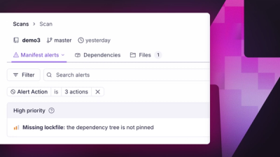
Introducing Manifest Alerts
Socket now detects supply chain risks in project manifests, starting with missing lockfiles that can make dependency installs non-reproducible.
By André Staltz, Trevor Norris - Jun 16, 2026
@deppon/deppon-ui
Advanced tools
@deppon/deppon-uiUI 组件库,基于 Element Plus,适用于 Vue 3 项目。
提供 Element Plus 组件的按需导出,支持按需引入。
import { Button, Input, Form } from '@deppon/deppon-ui';
从
1.0.20起,同时导出了带有El前缀的组件别名,例如:import { ElHeader, Header } from '@deppon/deppon-ui'; // ElHeader 可直接配合 <el-header> 使用,Header 仍兼容旧写法
import Button from '@deppon/deppon-ui/es/Button';
import Input from '@deppon/deppon-ui/es/Input';
// 方式 1:命名导入(推荐,支持 tree-shaking)
import { Fold, Expand, Document, Menu } from '@deppon/deppon-ui/icons-vue';

// 方式 2:子路径导入(也支持 tree-shaking)
import Fold from '@deppon/deppon-ui/icons-vue/Fold';
import Expand from '@deppon/deppon-ui/icons-vue/Expand';
说明:两种导入方式都支持 tree-shaking,打包工具会自动移除未使用的图标。命名导入方式更简洁,推荐使用。
推荐:使用 unplugin-element-plus 可以自动识别模板中的 el-* 标签并自动导入对应的样式。
npm install -D unplugin-element-plus
import { defineConfig } from 'vite';
import vue from '@vitejs/plugin-vue';
import ElementPlus from 'unplugin-element-plus/vite';

export default defineConfig({
    plugins: [
        vue(),
        // 使用 unplugin-element-plus 自动导入 Element Plus 样式
        ElementPlus({
            // 使用 CSS 样式(默认)
            useSource: false,
        }),
    ],
});
<template>
    <el-button>按钮</el-button>
    <el-input v-model="value" />
    <el-table :data="tableData">
        <el-table-column prop="name" label="名称" />
    </el-table>
</template>

<script setup>
import { ElButton, ElInput, ElTable, ElTableColumn } from '@deppon/deppon-ui';
// 无需手动导入样式,unplugin-element-plus 会自动处理
const value = ref('');
const tableData = ref([]);
</script>
说明:
unplugin-element-plus会自动检测模板中的el-*标签,并自动导入对应的样式- 这是 Element Plus 官方推荐的手动导入方式
- 支持按需导入,只会打包你实际使用的组件样式
- 参考文档:Element Plus 手动导入
Button - 按钮(扩展了防抖、节流、自动加载状态、权限控制等功能)Link - 链接Icon - 图标Divider - 分割线Space - 间距Scrollbar - 滚动条Row - 行(栅格系统)Col - 列(栅格系统)Input - 输入框InputNumber - 数字输入框Radio - 单选框Checkbox - 复选框Switch - 开关Select - 选择器Cascader - 级联选择器Transfer - 穿梭框DatePicker - 日期选择器TimePicker - 时间选择器Upload - 上传Rate - 评分ColorPicker - 颜色选择器Form - 表单Slider - 滑块Autocomplete - 自动完成Table - 表格Tag - 标签Progress - 进度条Tree - 树形控件Pagination - 分页Badge - 徽章Avatar - 头像Card - 卡片Collapse - 折叠面板Timeline - 时间线Empty - 空状态Descriptions - 描述列表Result - 结果Statistic - 统计数值Skeleton - 骨架屏Image - 图片ImageViewer - 图片预览Calendar - 日历Carousel - 走马灯Alert - 警告Loading - 加载Message - 消息提示MessageBox - 消息弹框Notification - 通知Popover - 弹出框Tooltip - 文字提示Dialog - 对话框Drawer - 抽屉Popconfirm - 气泡确认框NavMenu - 导航菜单Tabs - 标签页Breadcrumb - 面包屑Dropdown - 下拉菜单Steps - 步骤条Affix - 固钉Backtop - 回到顶部Container - 布局容器Header - 顶部容器Aside - 侧边栏容器Main - 主区域容器Footer - 底部容器InfiniteScroll - 无限滚动Watermark - 水印Tour - 漫游式引导Button 组件在 Element Plus 的基础上扩展了以下功能:
<template>
    <!-- 防抖:500ms 内只执行最后一次点击 -->
    <Button :debounce="500" @click="handleClick">防抖按钮</Button>

    <!-- 节流:500ms 内最多执行一次点击 -->
    <Button :throttle="500" @click="handleClick">节流按钮</Button>
</template>
当点击事件返回 Promise 时,自动管理 loading 状态:
<template>
    <Button :auto-loading="true" :on-click="handleAsyncClick"> 提交 </Button>
</template>

<script setup>
const handleAsyncClick = async () => {
    // 返回 Promise,按钮会自动显示 loading 状态
    await fetch('/api/submit');
};
</script>
<template>
    <!-- 当 permission 为 false 时,按钮自动禁用 -->
    <Button :permission="hasPermission">操作按钮</Button>
</template>
<template>
    <Button :throttle="1000" :auto-loading="true" :permission="userCanSubmit" :on-click="handleSubmit">
        提交订单
    </Button>
</template>
FAQs
Frontend UI component library
We found that @deppon/deppon-ui demonstrated a healthy version release cadence and project activity because the last version was released less than a year ago. It has 1 open source maintainer collaborating on the project.
Did you know?

Socket for GitHub automatically highlights issues in each pull request and monitors the health of all your open source dependencies. Discover the contents of your packages and block harmful activity before you install or update your dependencies.
Product
Socket now detects supply chain risks in project manifests, starting with missing lockfiles that can make dependency installs non-reproducible.

Research
/Security News
The trojanized extensions use TinyGo-compiled WebAssembly and Solana transaction memos to resolve command-and-control infrastructure.

Security News
Anthropic says the directive cited national security concerns over a narrow jailbreak, but offered no specific technical details.