Product
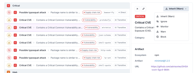
Introducing Enhanced Alert Actions and Triage Functionality
Socket now supports four distinct alert actions instead of the previous two, and alert triaging allows users to override the actions taken for all individual alerts.
@dile/dile-app-drawer
Advanced tools
Readme
Web component to create a simple animated menu, useful as app global menu, with a look & feel similar to the material design navigation drawer component.
npm i @dile/dile-app-drawer
Import the component.
import '@dile/dile-app-drawer/dile-app-drawer.js';
Use the component.
<dile-app-drawer>
  <p><a href="#">Link 1</a></p>
  <p><a href="#">Another link</a></p>
  <p><a href="#">More information</a></p>
  <p><a href="#">Contact us</a></p>
</dile-app-drawer>
This componen has two properties:
The component also provides a set of useful methods to controls the component state programmatically.
There are some CSS custom properties to customize the style and the animation.
| Custom property | Description | Default |
|---|---|---|
| --dile-app-drawer-content-height | Height of the menu | auto (or 100vh on "letf" direction) |
| --dile-app-drawer-content-width | Width of the menu | 100vw (or auto on "left" direction) |
| --dile-app-drawer-background-color | Background color menu layer | #ddd |
| --dile-app-drawer-z-index | z-index menu layer | 10001 |
| --dile-app-drawer-closed-top | Drawer content top position in closed state | -100vh (or 0 on "left" direction) |
| --dile-app-drawer-closed-left | Drawer content left position in closed state | 0 (or -100vw on "left" direction) |
| --dile-app-drawer-box-shadow | Menu shadow | 0 1px 8px #000 (or 1px 0 8px #000 on "left" direction) |
| --dile-app-drawer-modal-background-color | Menu modal layer background color | rgba(20, 20, 20, 0.7) |
| --dile-app-drawer-modal-z-index | Menu modal layer z-index | 10000 |
FAQs
Webcomponent to create a animated menu similar to the material design navigation drawer component
The npm package @dile/dile-app-drawer receives a total of 1 weekly downloads. As such, @dile/dile-app-drawer popularity was classified as not popular.
We found that @dile/dile-app-drawer demonstrated a not healthy version release cadence and project activity because the last version was released a year ago. It has 1 open source maintainer collaborating on the project.
Did you know?

Socket for GitHub automatically highlights issues in each pull request and monitors the health of all your open source dependencies. Discover the contents of your packages and block harmful activity before you install or update your dependencies.

Product
Socket now supports four distinct alert actions instead of the previous two, and alert triaging allows users to override the actions taken for all individual alerts.

Security News
Polyfill.io has been serving malware for months via its CDN, after the project's open source maintainer sold the service to a company based in China.

Security News
OpenSSF is warning open source maintainers to stay vigilant against reputation farming on GitHub, where users artificially inflate their status by manipulating interactions on closed issues and PRs.