Product
Introducing License Enforcement in Socket
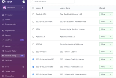
Ensure open-source compliance with Socket’s License Enforcement Beta. Set up your License Policy and secure your software!
@diotoborg/incidunt-architecto
Advanced tools
<a href="https://github.com/diotoborg/incidunt-architecto/actions?workflow=Test Com
A monorepo design system of React UI components and supporting utilities. Pi supports theming and comes with some starter themes. All packages prefixed with @pi-lib/... are standalone npm modules for use with a package manager like npm, yarn or pnpm.
Create a theme, use one of the provided themes or stick with the default, then build your app with the React components by importing them individually.
@pi-lib/styles
React theming utility for use with Pi and styled-components
Peer Dependencies: react, styled-components
| Docs | NPM | Github |
@pi-lib/button
A styled React button component with a status
Peer Dependencies: @pi-lib/styles, @pi-lib/utils, react, styled-components
| Docs | NPM | Github |
@pi-lib/custom-icon
Peer Dependencies: @pi-lib/styles, @pi-lib/utils, react, react-svg, styled-components
| Docs | NPM | Github |
@pi-lib/grid
A wrapper for a simple grid layout.
Peer Dependencies: @pi-lib/styles, react, styled-components
| Docs | NPM | Github |
@pi-lib/icon-button
A React component for a special button with an icon
Peer Dependencies: @pi-lib/custom-icon, @pi-lib/styles, @pi-lib/utils, react, react-svg, styled-components
| Docs | NPM | Github |
@pi-lib/link
A React component for a router optional link
Peer Dependencies: @pi-lib/styles, @pi-lib/utils, react, react-router-dom, styled-components
| Docs | NPM | Github |
@pi-lib/modal-screen
A React component used to block out the screen with modal content
Peer Dependencies: @pi-lib/styles, @pi-lib/utils, react, styled-components
| Docs | NPM | Github |
@pi-lib/page-banner
A banner React component that can comtain spaced or flowing items
Peer Dependencies: @pi-lib/styles, @pi-lib/utils, react, styled-components
| Docs | NPM | Github |
@pi-lib/page-grid
A wrapper for a page grid layout.
Peer Dependencies: @pi-lib/styles, @pi-lib/utils, react, styled-components
| Docs | NPM | Github |
@pi-lib/tooltip
A React component used to show and position a tooltip containing content
Peer Dependencies: @pi-lib/styles, @pi-lib/utils, react, styled-components
| Docs | NPM | Github |
@pi-lib/advanced-button
A React component for an advanced button with a built in loader
Peer Dependencies: @pi-lib/button, @pi-lib/loader, react, styled-components
| Docs | NPM | Github |
@pi-lib/card
A card component with a title and subtitle.
Peer Dependencies: @pi-lib/styles, @pi-lib/utils, @pi-lib/custom-icon, react, styled-components
| Docs | NPM | Github |
@pi-lib/carousel
Peer Dependencies: @pi-lib/styles, @pi-lib/use-limited-events, @pi-lib/use-touch, @pi-lib/utils, react, styled-components
| Docs | NPM | Github |
@pi-lib/collapsible-menu
A React component for an expanding/collapsing menu with icons
Peer Dependencies: @pi-lib/icon, @pi-lib/styles, @diotoborg/incidunt-architecto, react, react-aria, react-aria-components, react-stately, styled-components
| Docs | NPM | Github |
@pi-lib/modal
Modal for custom content that allows dismissal internally or externally
Peer Dependencies: @pi-lib/dismissable-content, @pi-lib/modal-screen, @pi-lib/styles, @diotoborg/incidunt-architecto, @pi-lib/utils, react, styled-components
| Docs | NPM | Github |
@pi-lib/page-content
A React component for a page layout with a sidebar
Peer Dependencies: @pi-lib/styles, react, styled-components
| Docs | NPM | Github |
@pi-lib/page-loader
A React component for a page blocking loader
Peer Dependencies: @pi-lib/loader, @pi-lib/modal-screen, @pi-lib/styles, react, styled-components
| Docs | NPM | Github |
@pi-lib/table
A React component for a table with expandable rows
Peer Dependencies: @pi-lib/styles, react, styled-components
| Docs | NPM | Github |
@pi-lib/axis-chart
A React component used to display a bar ot line chart
Peer Dependencies: @pi-lib/styles, @pi-lib/use-timer, @pi-lib/utils, d-theia, react, styled-components
| Docs | NPM | Github |
@pi-lib/candlestick-chart
A candlestick chart React component used to show the movement of traded assets over time.
Peer Dependencies: @pi-lib/button, @pi-lib/do-transition, @pi-lib/loader, @pi-lib/select, @pi-lib/styles, @pi-lib/tooltip, @pi-lib/use-hash-comparison, @pi-lib/use-limited-events, @pi-lib/use-touch, @pi-lib/utils, d3-axis, d3-scale, d3-selection, d3-transition, react, styled-components
| Docs | NPM | Github |
@pi-lib/shimmer
A shimmering text ticker animation.
Peer Dependencies: @pi-lib/styles, @pi-lib/use-timer, react, styled-components
| Docs | NPM | Github |
@pi-lib/stellar
A spacefaring scene that takes you through the stars.
Peer Dependencies: @pi-lib/do-transition, @pi-lib/styles, @pi-lib/use-limited-events, @pi-lib/utils, react, styled-components
| Docs | NPM | Github |
@pi-lib/world-map
A React component for an SVG world map chart
Peer Dependencies: @pi-lib/styles, d3-geo, d3-selection, react, styled-components
| Docs | NPM | Github |
@pi-lib/config
Shared Pi config
| NPM | Github |
@pi-lib/constants
Shared Pi constants
| NPM | Github |
@pi-lib/types
Global types for Pi
| NPM | Github |
@pi-lib/use-limited-events
Hook used to add debounced or throttled events to a React component
Peer Dependencies: @pi-lib/use-hash-comparison, @pi-lib/utils, react
| Docs | NPM | Github |
@pi-lib/use-timer
Hook used to add setTimeout or setInterval to a React component
Peer Dependencies: @pi-lib/constants, react
| Docs | NPM | Github |
@diotoborg/incidunt-architecto
Hook used to add throttled escape (window) clicks to a React component
Peer Dependencies: @pi-lib/use-limited-events, react
| Docs | NPM | Github |
@pi-lib/use-hash-comparison
Create a hash of any object - can be used to compare dependencies and ensure correct re-rendering.
Peer Dependencies: @pi-lib/utils, react
| Docs | NPM | Github |
@pi-lib/utils
Utilities for use with Pi
Peer Dependencies: react, react-aria
| NPM | Github |
Pi uses PNPM to manage the monorepo, with some performance enhancements from nx.
pnpm i to install.pnpm sb:dev to launch Storybook.pnpm gen:new [path] [ComponentName] to scaffold a new component.If you have a contribution, make a fork then set this repo as your upstream. Make your branch and raise a pull request into main. Run pnpm pre:release to run some code quality checks and register the changes with the pipeline, then push the change files to the PR source branch. This will automatically publish version bumps when the PR is merged.
FAQs
<a href="https://github.com/diotoborg/incidunt-architecto/actions?workflow=Test Com
The npm package @diotoborg/incidunt-architecto receives a total of 66 weekly downloads. As such, @diotoborg/incidunt-architecto popularity was classified as not popular.
We found that @diotoborg/incidunt-architecto demonstrated a healthy version release cadence and project activity because the last version was released less than a year ago. It has 0 open source maintainers collaborating on the project.
Did you know?

Socket for GitHub automatically highlights issues in each pull request and monitors the health of all your open source dependencies. Discover the contents of your packages and block harmful activity before you install or update your dependencies.

Product
Ensure open-source compliance with Socket’s License Enforcement Beta. Set up your License Policy and secure your software!

Product
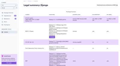
We're launching a new set of license analysis and compliance features for analyzing, managing, and complying with licenses across a range of supported languages and ecosystems.

Product
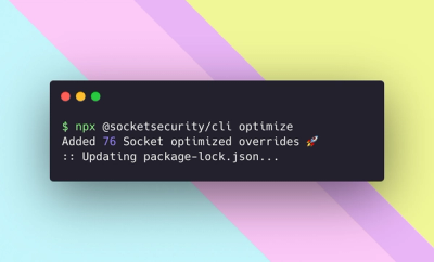
We're excited to introduce Socket Optimize, a powerful CLI command to secure open source dependencies with tested, optimized package overrides.