Product
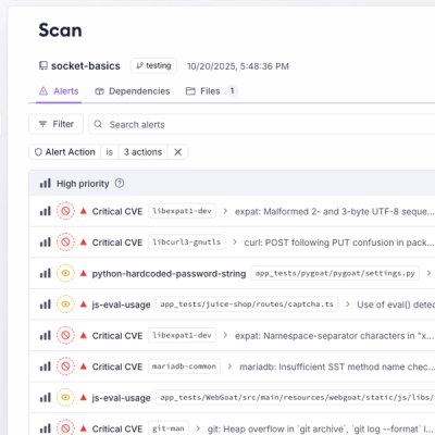
Unify Your Security Stack with Socket Basics
A single platform for static analysis, secrets detection, container scanning, and CVE checks—built on trusted open source tools, ready to run out of the box.
@dotcms/react
Advanced tools
@dotcms/react is the official set of React components and hooks designed to work seamlessly with dotCMS, making it easy to render dotCMS pages and use the page builder.
Install the package via npm:
npm install @dotcms/react
Or using Yarn:
yarn add @dotcms/react
Important: The DotcmsLayout component is deprecated. Please use the new DotCMSLayoutBody component instead.
// Deprecated:
import { DotcmsLayout } from '@dotcms/react';

const MyPage = ({ entity }) => {
    return <DotcmsLayout entity={entity} />;
};
DotCMSLayoutBodyThe DotCMSLayoutBody component renders the layout body for a DotCMS page.
'production'.import { DotCMSLayoutBody } from '@dotcms/react';
const MyPage = ({ page }) => {
return <DotCMSLayoutBody page={page} components={components} />;
};
BlockEditorRendererThe BlockEditorRenderer component renders the content of a Block Editor Content Type from dotCMS.
More information of Block Editor Content Type
| Prop | Type | Description |
|---|---|---|
blocks | Block | The block editor content structure to render. |
customRenderers | CustomRenderer | Optional custom renderers for specific block types. |
className | string | Optional CSS class name to apply to the container. |
style | React.CSSProperties | Optional inline styles to apply to the container. |
contentlet | DotCMSContentlet | Contentlet object containing the field to be edited. Required when editable is true. |
fieldName | string | Name of the field in the contentlet that contains the block editor content. Required when editable is true. |
For a more in-depth explanation of BlockEditorRenderer, visit the documentation.
useDotcmsPageContextA custom React hook that provides access to the PageProviderContext.
PageProviderContext | null: The context value or null if it's not available.import { useDotcmsPageContext } from '@dotcms/react';
const MyComponent = () => {
const context = useDotcmsPageContext();
// Use the context
};
usePageEditorA custom React hook that sets up the page editor for a dotCMS page.
PageEditorOptions - The options for the page editor. Includes a reloadFunction and a pathname.React.RefObject<HTMLDivElement>[]: A reference to the rows of the page.import { usePageEditor } from '@dotcms/react';
const MyEditor = () => {
const rowsRef = usePageEditor({ pathname: '/my-page' });
// Use the rowsRef
};
PageProviderA functional component that provides a context for a dotCMS page.
import { PageProvider } from '@dotcms/react';

const MyApp = ({ entity }) => {
    return <PageProvider entity={entity}>{/* children */}</PageProvider>;
};
GitHub pull requests are the preferred method to contribute code to dotCMS. Before any pull requests can be accepted, an automated tool will ask you to agree to the dotCMS Contributor's Agreement.
dotCMS comes in multiple editions and as such is dual licensed. The dotCMS Community Edition is licensed under the GPL 3.0 and is freely available for download, customization and deployment for use within organizations of all stripes. dotCMS Enterprise Editions (EE) adds a number of enterprise features and is available via a supported, indemnified commercial license from dotCMS. For the differences between the editions, see the feature page.
If you need help or have any questions, please open an issue in the GitHub repository.
Always refer to the official DotCMS documentation for comprehensive guides and API references.
| Source | Location |
|---|---|
| Installation | Installation |
| Documentation | Documentation |
| Videos | Helpful Videos |
| Forums/Listserv | via Google Groups |
| @dotCMS | |
| Main Site | dotCMS.com |
FAQs
Official React Components library to render a dotCMS page.
We found that @dotcms/react demonstrated a healthy version release cadence and project activity because the last version was released less than a year ago. It has 1 open source maintainer collaborating on the project.
Did you know?

Socket for GitHub automatically highlights issues in each pull request and monitors the health of all your open source dependencies. Discover the contents of your packages and block harmful activity before you install or update your dependencies.

Product
A single platform for static analysis, secrets detection, container scanning, and CVE checks—built on trusted open source tools, ready to run out of the box.

Product
Socket is launching experimental protection for the Hugging Face ecosystem, scanning for malware and malicious payload injections inside model files to prevent silent AI supply chain attacks.

Research
/Security News
The Socket Threat Research Team uncovered a coordinated campaign that floods the Chrome Web Store with 131 rebranded clones of a WhatsApp Web automation extension to spam Brazilian users.