Product
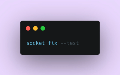
Introducing Socket Fix for Safe, Automated Dependency Upgrades
Automatically fix and test dependency updates with socket fix—a new CLI tool that turns CVE alerts into safe, automated upgrades.
By John-David Dalton - Apr 25, 2025
@emotion/react
Advanced tools
The @emotion/react package is a library designed for writing css styles with JavaScript. It is part of the Emotion library, which is a powerful tool for creating styled components in React applications. It allows developers to style their applications efficiently using the power of JavaScript and React.
Styled Components
This feature allows you to create React components with styles attached to them. The styles are written using tagged template literals, enabling dynamic styling based on props or global themes.
import styled from '@emotion/styled';

const Button = styled.button`
  background: transparent;
  border-radius: 3px;
  border: 2px solid palevioletred;
  color: palevioletred;
  margin: 0.5em 1em;
  padding: 0.25em 1em;

  &:hover {
    background-color: palevioletred;
    color: white;
  }
`;
CSS Prop
The CSS prop feature enables inline styling of components using the `css` prop. This approach is useful for applying styles directly within component render methods or function bodies, allowing for more dynamic and conditional styling.
/** @jsxImportSource @emotion/react */
import { css } from '@emotion/react';

const style = css`
  color: hotpink;
`;

function MyComponent() {
  return <div css={style}>Styled with Emotion</div>;
}
Global Styles
Global styles allow you to define CSS styles that are applied globally across your application. This is particularly useful for setting up base styles, such as resetting margins and paddings, or applying a consistent font across your app.
import { Global, css } from '@emotion/react';

function GlobalStyles() {
  return (
    <Global
      styles={css`
        body {
          margin: 0;
          padding: 0;
          background: papayawhip;
        }
      `}
    />
  );
}Styled-components is a library for React and React Native that allows you to use component-level styles in your application. It uses tagged template literals for styling, similar to @emotion/react. The main difference lies in the implementation details and syntax preferences, but both libraries aim to enhance CSS-in-JS experience.
JSS (JavaScript Style Sheets) is a CSS-in-JS library that allows you to write CSS in JavaScript. It offers a different approach by focusing on a JSON-based syntax for defining styles. Compared to @emotion/react, JSS might be preferred for its use of pure JavaScript objects for styling, but lacks the tagged template literal syntax.
Linaria is a zero-runtime CSS-in-JS library that extracts CSS to separate files at build time, rather than applying styles at runtime like @emotion/react. This can result in better performance for some applications. Linaria's approach is unique in that it offers the benefits of CSS-in-JS without the runtime cost.
Simple styling in React.
yarn add @emotion/react
/** @jsx jsx */
import { jsx, css, Global, ClassNames } from '@emotion/react'

render(
  <div css={{ color: 'hotpink' }}>
    <div
      css={css`
        color: green;
      `}
    />
    <Global
      styles={{
        body: {
          margin: 0,
          padding: 0
        }
      }}
    />
    <ClassNames>
      {({ css, cx }) => (
        <div
          className={cx(
            'some-class',
            css`
              color: yellow;
            `
          )}
        />
      )}
    </ClassNames>
  </div>
)
More documentation is available at https://emotion.sh.
FAQs
> Simple styling in React.
The npm package @emotion/react receives a total of 7,010,113 weekly downloads. As such, @emotion/react popularity was classified as popular.
We found that @emotion/react demonstrated a healthy version release cadence and project activity because the last version was released less than a year ago. It has 0 open source maintainers collaborating on the project.
Did you know?

Socket for GitHub automatically highlights issues in each pull request and monitors the health of all your open source dependencies. Discover the contents of your packages and block harmful activity before you install or update your dependencies.
Product
Automatically fix and test dependency updates with socket fix—a new CLI tool that turns CVE alerts into safe, automated upgrades.

Security News
CISA denies CVE funding issues amid backlash over a new CVE foundation formed by board members, raising concerns about transparency and program governance.
Product
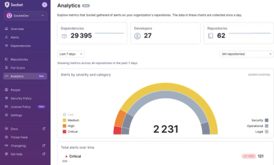
We’re excited to announce a powerful new capability in Socket: historical data and enhanced analytics.